Upgrade icons to modern SVGs
Upgrade icons to modern SVGs. SVGs are supported ever since Netbeans 11.x. With all the HiDPI stuff and all that, I propose a little bit of a facelift. Take SVGs into use as they scale to any size. Fortunately we don't have a lot of icons to change.
Icons are here with the constants that need to be changed as well: https://github.com/jMonkeyEngine/sdk/tree/master/jme3-core/src/com/jme3/gde/core/icons
At least I don't posses the capabilities to create new icons but there should be plenty available in the Internets. Just need to be careful with the licenses.
Good idea. I've been using icons from here, lately: https://game-icons.net/tags/gui.html May not have all needed, but can be combined in inkscape, for example. Liberal license. If I get the time I might dig into this.
More icons here: jme3-core/src/com/jme3/gde/core/editor/icons For the shader node editor, it seems. Also a note to anyone attempting this; not all icons originate from IconList.java. Paths are hard coded in other places. It would be reasonable to replace those with constants. (This is a general problem in the SDK, strings everywhere).
I did a naive attempt at replacing a couple of icons, but just loading an svg didn't work. It's either not shown, or extremely small, like a pixel.
I did a naive attempt at replacing a couple of icons, but just loading an svg didn't work. It's either not shown, or extremely small, like a pixel.
Could it be that the format of the SVG is not in the form expected? Needs to have width and height specified it seems.
https://github.com/apache/netbeans/pull/1278/files#diff-9ba09915eb7eaa1837fdd0943744d49bc050900b2a809f09db8fe6c320b81f69R32
https://github.com/eirikbakke/incubator-netbeans/blob/48dc68f90bbdbe907b5c5b2f2e90de179a9ab43e/platform/openide.util.ui/src/org/openide/util/spi/SVGLoader.java#L32
This is what it looks like:
<svg style="height: 512px; width: 512px;" xmlns="http://www.w3.org/2000/svg" viewBox="0 0 512 512">
I also tried various heights/widths and changed the viewBox, as well as scale, but they didn't seem to change anything.
Hmm, I had checked that PR, but didn't think of looking for supplied svg's. They do look different. I'll see if I can wrangle the ones I have to fit that format.
Bingo, I guess:
 I had to be specific about the width/height being 16px for it to fit. Tbh, they're so small I can barely see much difference in quality from the old.
I've been bit conservative and selected icons that look like the existing ones, but it would be a good opportunity for someone with UI inclinations to help pick new/better icons. I'm pretty sure (and glad) we won't find anything looking like the chimp icons.
Heh I did find actually very cool chimp icons that would have fit the current style perfectly. Although, one needs to pay 20e or so from them but after that they are free to use without restrictions. I could acquire them if people want. But sadly no brains blown out chimp there :D
If I understood correctly, the benefit from using SVGs comes with those HiDPI things. Then the UI (and its icons) is scaled up and pixels start to show. So yeah, little bit niche thing but but but... maybe think of it as a general facelift also. The chimps are quite pixellated in my opinion by default now.
When thinking about this one step further: "Wouldn't it be cool if" textures had an icon that was actually the texture, scenes had an icon that was a screenshot of the scene? What would be required for that?
- Screenshot of scene when saving using Robot (or is that legacy?). Textures are images, so that should be easy. Materials also have image representations.
- Saving images to an external folder (.local, etc).
- Reading from said folder.
- Custom icon per asset, fallback to asset type icon.
- And of course the functionality to have a custom icon per item.
Maybe pointless as long as the icons are only 16x16.
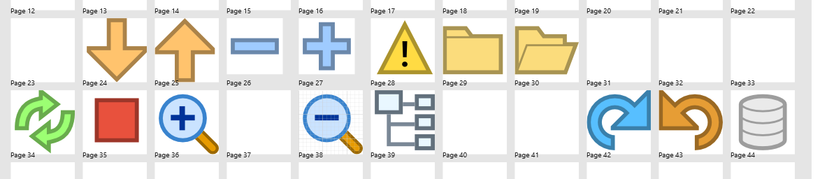
More(!) icons here: https://github.com/jMonkeyEngine/sdk/tree/master/jme3-scenecomposer/src/com/jme3/gde/scenecomposer
Here is by the way how they do (did.. I'm not sure is this super accurate) this in NB itself:
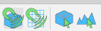
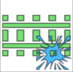
Notice that the outline is a darker shade of the actual item. This probably helps them to be seen in various themes. And this would probably help the green on blue icons we have:
Just a thought.
Nice thought ;) I had not considered it before doing the icons, and when I added the outline I scripted it (for most of them). Maybe it's just a matter of opacity, in which case they can be "sed'ed" again. But next version?
3.5 is already out :) By all means this can be tried out. I didn't try it at all, so I'm unsure what results it will yield.
Sorry, I missed the fanfares :D
Well, you made me have to check. The stroke paint is half over the paint and half outside, so opacity doesn't give exactly that result.
Here it is with opacity and a bit of blur to give it some pleasant smoothness.
and with thicker stroke
Sorry, I missed the fanfares :D
Well, you made me have to check. The stroke paint is half over the paint and half outside, so opacity doesn't give exactly that result. Here it is with opacity and a bit of blur to give it some pleasant smoothness.
Looks ok like that. The challenge comes with the small size and the background color. Can't say how they perform. I put all my trust in you :)
I'll experiment a bit in the upcoming PR's, and if we find something that works well, I'll go back and update the existing ones.