 ithaka
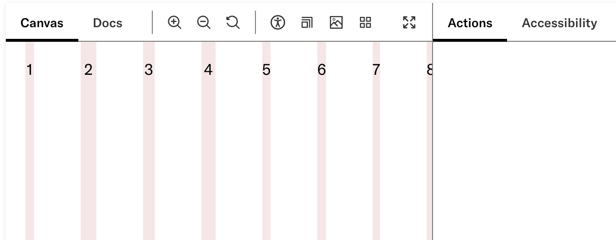
Layout: gutter sizes are prohibitive and cause overflow
Expected behavior
The layout grid is fluid and adjusts well to all screen sizes
Actual behavior
At particular screen sizes, and partially dependent on the content of a given column, the layout overflows the screen.
Steps to reproduce the issue
- Visit the layout story
- Place the Actions panel on the right
- Drag the panel to be wider, narrowing the area with the layout
- Observe the layout eventually stops shrinking and overflows its portion of the screen
Screenshots or code
Pharos version
11.0.0
Your environment
- OS: macOS
- Browser: Chrome, Firefox, likely all
- Version: Likely all
Additional information
We likely want to use either smaller or fluid gutter sizes on smaller screens. Because real estate becomes precious, even a 20px gutter in a 4-column layout on a 360px screen will steal (20px * 3) / (360px) = 1/6th of the screen.
We likely need to revisit this and re-develop a holistic point of view on how we handle layout systemically on the platform.
Design (product & labs) have investigated the referenced gridless design systems recommended by Brad Frost. We agree that this approach would eliminate the current issues we are experiencing with grids.
Design will need to create a new series of objects for the UI toolkit that will replace the current grid system. We are observing that Figma's new capabilities (e.g. setting min/max of frames; and wrapping of items within a frame) will support this work.