Story: Parallel coordinates plot
Opening this to discuss how Parallel Coordinates Plot is implemented in DVC (https://github.com/iterative/dvc/pull/6933)
The DVC implementation is based on performing operations using an internal class called TabularData.
Unfortunately, all these operations happen after the --json output is dumped, so VSCode can't reuse the logic.
I will describe the operations bellow so you can decide which ones make sense to implement on vscode side.
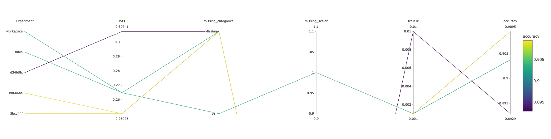
Sample Table used to generate snippets bellow
| Experiment | Created | loss | accuracy | train.batch_size | train.hidden_units | train.dropout | train.num_epochs | train.lr | train.conv_activation | missing_categorical | missing_scalar |
|---|---|---|---|---|---|---|---|---|---|---|---|
| workspace | - | 0.26484 | 0.9038 | 128 | 64 | 0.4 | 10 | 0.001 | relu | bar | 1 |
| main | Sep 14, 2021 | 0.26484 | 0.9038 | 128 | 64 | 0.4 | 10 | 0.001 | relu | - | - |
| 5bcd44f | Sep 01, 2021 | 0.25026 | 0.9095 | 128 | 64 | 0.4 | 10 | 0.001 | relu | - | - |
| b06a6ba | Aug 31, 2021 | 0.25026 | 0.9095 | 128 | 64 | 0.4 | 10 | 0.001 | relu | - | - |
| d34fd8c | Aug 30, 2021 | 0.30741 | 0.8929 | 128 | 64 | 0.4 | 10 | 0.01 | relu | - | - |
Associated plot
Plot Structure
HTML template
The plot is rendered with https://plotly.com/javascript/
This is how the HTML template looks like
<!DOCTYPE html>
<html>
<head>
    <title>DVC Plot</title>
    <script src="https://cdn.plot.ly/plotly-latest.min.js"></script>
</head>
<body>
    <div id = "plot_experiments">
        <script type = "text/javascript">
            var plotly_data = {
              "data": {{DATA}},
              "layout": {{LAYOUT}}
            };
            Plotly.newPlot("plot_experiments", plotly_data.data, plotly_data.layout);
        </script>
    </div>
</body>
</html>
{{DATA}}
{{DATA}} it's a list of Plotly traces.
In the case of this plot, it is a list with a single trace of type parcoords. The full reference is here: https://plotly.com/python/reference/parcoords/
We use the exp show table to fill the {{DATA}} placeholder (more on this bellow).
This is how filled {{DATA}} looks like
[
    {
        "type": "parcoords",
        "dimensions": [
            {
                "label": "Experiment",
                "values": [
                    4,
                    3,
                    0,
                    1,
                    2
                ],
                "tickvals": [
                    4,
                    3,
                    0,
                    1,
                    2
                ],
                "ticktext": [
                    "workspace",
                    "main",
                    "5bcd44f",
                    "b06a6ba",
                    "d34fd8c"
                ]
            },
            {
                "label": "loss",
                "values": [
                    0.26484,
                    0.26484,
                    0.25026,
                    0.25026,
                    0.30741
                ]
            },
            {
                "label": "accuracy",
                "values": [
                    0.9038,
                    0.9038,
                    0.9095,
                    0.9095,
                    0.8929
                ]
            },
            {
                "label": "train.lr",
                "values": [
                    0.001,
                    0.001,
                    0.001,
                    0.001,
                    0.01
                ]
            },
            {
                "label": "missing_categorical",
                "values": [
                    0,
                    1,
                    1,
                    1,
                    1
                ],
                "tickvals": [
                    0,
                    1,
                    1,
                    1,
                    1
                ],
                "ticktext": [
                    "bar",
                    "Missing",
                    "Missing",
                    "Missing",
                    "Missing"
                ]
            },
            {
                "label": "missing_scalar",
                "values": [
                    1.0,
                    null,
                    null,
                    null,
                    null
                ]
            }
        ],
        "line": {
            "color": [
                0.9038,
                0.9038,
                0.9095,
                0.9095,
                0.8929
            ],
            "showscale": true,
            "colorbar": {
                "title": "accuracy"
            }
        }
    }
]
{{LAYOUT}}
We don't currently use {{LAYOUT}} at all but we plan to allow users customizing some of its properties.
Full reference of options here: https://plotly.com/python/reference/layout/
Filling {{DATA}}
Overview
This the high level schema of unfilled {{DATA}}:
[
        "type": "parcoords",
        "dimensions": [
            {{DIMENSIONS}}
         ],
        "line": {{LINE}}
]
{{DIMENSIONS}}
This is a list of dictionaries. Full reference: https://plotly.com/python/reference/parcoords/#parcoords-dimensions
Each column in the experiments table will be one item in this list
To prevent saturating the plot, we use the drop_duplicates operation which removes any column with 0 variance (same value for all rows like train.conv_activation in the sample table).
Scalar columns
For scalar columns, the structure of the item to append to the list is very simple:
Scalar column
{
    "label": "loss",
    "values": [
        0.26484,
        0.26484,
        0.25026,
        0.25026,
        0.30741
    ]
}
When a value is missing, we just inject a null:
Scalar column with missing value(s)
{
    "label": "missing_scalar",
    "values": [
        1.0,
        null,
        null,
        null,
        null
    ]
}
Categorical columns
For categorical columns, the structure of the item to append to the list it's a little more elaborated:
Categorical column
{
    "label": "Experiment",
    "values": [
        4,
        3,
        0,
        1,
        2
    ],
    "tickvals": [
        4,
        3,
        0,
        1,
        2
    ],
    "ticktext": [
        "workspace",
        "main",
        "5bcd44f",
        "b06a6ba",
        "d34fd8c"
    ]
},
When a value is missing, we just inject a "Missing":
Categorical column with missing value(s)
{
    "label": "missing_categorical",
    "values": [
        0,
        1,
        1,
        1,
        1
    ],
    "tickvals": [
        0,
        1,
        1,
        1,
        1
    ],
    "ticktext": [
        "bar",
        "Missing",
        "Missing",
        "Missing",
        "Missing"
    ]
}
There are a few gotchas here (don't hesitate on asking). It would be probably better to just check the source code: Here is the logic for generating the content
{{LINE}}
The line property is what the defines the colors of the lines and the color bar showed on the right. In DVC, we reuse the existing flag --sort-by to select which column defines the colors (If --sort-by is not provided, we colorize using the Experiment column).
The example plot above is generated by dvc exp show --html --sort-by accuracy.
Scalar lines
For scalar lines, we use the values of the associated dimension dict as "color" and the labelas"colorbar.title"`:
Scalar line
"line": {
    "color": [
        0.9038,
        0.9038,
        0.9095,
        0.9095,
        0.8929
    ],
    "showscale": true,
    "colorbar": {
        "title": "accuracy"
    }
}
Categorical lines
For categorical lines, in addition to what we do for scalars, we use the tickvals and ticktext of the associated dimension dict and set the tickmode to "array":
Categorical line
"line": {
    "color": [
        4,
        3,
        0,
        1,
        2
    ],
    "showscale": true,
    "colorbar": {
        "title": "Experiment",
        "tickmode": "array",
        "tickvals": [
            4,
            3,
            0,
            1,
            2
        ],
        "ticktext": [
            "workspace",
            "main",
            "5bcd44f",
            "b06a6ba",
            "d34fd8c"
        ]
    }
}
Hope this helps
@mattseddon probably not, plenty of stuff before the release I think that we can still iterate on and improve. Let's focus on the existing things for now. If needed focus on docs, READMEs, and other content.
@shcheklein do we have here anything interesting in relation to the "Plots web view redefining #2107"? What are the status and priority of this ticket?
It's not prioritized yet. No, it doesn't affect the plots effort for now.