ipfs-companion
 ipfs-companion copied to clipboard
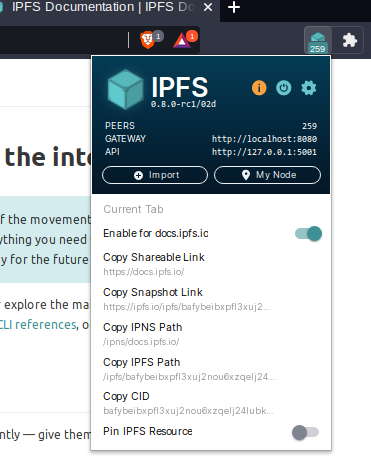
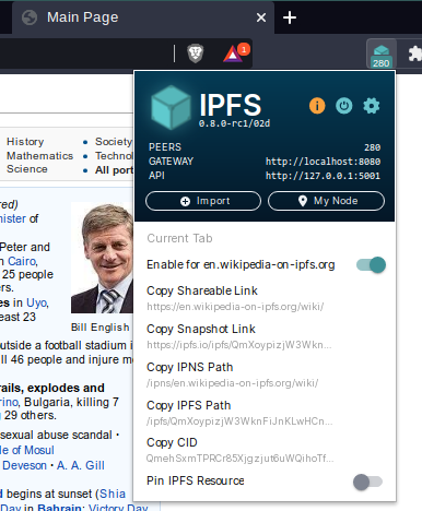
Domain cut off in popup (when UI is scaled to 75%)
Describe the bug I use my browser (brave) with a 75% scale in the settings. I noticed that the Domain in the Popup of the ipfs-companion-add-on get's slightly cut off at the end.
To Reproduce Steps to reproduce the behavior:
- Open the browser
- Go to the settings
- Select 75% scale
- Install the IPFS-Companion-Add-On
- Click on the Add-On-Icon
Expected behavior The scaling should not cut the labels in the popup.
Screenshots

Desktop (please complete the following information):
- OS: ArchLinux
- Browser: brave
- Version: Version 1.19.86 Chromium: 88.0.4324.96 (Official Build) unknown (64-bit)
This is a strange effect - it looks like Brave's overlay bar is what's cutting off the domain. Are there any other extensions you've got with their icons positioned on either side of the IPFS cube with dropdown menus that you could use to see if there's a similar impact on them? Just trying to confirm if the issue is with the Companion menu or something in Brave's overlay bar.
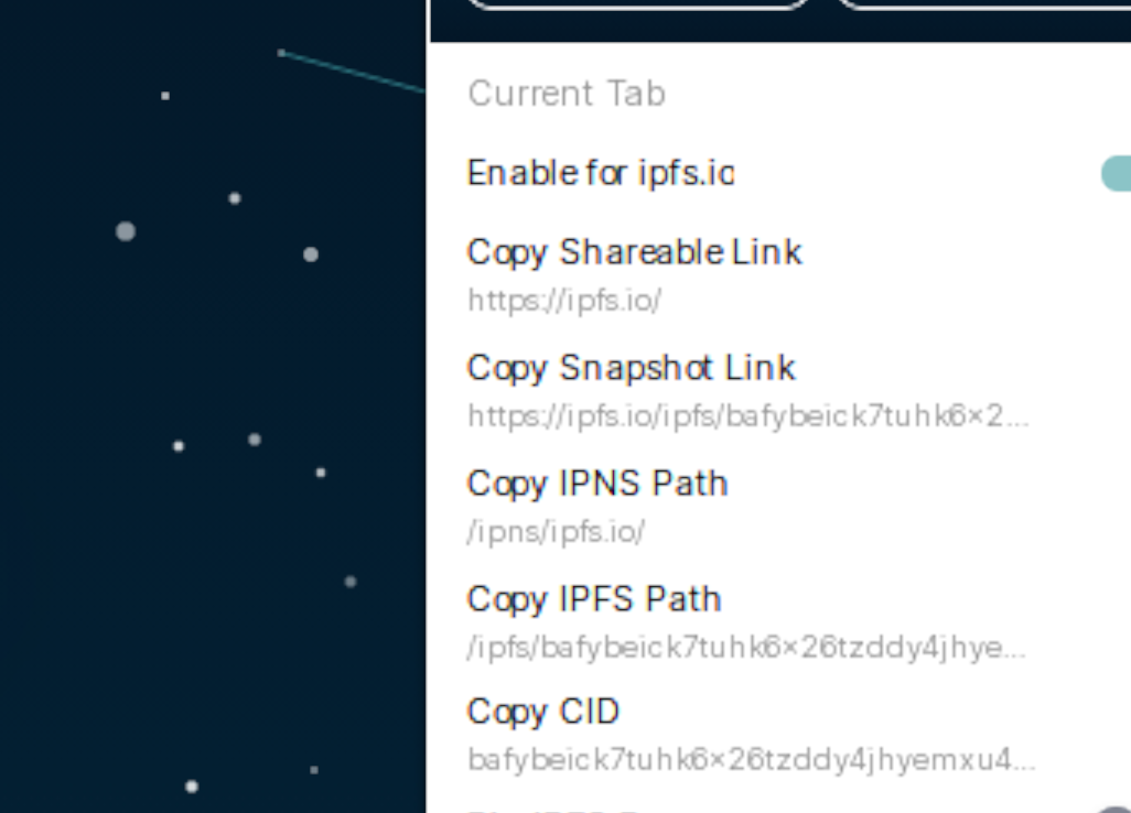
@jessicaschilling well, there's nothing above the window that is just "white", since the highlight effect is working properly.
It's also only affecting the site "ipfs.io" which is kind of ironic. So I guess there's something from the site overlaying it?
The ipfs.io site's background is also a bit strangely rendered since it's scaled-down while the rest of the page stays the same. Never minded - but might be related?
The plugin "Improve Youtube" is completely unaffected, while featuring a dialog in a similar place.
The ipfs.io site's background is also a bit strangely rendered since it's scaled-down while the rest of the page stays the same. Never minded - but might be related?
Just noticed, zooming the side works fine down from 100% as long as you down reload it. In this case, the background is wrongly rendered. Anyway - I think I understand where the bug comes from:
The font is scaled down by 75% and then up again to 100%. Since this is done without subpixel precision the o jumps a bit to the right and thus jumps beyond the size of the label.
When the popup is opened, the label looks normal and then jumps to the broken state as it does the scaling when the animation is completed.
When the animation runs:
When the animation is completed:
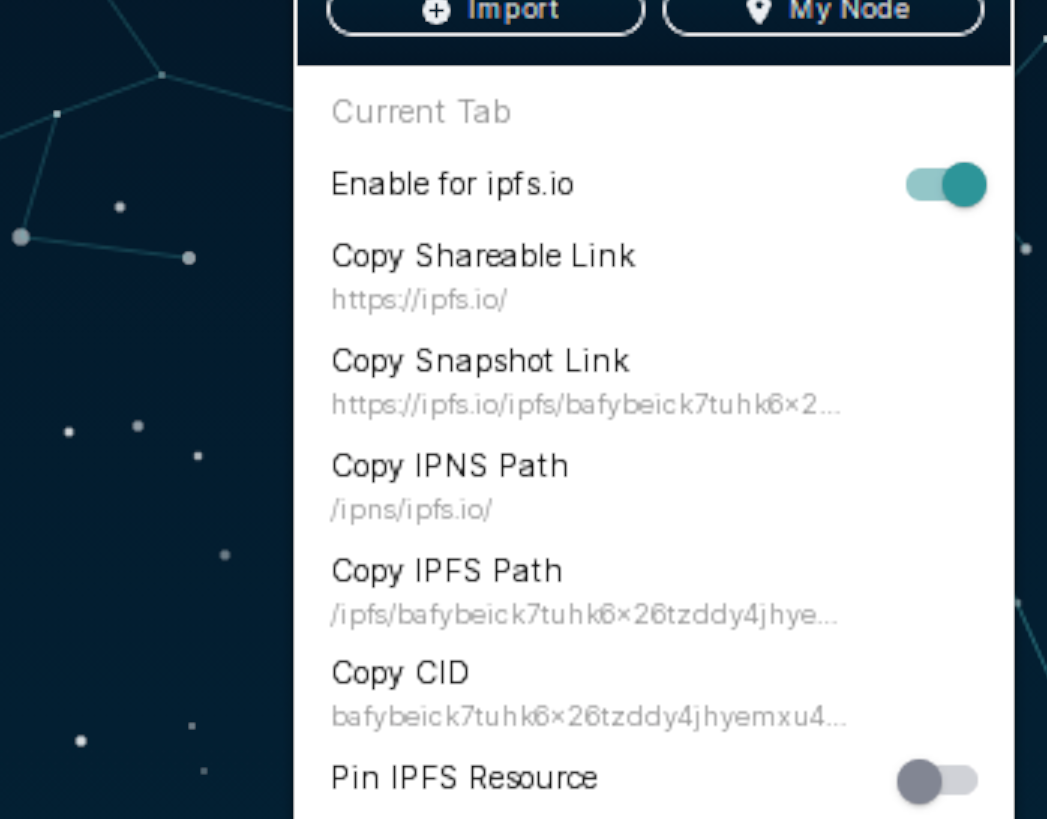
 Notice that all o's are jumped a bit to the right, that there's more color fringing, and the font looks 'steppy', because of the low resolution.
The subpixel hinting is just hiding it pretty well.
But even when the animation runs, there are some rendering bugs... look at "Shareable" with the weird "ae" and "Resource" with the weird "so" and "rce".
Maybe the font is pixel-based and just not made for those lower resolutions?
I've struggled to try to duplicate this locally, but I'm on a Mac, where fonts are a whole different game. This might be a Linux-specific issue with font rendering at percentage scaling, or a Chromium thing, or a Brave-specific thing ...
@RubenKelevra, maybe see if you can force similar behavior on another Chromium browser? @lidel, mind trying to duplicate this on Linux? (Any Linux flavor details from @RubenKelevra would be helpful here too.)
I suspect this is a deeper font issue than something specific to Companion, but it's worth trying to confirm/deny.
I can confirm that if I switch UI to be 75% globally (via Brave Settings) it renders like this on Linux:
| some have tiny cut-off | some ok |
|---|---|
 |
 |
I guess we could work around this via some padding, but this is pretty unusual niche setup on a niche platform, and we will most likely break it again in the future, because there is no test for avoiding regression.
@RubenKelevra my understanding is that this cosmetic issue only cuts off a few pixels of the TLD, sometimes. Are you able to provide example where UX is regressed enough to be worth special-handling? I am leaning towards closing this as nofix (due to custom setting).
Well true, my setting is somewhat unique, but I think it will become more common - since the displays get higher and higher in resolution, so people start to do scaling more often in both directions. Which could lead to this.
Since the font in the blue part is completly unaffected I wonder if we could just exchange the font?
A different option would be to just add a not-breaking-space ( in HTML) automatically to all text fields on the right side. Doesn't fix the weird look but it would fix the cut on the right (probably).
The fonts are intentionally chosen to match the brand overall, but we're planning a closer look at brand artifacts later this spring. I'd suggest tabling this until then.