Standardize Open Library's buttons
According to #1181 we don't style our edit icon. It should be a https://github.com/internetarchive/openlibrary/wiki/Design-Pattern-Library#buttonbtn rather than rely on the default browser styling.
That aside there is a much larger problem - we have many ways of rendering a button. They come in all sorts of colors and it's not clear when and where to use them and in some cases we probably shouldnt use them at all!
Sign off checklist
- [x] #9086
- [x] #9238
- [ ] One CSS base class name to rule them all! All buttons should use a class to show they are buttons and should use well documented modifiers to change their color
- [ ] it should be obvious which button to use for a given context.
- [ ] there should be less buttons. The status quo is confusing. Which is the most important button on the page?
- [ ] consider icons rather than colors - if all buttons were the same color could an icon inside the button convey meaning more strongly?
- [ ] buttons with similar styles should be merged e.g. ButtonBtn, ButtonGeneric and Book "book-cta" as well as ".borrow-btn, .read-btn, .wait-btn, .unwait-btn"
Impacted buttons (feel free to add others you find)
- [ ] search button on subject page
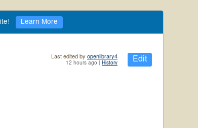
- [ ] Edit button
- [ ] Log in button on /account/login page
- [ ] Sign up button on /account/create page
- [ ] "Browse..." button on /account/import page
- [ ] "Save" button on book edit pages
- [ ] "Search" button on /lists page
- [ ] "Search" button on \advancedsearch page
- [ ] "Add" button on /books/add page
According to the description and #1158 is this what we'd like to achieve?
or that?

Provided @mekarpeles is okay yes (first screenshot). I think all buttons should be of that style going forward - either blue (primary) or white. Given this is a primary action, blue is appropriate.
sure to remove any other styles the button has that are not related.
@jdlrobson @Num170R Edit has traditionally been a ButtonSearch as opposed to ButtonBtn.
I'm weary of overloading ButtonBorrow / ButtonBtn (which should probably be merged) which represents a primary call to action.
I'm not opposed to us changing button colors, especially if we can achieve greater consistency, but as a first pass, I'd prefer us restore previous functionality and then discuss as community call topic.
Is everyone ammenable to that? If so @Num170R, I think "Edit", "Save", "Signup" etc should be the style which is currently called ButtonSearch -- maybe it should be called ButtonSubmit (other name suggestions welcome)
Similarly, and hopefully not overloading this ticket, but I believe ButtonGeneric is/was only used for the main website header "Sign Up" button
https://github.com/internetarchive/openlibrary/wiki/Design-Pattern-Library#buttongeneric
Again, I'm very open to this button changing, though the current ButtonBtn doesn't quite look balanced as is and my preference would be for us to use the original style until we've had a chance to discuss an alternate style on staging :)
Can you document ButtonSearch on the component style guide? Not 100% sure which one we are referring to and want to understand the differences.
Right now the edit button is not any kind of button other than default browser styling so it should be changed to something :)
Agreed that it would be good to discuss as a community topic!
Update: ignore. I see someone beat me to it :) it is documented on style guide.
Since this issue was retitled, it really should be an epic. Assigning jdlrobson (not tagging as requested) per slack discussions
edit: related issues - #1158, #1951