flutter-charts
 flutter-charts copied to clipboard
 infinum
Customizable charts library for flutter.
Charts painter 
Idea behind this lib is to allow highly customizable charts. By having decorations as Widgets (foreground and background) and item renderers that can be updated with how and where they draw items.
Customizing and adding new decorations and items will require some RenderObject knowledge.
Table of Contents
- Showcase
- Usage
- Drawing charts
- Basic
- Bar chart
- Line chart
- Multi chart
- More examples
- Golden files
Showcase
Example charts that can easily be built.
Usage
Add it to your package's pubspec.yaml file
dependencies:
  charts_painter: ^2.0.0+2
Install packages from the command line
flutter packages get
Chart data
Chart data has some options that will change how the data will be processed.
By changing axisMin or axisMax scale of the chart will change in order to show that value, in case data has higher/lower data than axisMax/axisMin, then this option is ignored.
Adding valueAxisMaxOver will add that value to currently the highest value.
Data strategy
Data strategy can manipulate data before being drawn, in case you want to stack data you can pass StackDataStrategy. Strategy only affects how multiple lists are being processed, to change how multi list items can be drawn see ChartBehaviour.multiItemStack
Chart behaviour
Sets chart behaviour and interaction like onClick and isScrollable can be set here
Item options
Options that set how it draws each item and how it looks.
When using BarItemOptions or BubbleItemOptions geometry painters have been preset, and they include some extra options for their painters.
Geometry items
What are geometry items?
Geometry items are RenderObjects that are responsible for drawing each item on the canvas.
Included in the lib are 2 GeometryPainters's.
| Bar painter (default) | Bubble painter |
|---|---|
 |
 |
 |
Decoration
We use Decorations to enhance our charts. Chart decorations can be painted in the background or in a foreground of the items. Everything that is not chart item is a decoration. See all decorations
Here are decorations we have included, bar items with opacity have been added for better visibility.
 Horizontal decoration
 Vertical decoration
 Grid decoration
 Target line decoration
 Target line text decoration
 Target area decoration
 Value decoration
 Selected item decoration
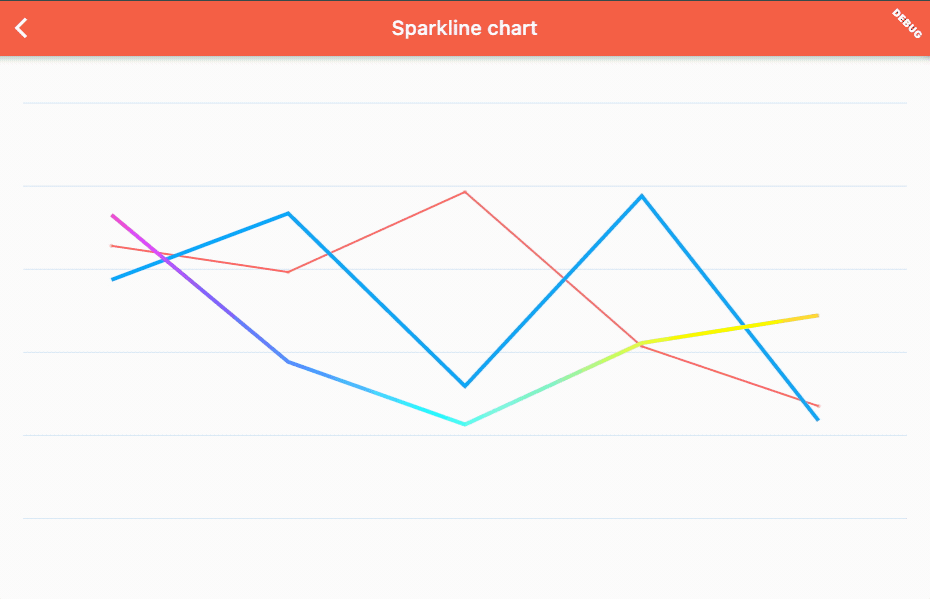
 Sparkline decoration
 Border decoration
Drawing charts
Now you are ready to use charts lib. If chart needs to animate the state changes then use AnimatedChart<T> widget instead of Chart<T> widget.
AnimatedChart<T> needs to specify Duration and it can accept Curve for animation.
Basic charts
By passing ChartState.line or ChartState.bar to Chart widget we will add appropriate decorations for the selected chart.
@override
Widget build(BuildContext context) {
  return Chart(
    state: ChartState.line(
      ChartData.fromList(
        <double>[1, 3, 4, 2, 7, 6, 2, 5, 4].map((e) => BubbleValue<void>(e)).toList(),
      ),
    ),
  );
}

By charging ChartState.line to ChartState.bar we can change look of the chart.
@override
Widget build(BuildContext context) {
  return Chart(
    state: ChartState.bar(
      ChartData.fromList(
        <double>[1, 3, 4, 2, 7, 6, 2, 5, 4].map((e) => BarValue<void>(e)).toList(),
      ),
    ),
  );
}

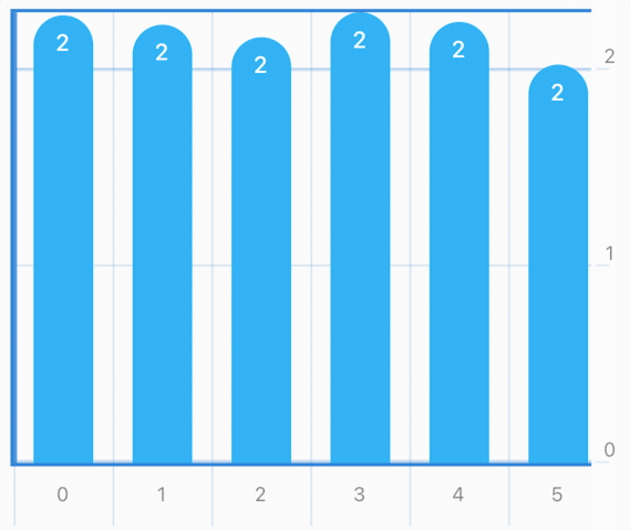
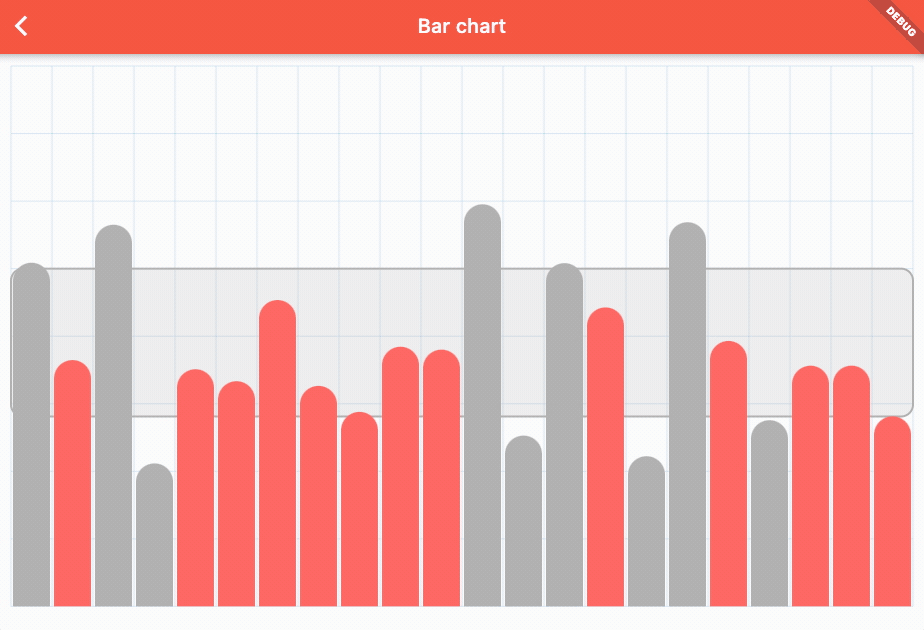
Bar chart
This is how you can start, this is simple bar chart with grid decoration:
  @override
  Widget build(BuildContext context) {
    return Padding(
      padding: const EdgeInsets.all(8.0),
      child: Chart<void>(
        height: 600.0,
        state: ChartState(
          ChartData.fromList(
            [1, 3, 4, 2, 7, 6, 2, 5, 4].map((e) => BarValue<void>(e.toDouble())).toList(),
            axisMax: 8.0,
          ),
          itemOptions: BarItemOptions(
            padding: const EdgeInsets.symmetric(horizontal: 8.0),
            radius: BorderRadius.vertical(top: Radius.circular(42.0)),
          ),
          backgroundDecorations: [
            GridDecoration(
              verticalAxisStep: 1,
              horizontalAxisStep: 1,
            ),
          ],
          foregroundDecorations: [
            BorderDecoration(borderWidth: 5.0),
          ],
        ),
      ),
    );
  }
Code above will draw this:

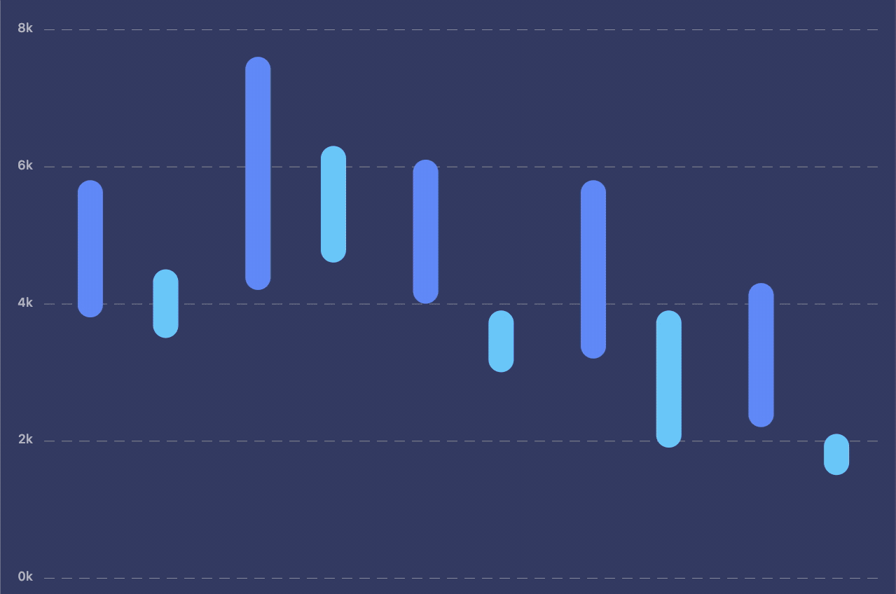
Line Chart
To turn any chart to line chart we just need to add SparklineDecoration to foregroundDecorations or backgroundDecorations. This will add decoration line on top/bottom of the chart.
By replacing the BarValue to BubbleValue and changing geometryPainter to bubblePainter we can show nicer line chart with small bubbles on data points:
  @override
  Widget build(BuildContext context) {
    return Padding(
      padding: const EdgeInsets.all(8.0),
      child: Chart<void>(
        height: 600.0,
        state: ChartState(
          ChartData.fromList(
            /// CHANGE: Change [BarValue<void>] to [BubbleValue<void>]
            [1, 3, 4, 2, 7, 6, 2, 5, 4].map((e) => BubbleValue<void>(e.toDouble())).toList(),
            axisMax: 8.0,
          ),
          /// CHANGE: From [BarItemOptions] to [BubbleItemOptions]
          itemOptions: BubbleItemOptions(
            padding: const EdgeInsets.symmetric(horizontal: 8.0),
            /// REMOVED: Radius doesn't exist in [BubbleItemOptions]
            // radius: BorderRadius.vertical(top: Radius.circular(12.0)),

            /// ADDED: Make [BubbleValue] items smaller
            maxBarWidth: 4.0,
          ),
          backgroundDecorations: [
            GridDecoration(
              verticalAxisStep: 1,
              horizontalAxisStep: 1,
            ),
          ],
          foregroundDecorations: [
            BorderDecoration(borderWidth: 5.0),

            /// ADDED: Add spark line decoration ([SparkLineDecoration]) on foreground
            SparkLineDecoration(),
          ],
        ),
      ),
    );
  }
Code above will make our nicer line graph:

Multi Chart
Charts can have multiple values that are grouped.
To turn any chart to multi value we need to use ChartState instead of ChartState.fromList constructor. Default constructor will accept List<List<ChartItem<T>> allowing us to pass multiple lists to same chart.
  @override
  Widget build(BuildContext context) {
    return Padding(
      padding: const EdgeInsets.all(8.0),
      child: Chart<void>(
        height: 600.0,
        state: ChartState(
          /// CHANGE: From [ChartData.fromList] to [ChartData]
          ChartData(
            /// CHANGE: Add list we had into bigger List
            [
              [1, 3, 4, 2, 7, 6, 2, 5, 4].map((e) => BubbleValue<void>(e.toDouble())).toList(),

              /// ADD: Another list
              [4, 6, 3, 3, 2, 1, 4, 7, 5].map((e) => BubbleValue<void>(e.toDouble())).toList(),
            ],
            axisMax: 8.0,
          ),
          itemOptions: BubbleItemOptions(
            padding: const EdgeInsets.symmetric(horizontal: 8.0),
            maxBarWidth: 4.0,

            /// ADDED: Color bubbles differently depending on List they came from. [ColorForIndex]
            colorForKey: (item, index) {
              return [Colors.red, Colors.blue][index];
            },
          ),
          backgroundDecorations: [
            GridDecoration(
              verticalAxisStep: 1,
              horizontalAxisStep: 1,
            ),
          ],
          foregroundDecorations: [
            BorderDecoration(borderWidth: 5.0),

            /// ADDED: Add another [SparkLineDecoration] for the second list
            SparkLineDecoration(
              // Specify key that this [SparkLineDecoration] will follow
              // Throws if `lineKey` does not exist in chart data
              lineArrayIndex: 1,
              lineColor: Colors.blue,
            ),
            SparkLineDecoration(),
          ],
        ),
      ),
    );
  }
Code above will make this multi line graph:

Scrollable chart
Charts can also be scrollable, to use scroll first you have to wrap chart your chart in SingleChildScrollView widget. Then in ChartBehaviuor make sure you set isScrollable to true.
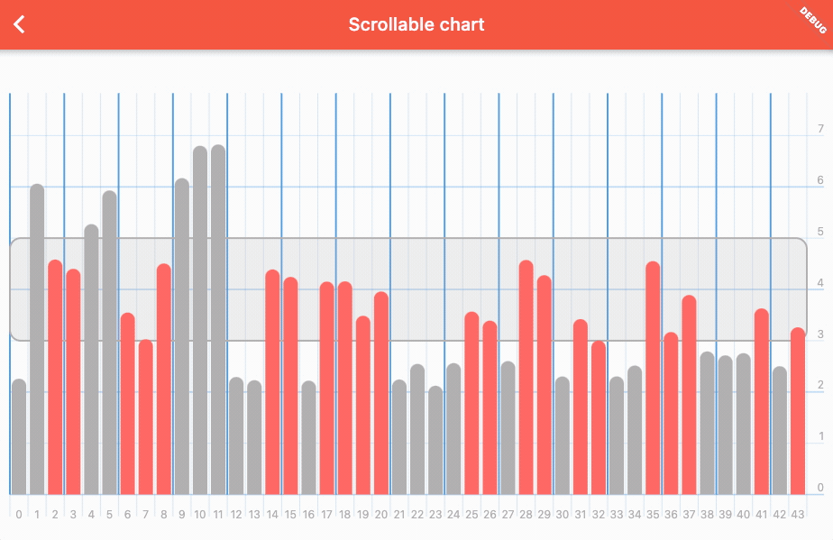
To make sure you can make any chart you want, we have included DecorationsRenderer as widget that you can use outside of the chart bounds. That is useful for fixed legends:
To make fixed decorations you will have to make these changes to your chart:
final _chartState = ChartState(
  ChartData.fromList([1, 2, 3, 4, 5, 3, 2, 2].map((e) => BarValue<void>(e.toDouble())).toList()),
  behaviour: ChartBehaviour(
    // 1) Make sure the chart can scroll
    isScrollable: true,
  ),
  backgroundDecorations: [
    HorizontalAxisDecoration(
      endWithChart: false,
      lineWidth: 1.0,
      axisStep: 1,
      lineColor: Theme.of(context).colorScheme.primaryVariant.withOpacity(0.2),
    ),
  ],
);

/// .....Somewhere in build method.....
// 2) Wrap Chart in Row widget
Row(
  children: [
    Expanded(
      // 3) Wrap chart in `SingleChildScrollView`
      child: SingleChildScrollView(
        scrollDirection: Axis.horizontal,
        child: Chart(
          width: MediaQuery.of(context).size.width,
          // Make sure height for the chart and fixed decoration are the same
          height: MediaQuery.of(context).size.height * 0.4,
          state: _chartState,
        ),
      ),
    ),
    // 4) Add fixed decoration at the end of scroll view
    Container(
      color: Colors.white,
      width: 14.0,
      // Make sure height for the fixed decoration and chart are the same
      height: MediaQuery.of(context).size.height * 0.4,
      // 5) Use `DecorationsRenderer` to render fixed decoration
      child: DecorationsRenderer(
        [
          HorizontalAxisDecoration(
            lineWidth: 1.0,
            axisStep: 1,
            showValues: true,
            legendFontStyle: Theme.of(context).textTheme.caption,
            valuesAlign: TextAlign.center,
            lineColor: Theme.of(context).colorScheme.primaryVariant.withOpacity(0.2),
          )
        ],
        // Must pass same state, this is used to calculate spacings and padding of decoration, to make sure it matches the chart.
        _chartState,
      ),
    )
  ],
);
More examples
Line charts
Line chart with multiple values example code
Bar charts
Bar chart with area example code
Scrollable chart
Scrollable bar chart example code
 infinum