wpt.fyi
 wpt.fyi copied to clipboard
Improve gridline ticks on Interop 2022
https://staging.wpt.fyi/interop-2022's graphs look not great currently:
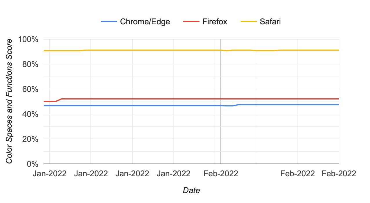
Having "Jan-2022 Jan-2022 Jan-2022 Jan-2022 Feb-2022 Feb-2022 Feb-2022" as ticks is very… not helpful.
https://developers.google.com/chart/interactive/docs/datesandtimes#formatting-axis,-gridline,-and-tick-labels makes it sound like we probably want something like:
          gridlines: {
            count: -1,
            units: {
              months: {format: ['MMM-YYYY']},
              days: {format: ['dd-MMM-YYYY']},
            }
          },
@gsnedders this is what I see on https://staging.wpt.fyi/interop-2022?feature=interop-2022-color in Safari right now:
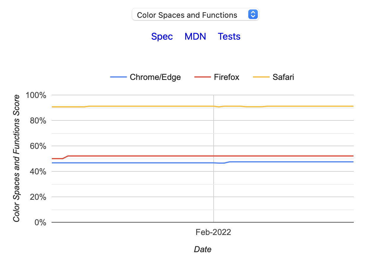
I would call that "not great" as well, but it doesn't match your screenshot. Can you reproduce this right now, and with what browser? Chrome, Firefox and Safari all look the same to me.
@gsnedders I see, you zoomed in on part of the graph. That does result in something pretty silly.
@gsnedders did you try your suggestion locally? I tried it and a bunch of variations, but didn't arrive at something I thought really fixes the problem well.
This has been addressed with the Interop 2023 UI design. Is it safe to say we can close this issue?