rc-dock
 rc-dock copied to clipboard
Published
20 hours ago •
 ticlo
ticlo
ticlo
Dock Layout for React Component
Dock Layout for React Component
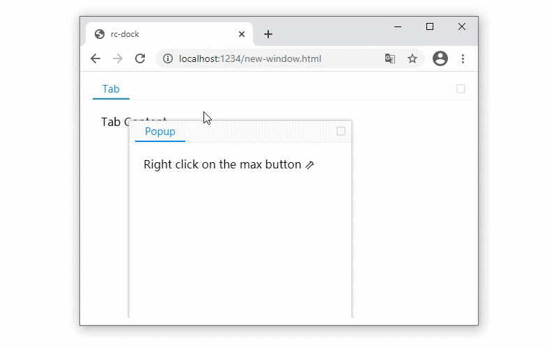
Popup panel as new browser window
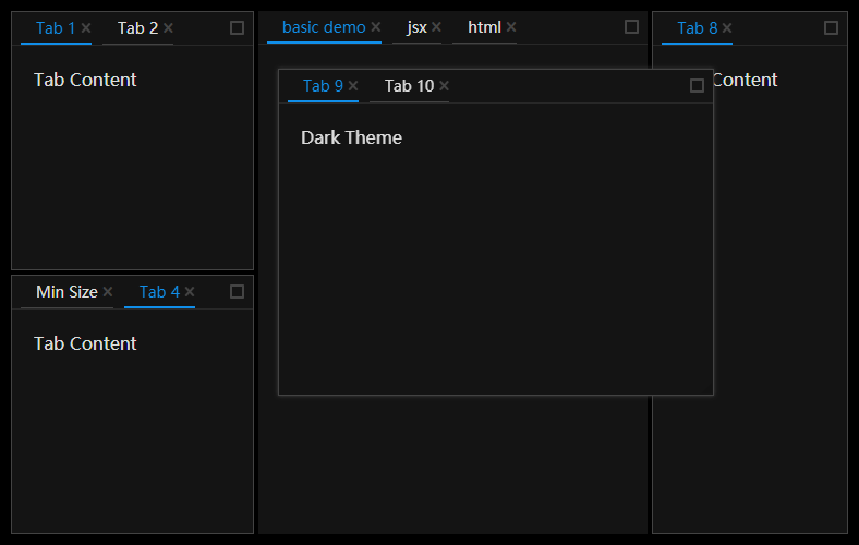
Dark Theme
- Examples: https://ticlo.github.io/rc-dock/examples
- Docs: https://ticlo.github.io/rc-dock
- Discord:

Usage
import DockLayout from 'rc-dock'
import "rc-dock/dist/rc-dock.css";

...

defaultLayout = {
  dockbox: {
    mode: 'horizontal',
    children: [
      {
        tabs: [
          {id: 'tab1', title: 'tab1', content: <div>Hello World</div>}
        ]
      }
    ]
  }
};

render() {
  return (
    <DockLayout
      defaultLayout={defaultLayout}
      style={{
        position: "absolute",
        left: 10,
        top: 10,
        right: 10,
        bottom: 10,
      }}
    />
  )
}
- use as uncontrolled layout
- set layout object in DockLayout.defaultLayout
- use as controlled layout
- set layout object in DockLayout.layout
types
LayoutData 🗎
| Property | Type | Comments | Default |
|---|---|---|---|
| dockbox | BoxData | main dock box | empty BoxData |
| floatbox | BoxData | main float box, children can only be PanelData | empty BoxData |
BoxData 🗎
a box is the layout element that contains other boxes or panels
| Property | Type | Comments | Default |
|---|---|---|---|
| mode | 'horizontal' | 'vertical' | 'float' | layout mode of the box | |
| children | (BoxData | PanelData)[] | children boxes or panels | required |
PanelData 🗎
a panel is a visiaul container with tabs button in the title bar
| Property | Type | Comments | Default |
|---|---|---|---|
| tabs | TabData[] | children tabs | required |
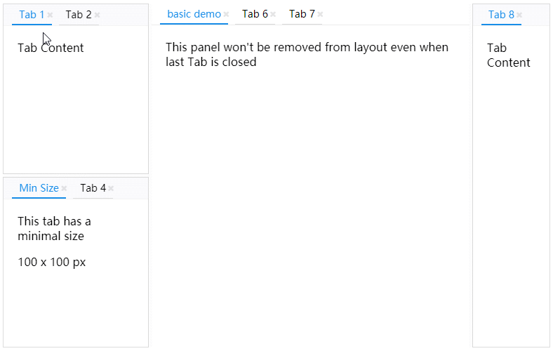
| panelLock | PanelLock | addition information of a panel, this prevents the panel from being removed when there is no tab inside, a locked panel can not be moved to float layer either |
TabData 🗎
| Property | Type | Comments | Default |
|---|---|---|---|
| id | string | unique id | required |
| title | string | ReactElement | tab title | required |
| content | ReactElement | (tab: TabData) => ReactElement | tab content | required |
| closable | bool | whether tab can be closed | false |
| group | string | tabs with different tab group can not be put in same panel, more options for the group can be defined as TabGroup in DefaultLayout.groups |
DockLayout API
get the ref of the DockLayout component to use the following API
saveLayout 🗎
save layout
saveLayout(): SavedLayout
loadLayout 🗎
load layout
loadLayout(savedLayout: SavedLayout): void
dockMove 🗎
move a tab or a panel, if source is already in the layout, you can use the find method to get it with id first
dockMove(source: TabData | PanelData, target: string | TabData | PanelData | BoxData, direction: DropDirection): void;
find 🗎
find PanelData or TabData by id
find(id: string): PanelData | TabData;
updateTab 🗎
update a tab with new TabData
returns false if the tab is not found
updateTab(id: string, newTab: TabData): boolean;
 ticlo
ticlo