thunderbird-android
 thunderbird-android copied to clipboard
 thunderbird
Make message header more consistent
I find the message header view a very busy layout because of its inconsistency. There are currently dozens of different
- alignments,
- font sizes,
- font colors,
- spacings,
- and font weights,
all mixed together. This PR is a rather small change that does not impact the displayed information. It just makes the layout a little more consistent. In my opinion, this looks more modern and also easier on the eye.
Before/After:
Most of the diff comes from removing a LinearLayout and changing the indention of all children.
I feel concerned about the removal of line separating header and content due to The Line of Death. I worry this may increase risks of phishing (although, granted, K-9 Mail already doesn't really enforce the trusted line completely by having the "Download images" button and stuff outside of that line).
Aside from that I have no real preference one way or the other about this.
I agree that the message view layout should be changed. However, it needs a lot more changes than this.
I'd like us to come up with a new design incorporating all necessary changes first. So that we don't make changes to such an important screen in multiple successive major releases.
Do you mean something like the design in #1859? I think this PR looks kind of similar to that concept. Maybe the toolbar could be "expanded", so that all the header info also has the grey background.
Together with that ugly "show images" button, the cluttered message headers are currently kind of my biggest pain point in K-9, so I would love to improve them :)
Second attempt, more inspired by the mock-ups (and by the line of death that @TheLastProject mentioned)
Before/After:
@Alecaddd we need to look at this and what we should do with the message header. @cketti can add some insight about future plans.
Thank you @ByteHamster for this PR, we'll provide some insight here soon.
I've started writing down what a message view redesign needs to consider in this issue:
- #6198
@ryanleesipes Not yet. Had a long day at work and am now working on clearing my AntennaPod inbox. I will create the branch and update the header tomorrow if I have time.
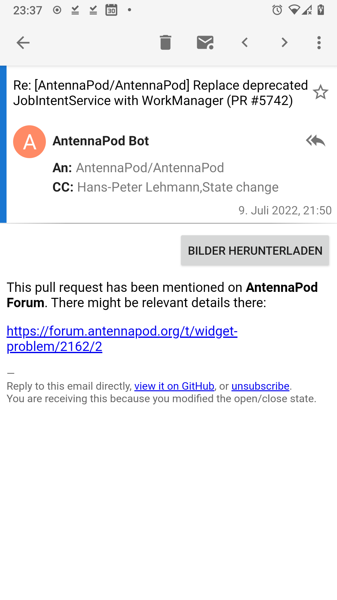
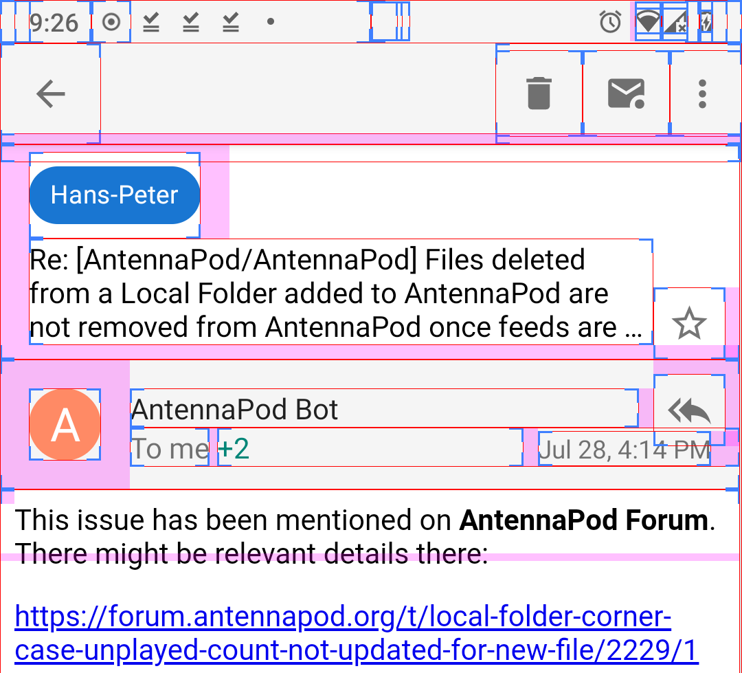
Is the screenshot in the OP the current proposal now? I have to say that this is really confusing to me. What is that Hans-Peter Badge doing up there? (That's in CC in the original message... but now it's a badge on top?)
The To: me + 2 line also seems like a downgrade conveying way less information that before. Which address is me in this case? Or even if that wasn't shown in the original version either, that at least showed the name/address the sender sent this email to. I never know what me is supposed to stand for in email services that do this. :-/
Also it doesn't show the additional CC targets anymore? Are they expandable on click now?
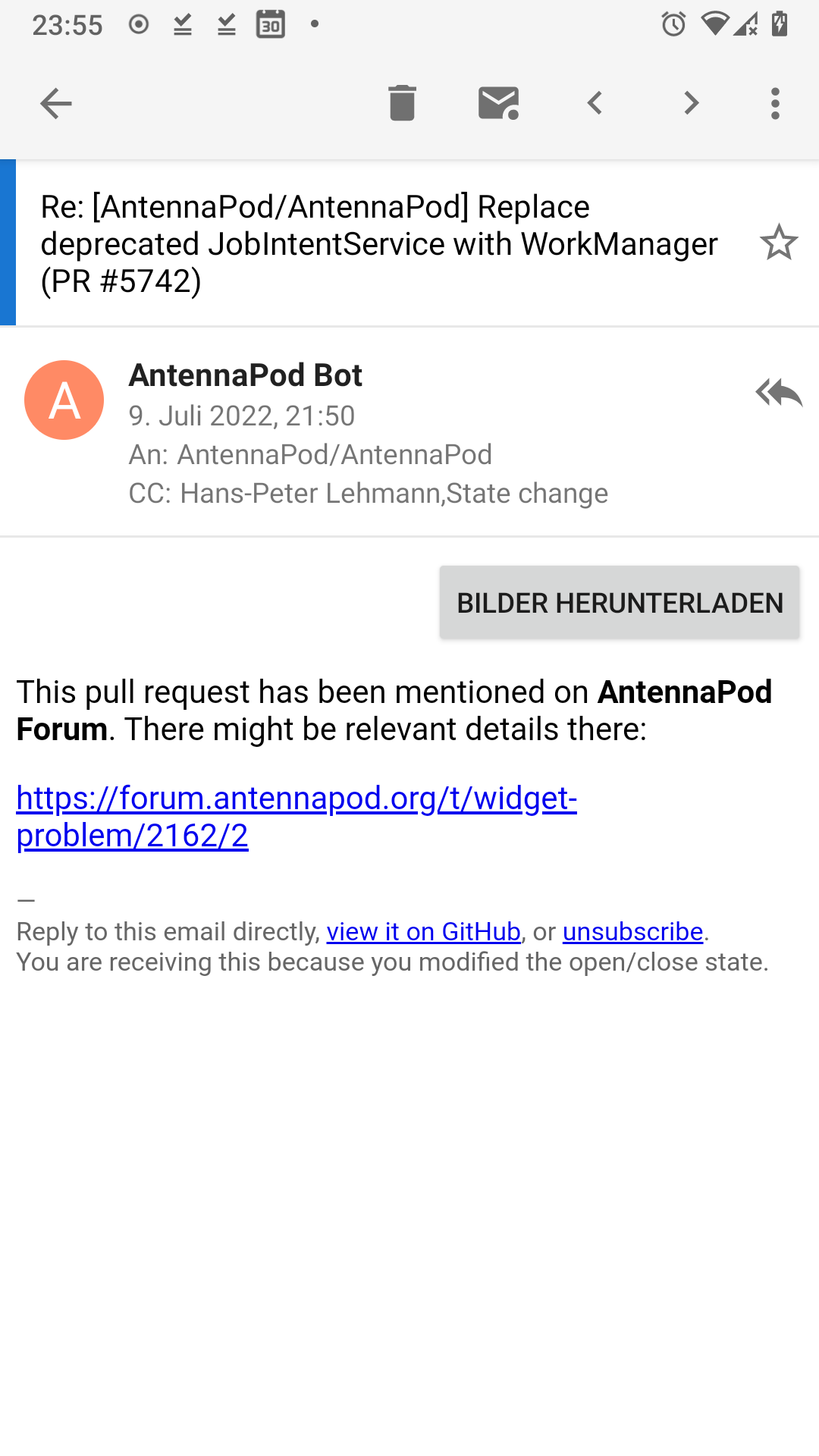
Is the screenshot in the OP the current proposal now?
Yes. (Not finished yet, but looks more or less like it will look)
What is that Hans-Peter Badge doing up there?
That's the account name. It is hidden when you only have one account.
The To: me + 2 line also seems like a downgrade conveying way less information that before.
That was done on purpose to reduce the screen clutter
Which address is me in this case? Or even if that wasn't shown in the original version either, that at least showed the name/address the sender sent this email to.
I don't remember exactly what we decided on but I think if you are just CC'ed, it shows the receiver
Also it doesn't show the additional CC targets anymore? Are they expandable on click now?
Yes, they will be expandable on click. (Not in this PR yet, but definitely before releasing it).
Which address is me in this case? Or even if that wasn't shown in the original version either, that at least showed the name/address the sender sent this email to.
I don't remember exactly what we decided on but I think if you are just CC'ed, it shows the receiver
I was actually wondering about something slightly different.
I've read the implementation and tried out the branch now, this part might not be finished yet though. But currently it just always show "to: me" regardless of the actual receiver of the email? I get a lot of emails in my inbox that aren't actually addressed to me. Via aliases, redirects, mailing lists or moved from different accounts they are addressed to various addresses that don't match the address of the account that belongs to the inbox. Thunderbird also does the "me" thing but a) only for the exact email that matches the one configured in the account and b) it still shows the receivers mail address if you don't have a contact for it created. I.e. Me <[email protected]>. For the rest it still shows the recipient as specified by the sender.
(Oh and also I just found out how to disable this behaviour in TB (woo!): https://support.mozilla.org/en-US/questions/1372477)
If the last screenshot continue to be relevant, I have a small input, the vertical blue line should be round on the corner to follow the home page
@Octoton I updated the screenshot in the first post. That's the one that is relevant now. The blue line was replaced with a blue chip.
And why not keep the "show image button" inside the header part to slim it done/make it more fresh (this button and the reply icon are part of the reason the header look so old), something like what you show in the middle of the page:
And why not keep the "show image button" inside the header part to slim it done/make it more fresh (this button and the reply icon are part of the reason the header look so old), something like what you show in the middle of the page:
@Octoton we have been discussing moving that button so that it isn't confused with mail content. Somewhere in the header might be good, like you proposed.
This will be quite substantial in terms of changed lines. That's why the work will be done in a separate branch. We can make smaller changes and leave the branch in a state where the message view isn't 100% functional. We won't ship the changed message view (even in beta versions) until it is functionally complete again.
For this first step I suggest to concentrate on the base layout change and ignore all (display) logic changes. So using a hard-coded "to me" or a placeholder date is preferable for now. That should make the individual pull requests easier to review and will also make it easier to read the Git history in the future.
@ByteHamster: When you temporarily disable/remove functionality can you please create new issues and add them to the Message View Redesign milestone so we don't forget about adding the functionality back later.
I suggest to concentrate on the base layout change and ignore all (display) logic changes
Okay, reverted.
When you temporarily disable/remove functionality can you please create new issues
Not sure if it is worth adding an issue for all those things, given that most of them will be addressed directly after merging this. Will create issues for the remaining things when the basic/easy things are merged. To not forget them, here is a list of things I removed.
- Show Sender, To, CC, BCC in popup dialog
- Restore adding contact to address book
- Re-add copying address
- Show To in header
- Show "answered" icon
- Show "forwarded" icon
- Restore crypto click
- Add content description to message star
- Get the +1 text right when receiver name is long
I think I'm ready for a first review. Note that the layout is quite complex because we want to make the star/reply icons 40dp large to be an easy touch target, but also visually make it look like it is only as high as the text (~24dp). See layout bounds below.
- The left margin of the subject is 16dp, but the right margin of the star icon is only 8dp, because the other 8dp are used as padding for a larger touch target. So even though it looks asymmetric with layout bounds enabled (and in Android Studio's preview), the visual result is symmetric.
- I made the star icon an ImageView instead of a CheckBox, because the
android:buttonof a CheckBox is not aligned in the center when using paddings (which we need for the touch target).
Side note: I updated issue #6198 with drafts of the new design and many of the things we talked about in our design sessions. If you're following this work and are curious about the direction of the message view screen, you might want to have a look.
@ByteHamster:
I love the screenshot containing layout bounds :heart:
I think it would be less messy and more flexible to use ConstraintLayout.
Can you add an item for the overflow menu? We should make sure it aligns with the overflow button in the toolbar.
The reply action button and the date are too close together. We'll have to do something about that.
In general I think touch areas for buttons at the edge of an area should extend all the way to the edge. Nothing is more annoying than accidentally hitting the area between the button and the edge of the area when you've meant to hit the button. Especially if that area also has a touch/click handler.
The contact image could probably be a bit larger.
I think it would be less messy and more flexible to use ConstraintLayout.
How? I changed it to ConstraintLayout but it is exactly as messy as before. Each view is still aligned left and top depending on another view, just like before, only using another attribute name.
The reply action button and the date are too close together. We'll have to do something about that. The contact image could probably be a bit larger.
Done. By making the image larger, we have more space that we can put between the two test lines (and therefore between text and icon)
Can you add an item for the overflow menu? We should make sure it aligns with the overflow button in the toolbar.
Done. To be honest, I would rather align the overflow menu with the star icon above, not with the other overflow menu, because it is closer to that one. Aligning it with the overflow icon on top looks weird (see screenshot).
In general I think touch areas for buttons at the edge of an area should extend all the way to the edge.
Wouldn't that make the ripple effect asymmetric as well? Not sure if that looks good.
This is still missing one thing that I don't think is possible directly in the layout (even with ConstraintLayout). When the "To" text gets very long, we want the layout to grow, but only until the "+1" text touches the date - not more. I think we can currently either constraint the width of the "to" text to the available width (then the "+1" text is always right-aligned) or we can add the "+1" text to the same "to" layout (then the "+1" is removed by the ellipsis). Any ideas?
This is still missing one thing that I don't think is possible directly in the layout (even with ConstraintLayout). When the "To" text gets very long, we want the layout to grow, but only until the "+1" text touches the date - not more. I think we can currently either constraint the width of the "to" text to the available width (then the "+1" text is always right-aligned) or we can add the "+1" text to the same "to" layout (then the "+1" is removed by the ellipsis). Any ideas?
You can use app:layout_constrainedWidth="true" on @+id/to.
In general I think touch areas for buttons at the edge of an area should extend all the way to the edge.
Wouldn't that make the ripple effect asymmetric as well? Not sure if that looks good.
We can limit the size of the ripple by using android:background="?attr/controlBackground" instead of android:background="?selectableItemBackgroundBorderless". I believe that's what is also used in the toolbar.
Can you add an item for the overflow menu? We should make sure it aligns with the overflow button in the toolbar.
Done. To be honest, I would rather align the overflow menu with the star icon above, not with the other overflow menu, because it is closer to that one. Aligning it with the overflow icon on top looks weird (see screenshot).
Aligning everything to the center of the overflow icon in the toolbar looks quite nice. You should get an idea of how it looks like here:
In the screenshot the icons don't align perfectly. Right now part of the viewpager decoration is showing on the right edge of the screen. I will look into how to get rid of that.
In my opinion the proposed layout is not well balanced regarding focus points. It begins with difficulties identifying where the mail subject line is and to tell it apart from the bold sender full-name.
The eye first focusses on the blue bubble tag (what is it? a label/tag, a folder, an account?). Then the bar with the gray background attracts the eye as a completely new area. The circle with sender initials comes into focus, then the bold text beside it catches attention, possibly expecting the subject line there.
I don't think you can simply blame it on being accustomed to a certain layout or not. While I think you can indeed get accustomed to the layout proposed, I don't believe it is as intuitive as it should be.
@xax: Your comment would be much more valuable if you had included concrete suggestions on how to improve the design.
@ByteHamster: I rebased and cleaned up these changes and created a new PR: #6303
@xax: Your comment would be much more valuable if you had included concrete suggestions on how to improve the design.
It requires different talent™ to assess usability/UX of a graphical interface versus to design/imagine/invent a perfect UX/UI. So while you are right stating the obvious, I have to excuse myself not being overly constructive. ;)
Reserving white background for the mail content could perhaps be a first step to unclutter the visual impression…
Regarding your point about the bubble tag: It is the account name and only displayed if you have multiple accounts. Just a few minutes ago, we discussed making it less prominent, so that it does not catch the eye immediately.
Updated design mock-up from #6198:
