thunderbird-android
 thunderbird-android copied to clipboard
Show small line next to attachment button
Apparently, people have difficulties with the attachment box. This adds a small line to separate the two buttons. While I was at it, I changed the corners to be a bit more round.
https://forum.k9mail.app/t/default-folder-for-attachments/3931 https://forum.k9mail.app/t/concerning-attachments-embedded-media/359
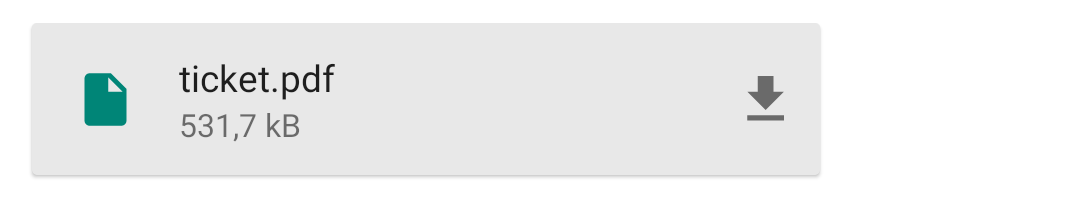
Before:
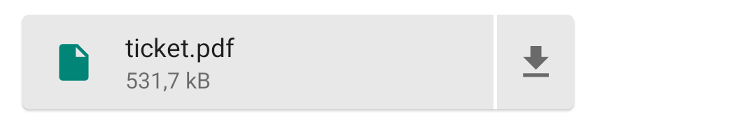
After:
This change breaks the UI when image previews are displayed.
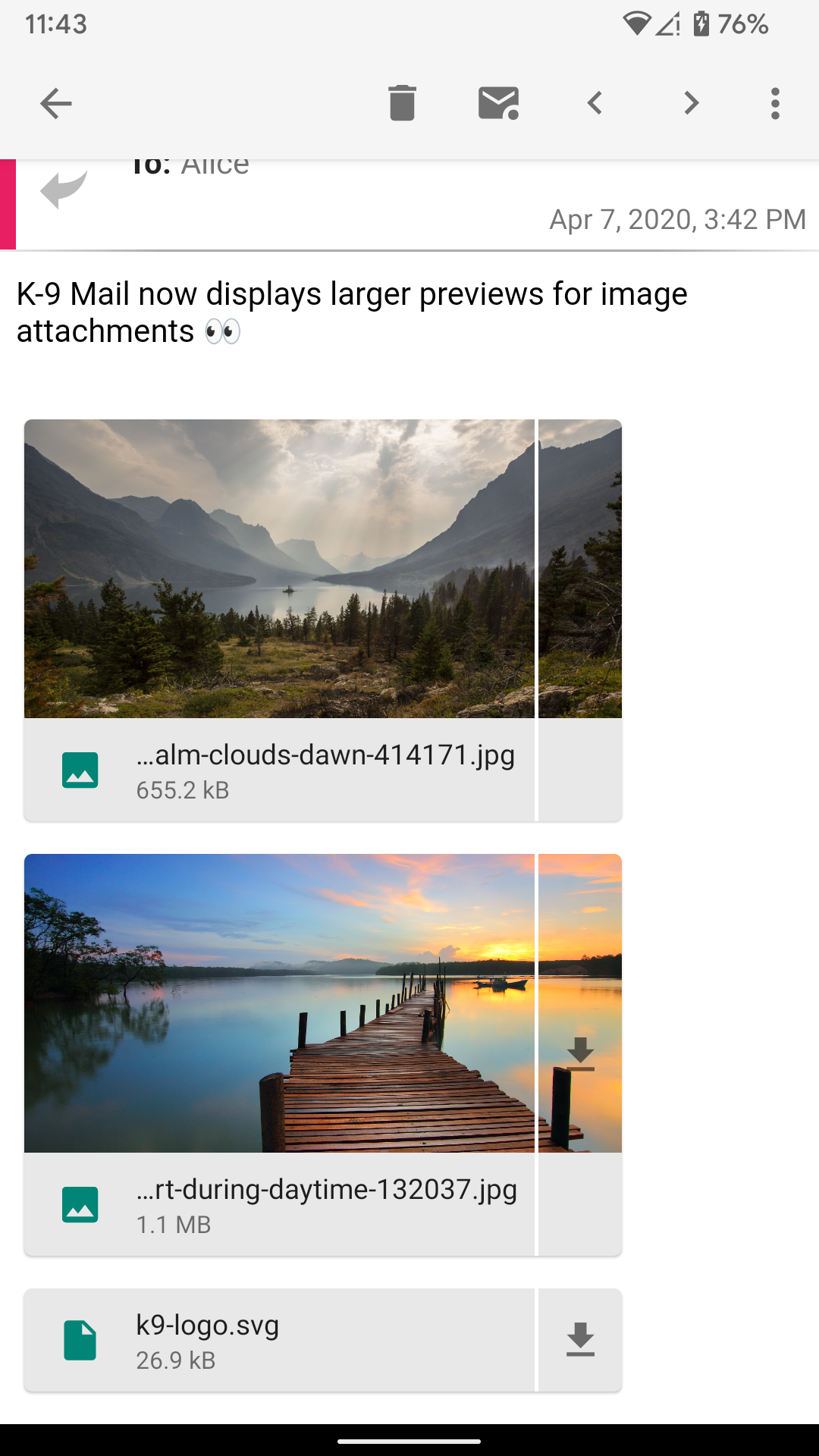
From a design standpoint, I don't think slicing the surface apart works very well given that the attachment box can include an image preview. And if we really wanted to do that, we probably can't use CardView. There's still a shadow spanning the whole width.
We could add a (gray) divider that doesn't stretch all the way to the top and bottom of the card.
But I'm not convinced adding a divider would fix the problem. From the experience with Android's notification settings, you know that some people still won't realize that there's two different tap areas.
"Downsides" of adding a separator:
- More padding required. Where we previously only needed padding between the text and the save icon we now need padding between the text and the divider and between the divider and the save icon.
- When there's a divider, the pressed state of the card probably shouldn't change the background of the save button. This might be tricky to implement (when there's an image preview).
What might help and is very low effort, is to make the save button look more like regular text buttons do, i.e. change the color to black (when using the light theme).
Another thing we could do is replace the save button with a "three dots" button that will display a popup menu containing a "save" option. It could also include an "open" and "share" (see #5913) action.
From the experience with Android's notification settings, you know that some people still won't realize that there's two different tap areas.
I think it might work better here, though. On the settings screen, people are used to the fact that clicking anywhere on a row toggles the switch. Here, it isn't a "standard" UI element. Making the divider white makes it more clear, though, because it looks like two independent buttons.
What might help and is very low effort, is to make the save button look more like regular text buttons do, i.e. change the color to black (when using the light theme).
So the only change would be the icon color? I highly doubt that this would help, to be honest.
Another thing we could do is replace the save button with a "three dots" button that will display a popup menu containing a "save" option.
Hmm, my feeling would be that many users still wouldn't get that but it sounds better than just changing the color. Maybe long-pressing to show the menu (in addition to the "three dots") could make it a bit better, too.
I still think that a white divider that clearly makes it two buttons would work best but if you like the popup more, I can also give that a try.