scale
 scale copied to clipboard
 telekom
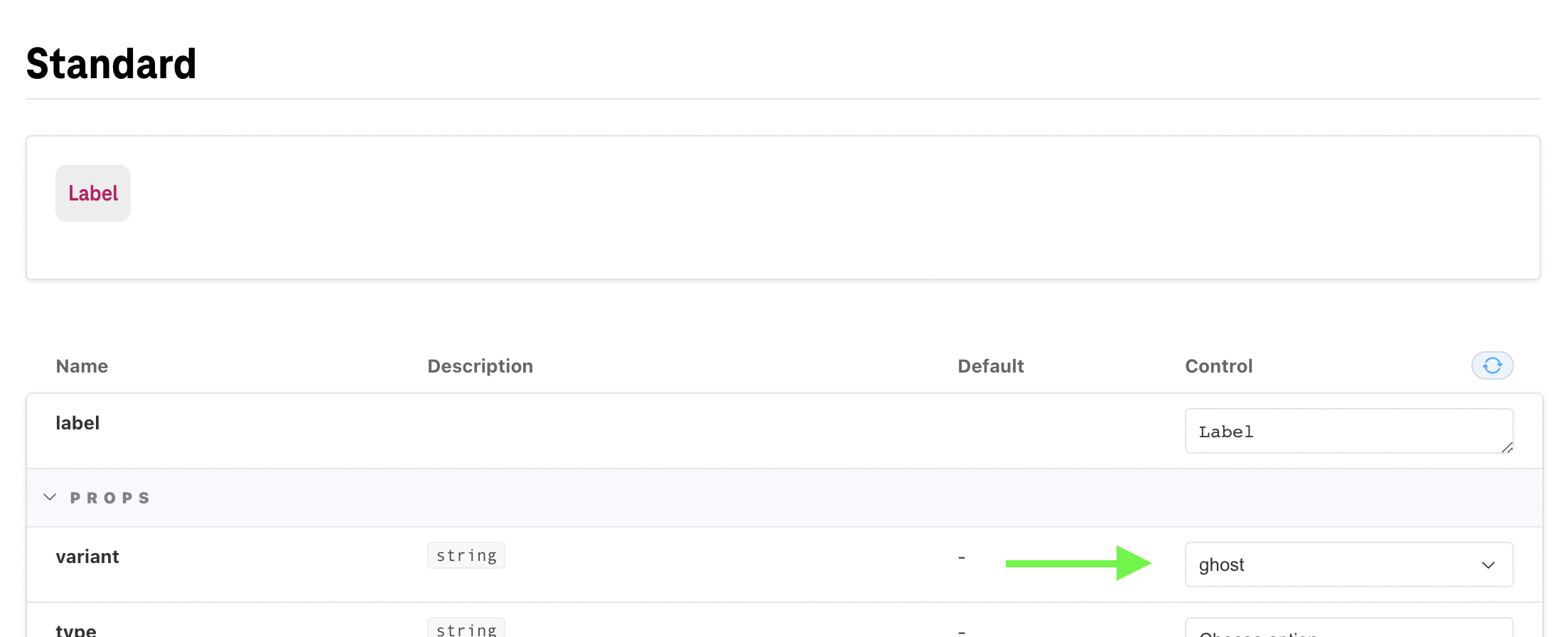
Button - official support for ghost and ghost-secondary variants
Hi there,
I'd like to ask if it would be possible to add documentation for ghost variant of button and
to introduce new variant ghost-secondary which would be the same as ghost but with (front) color like the secondary variant.
So basically the color of text / icon is black instead of magenta in the default light theme.
We are using this quite a lot in our application I wonder maybe it could be useful for the whole community. I could try to contribute it if there is interest in it.
.button--variant-ghost-secondary {
  background: transparent;
  text-align: center;
  border-radius: var(--radius-ghost);
  border: var(--border-width-ghost) solid transparent;
  color: var(--color-ghost-secondary);
  padding-left: var(--spacing-x-ghost);
  padding-right: var(--spacing-x-ghost);
}
.button--variant-ghost-secondary:not(.button--disabled):hover {
  color: var(--color-ghost-secondary-hover);
  background-color: var(--background-ghost-hover);
}
.button--variant-ghost-secondary:not(.button--disabled):active {
  color: var(--color-ghost-secondary-active);
  background-color: var(--background-ghost-active);
}
.button--disabled.button--variant-ghost-secondary {
  color: var(--color-ghost-secondary-disabled);
}
Hey @mato-a, thanks for opening this!
The ghost variant is supported already, styles/design was recently updated during the dark mode refactor. It's in the variants selector in Storybook to try out, but it's true there's no story for it so it may appear undocumented. We'll probably add this story in the near future.
To make sure we get it right, this new ghost-secondary variant will be exactly like the current ghost but with black icon/text, correct?
On this screenshot you see the hover state:
Hi @acstll,
Yes adding the story for ghost and ghost-secondary variant would help.
To make sure we get it right, this new ghost-secondary variant will be exactly like the current ghost but with black icon/text, correct?
yes, exactly
Perfect, thank you @mato-a — I just checked with design and there will be one more revision to the ghost button. So we'll discuss adding the new variant as well.