Bold Variant
I have faced a few issues with bold characters like letter m. The problem is that the character becomes so thick that it's difficult to identify them. I have seen this for all the characters, the only problem is with only letter m (small one). I have attached one the screenshot for understanding. Thanks, it's an amazing font and cozy as well.
Just a heads up, I don't see any screenshot attached. Perhaps you should try again?
As much as I'd like to, this isn't really possible for me to work around easily - glyphs in bitmap fonts are bolded by the terminal, by redrawing the glyph one pixel to the right, like this:
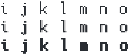
The font can't really influence that.
Since Cozette is a 6px wide font, with 5px for the actual character (and 1px for the space), there isn't really a way to draw lowercase m with wider spacing between the legs than the current one: #.#.#, for five pixels wide.
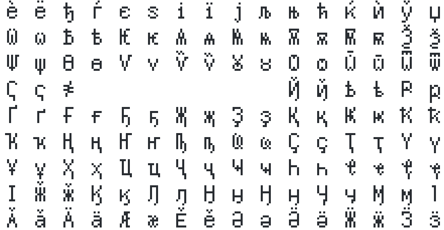
The solution for this would be to make a bold variant of the font, and let fontconfig handle switching to Cozette-Bold for bold glyphs. This is quite a bit of work, due to the sheer number of glyphs that would need redrawing for the bold variant - and m is far from the most problematic one. The cyrillic block, in particular, would be an absolute mess with some of these glyphs:
A bold variant is on the roadmap, but unlikely to happen anytime soon.