qBittorrent
 qBittorrent copied to clipboard
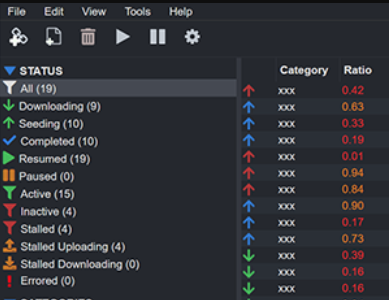
Completed icon is barely visible on Dark theme in 4.5.0beta1
qBittorrent & operating system versions
qBittorrent: 4.5.0beta1 (build from here) Operating system: Windows 10 Pro 21H2 x64 Qt: 6.3.0 libtorrent-rasterbar: 1.2.17.0
What is the problem?
New Completed icon is barely visible in 4.5.0beta1 if the Dark theme is used.
Steps to reproduce
- Apply custom dark UI theme (i.e. mumble-dark-nowshed.zip)
Additional context

Log(s) & preferences file(s)
N/A
Well, qB already supports dark mode on Linux and (afaik) on macOS. So that icon will be barely visible anyway, even if user doesn't apply custom theme.
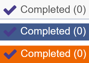
Here is the screenshot from Manjaro Linux w/o any custom theme, just with build-in Qt6 dark theme:

@adem4ik Are you using a TN type monitor?
@thalieht had an issue with this icon colour in initial implementation of icon changes....doesn't seem to be a problem on IPS panel.......color should be changed anyway to avoid such an issue going forward.
yes, I have
TNtype monitor.
Will change color used for completed icon & associated text in transfer list
Labelled with Confirmed bug as issue seems to arise with the use of TN panel type monitors & thalieht encountered it too on a TN panel monitor.
I doubt a TN panel is the issue, especially if they have accurate colour reproduction. What I see in this thread are two images with different shades of grey background.
The first image with custom dark contrasts better against the purple icon and I see it better.
The image here that is using the OS to theme has a lighter shade of grey with worse contrast and I can barely see it.
It's fine in this theme
https://raw.githubusercontent.com/brettpetch/nightwalker/main/preview.png
Just make it green ( it is a tick after all ) or clear contrast to light/dark theme. I very much doubt this is anything specific to TN panels as I don't have one and take issue with the contrast on VA/IPS
@userdocs That's a different icon/color being used in your screenshot......anyway - will change it this wknd when I have time.
It's the same in the webui for 4.5 beta, the colour does not contrast well against certain shades.
Maybe the Dracula theme might be a good reference for dark themes and suitably well contrasted colours
https://draculatheme.com/qbittorrent
It's the same in the webui for 4.5 beta, the colour does not contrast well against certain shades. The blue checkmark that OP is seeing should be a lighter shade of blue to contrast well against the dark background.
I agree. We should have different colors for both light and dark by using a contrast checking tool. The blue checkmark that OP is seeing should be a lighter shade of blue to contrast well against the dark background. There's already a lighter blue being used for "seeding" so we can instead use a different kind of light blue like Teal or a greenlsh blue like Cyan.

@now-im was working on the new themes for 4.5.0 so maybe he should have some input.
@now-im was working on the new themes for 4.5.0 so maybe he should have some input.
I proposed to make two seperate icon pack for light and dark themes. I would have worked on it. However, I have neither the time nor the skillset to make a complete theme set.
I proposed to make two seperate icon pack for light and dark themes. I would have worked on it. However, I have neither the time nor the skillset to make a complete theme set.
That's ok. Somebody just has to tweak the downloads checkmark to a different kind of color that stands out more on the dark theme and it will work for both themes. The current download checkmark seems like kind of a purplish blue that blends into the dark background. We just have to test different kinds of blues until one of them is clearly visible on the current dark theme background. Or we can just have somebody switch out all the colors until they are clearly visible on both dark and light backgrounds and do not conflict with each other.
will change it this wknd when I have time.
For those who may have missed this......(setting time aside for this & other things tomorrow)