qBittorrent-website
 qBittorrent-website copied to clipboard
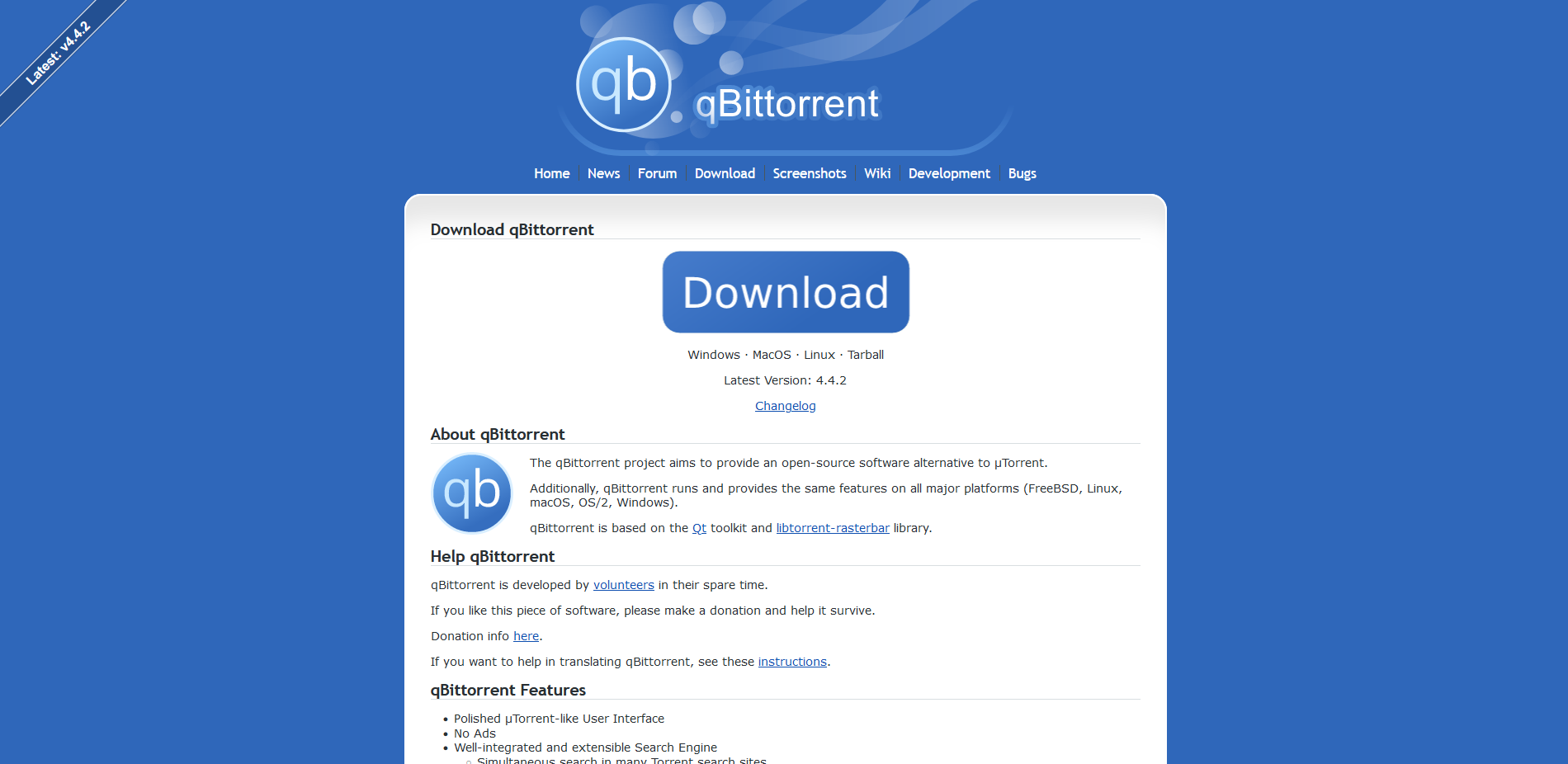
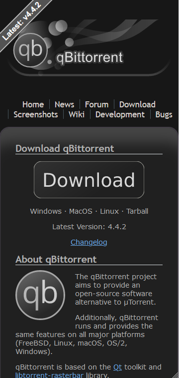
New download button, new svg icons, and dark mode
Hi, this is my first contribution on GitHub, I hope you like it :)
- Remade banner and icons all in .svg format
- Added new main download button
- Added a changelog link directly below the download button
- Replaced old "get latest release here" image with the qBittorrent logo
- Added a OS preference based dark mode
- Added a dark mode version of the download button
- Adjusted a number of colors for dark mode (font , background etc.)
- Adjusted ribbon color for dark mode
- Added filters to greyscale colored images
- Added a new .css file for download button
- Improved navigation menu color transition
- Fixed text cursor appearing in navigation menu
- Fixed minor spelling mistake in news
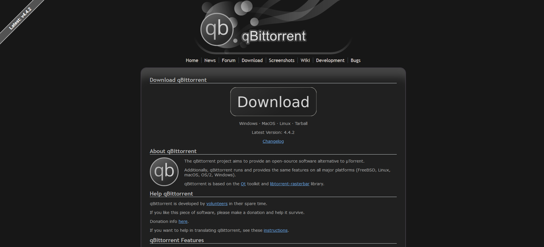
New button
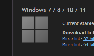
 Dark mode
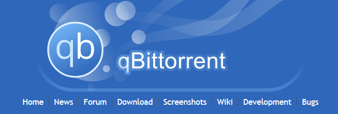
 New banner
 New logos
 Before
 After
After

Not a fan of the dark theme (too grey for my taste), otherwise looks pretty good. However, this not up to me. ping @Chocobo1 @sledgehammer999.
Not a fan of the dark theme (too grey for my taste), otherwise looks pretty good. However, this not up to me. ping @Chocobo1 @sledgehammer999.
Thanks, by too grey did you mean that its too light or the wrong color? (not blueish)
Thanks, by too grey did you mean that its too light or the wrong color? (not blueish)
Both, I guess?
@FranciscoPombal what do you think?
alternate color scheme 1 ff style

 2 windows style (text color is off , but generally you get the idea)
 3 chrome style
Unfortunately I'm not a fan of any of them, but out of all of them, the first is my favorite. Again, you don't have to please me, since I currently have not say on what goes on the website, better wait for more feedback before doing more iterations on the design.
Unfortunately I'm not a fan of any of them, but out of all of them, the first is my favorite. Again, you don't have to please me, since I currently have not say on what goes on the website, better wait for more feedback before doing more iterations on the design.
Alright :) I am curious though , mind linking a website you like the dark scheme of?
GitHub itself is nice; darker than your original proposal and without a "tint", but not as dark as some of the follow-up ones. The one from stackoverflow is also nice. I now realize that part of my dislike for the original one also probably comes from the fact that it uses 2 tones that contrast too much between background and foreground (and I don't mean the font), if that makes sense.
I also like some quite dark and high-contrast dark themes (think "black" themes on AMOLED smartphones) but they have to be very well executed in order to not become the classic Windows high-contrast theme.
In my coding environment I am partial to solarized dark. On my XFCE desktop, I use Adwaita-dark.
I get what you mean, thanks for explaining 👍 I'll wait for some more feedback to see what others think so I can find something that suits everyone.
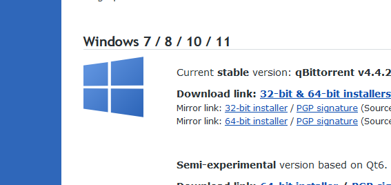
could you please use the new windows icon? x
Sure, I will make it when I have the time.
The banner looks a bit off centre because the little dragon in the egg isn't there. Could you move the qBittorrent logos to the right a bit?
- Improved dark mode color scheme
- Improved gradient on download button
- Improved dark mode coloring of download button
- Improved dark version of QB logo
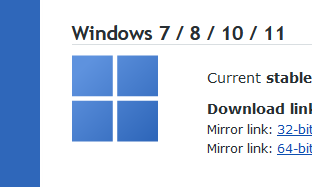
- Replaced old Windows logo with new Windows 10 svg logo with gradient
- Made a gradient matched tux svg
- Added native dark mode banner (no filter)
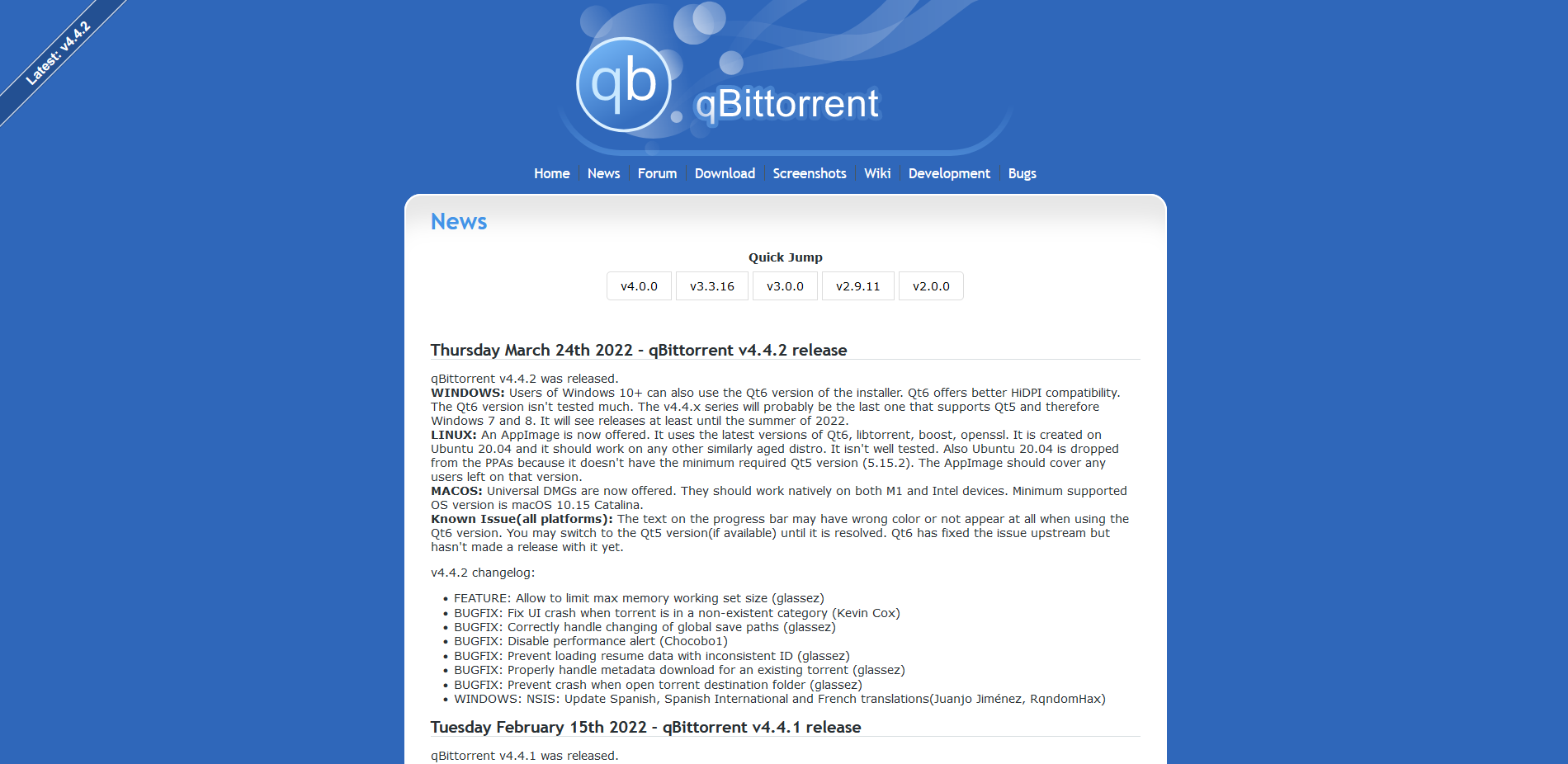
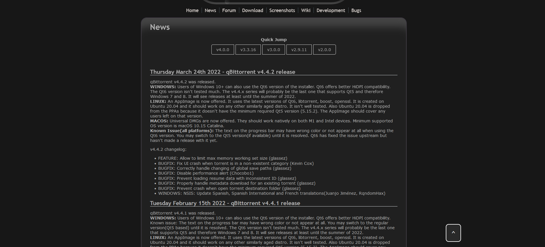
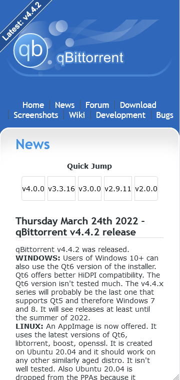
- Added quick jump buttons for important versions to news page
- Added dark mode for quick jump buttons
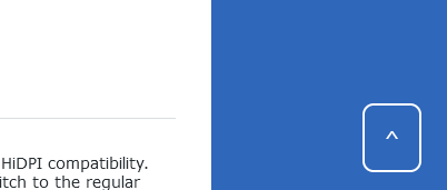
- Added a responsive go to top button to news page
- Added mobile support for go to top button to news page
- Added mobile support for quick jump
- Fixed mobile version of news page's unwanted horizontal scrolling
- Fixed version ribbon overlapping QB logo on banner on mobile version.
- Fixed Download button appearing too small on mobile
I don't know how to fix the checks, sorry
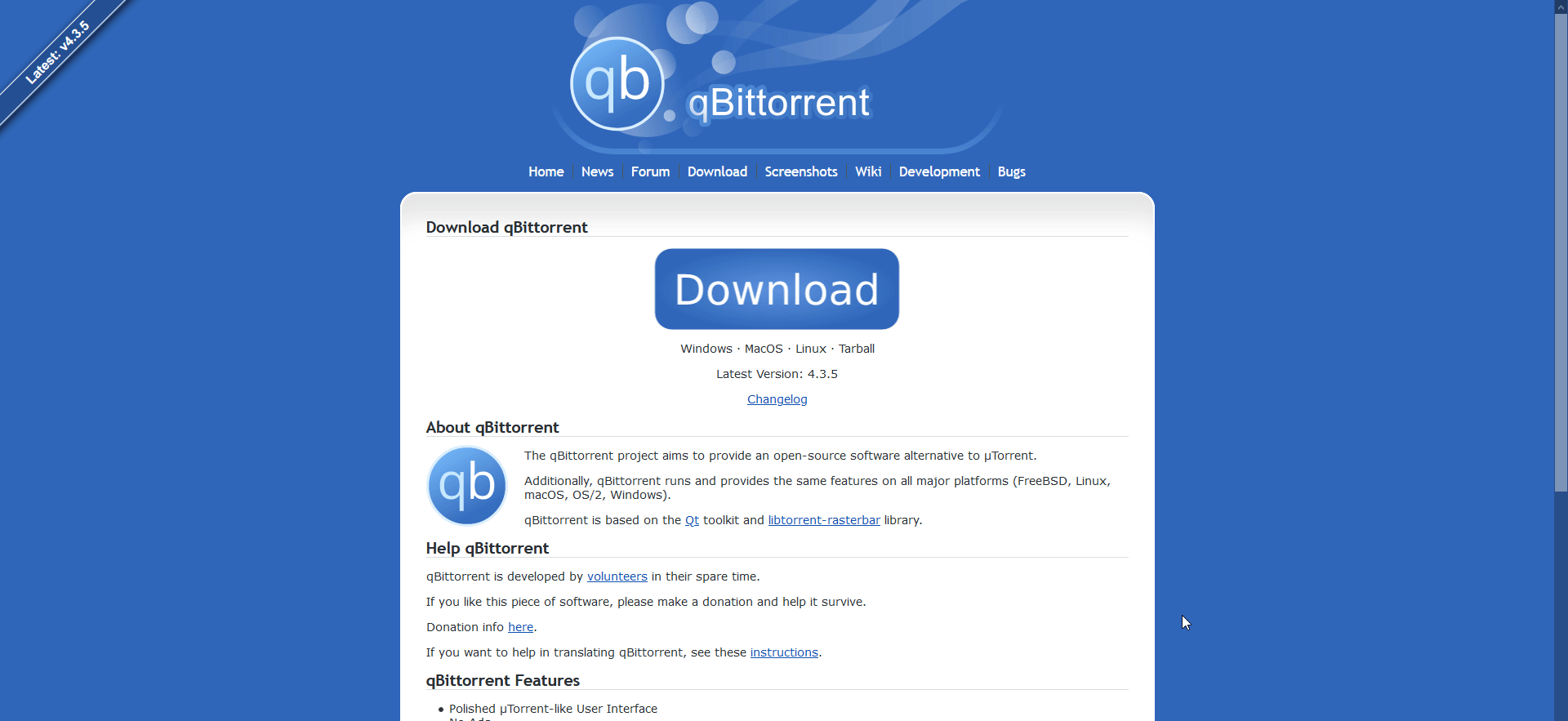
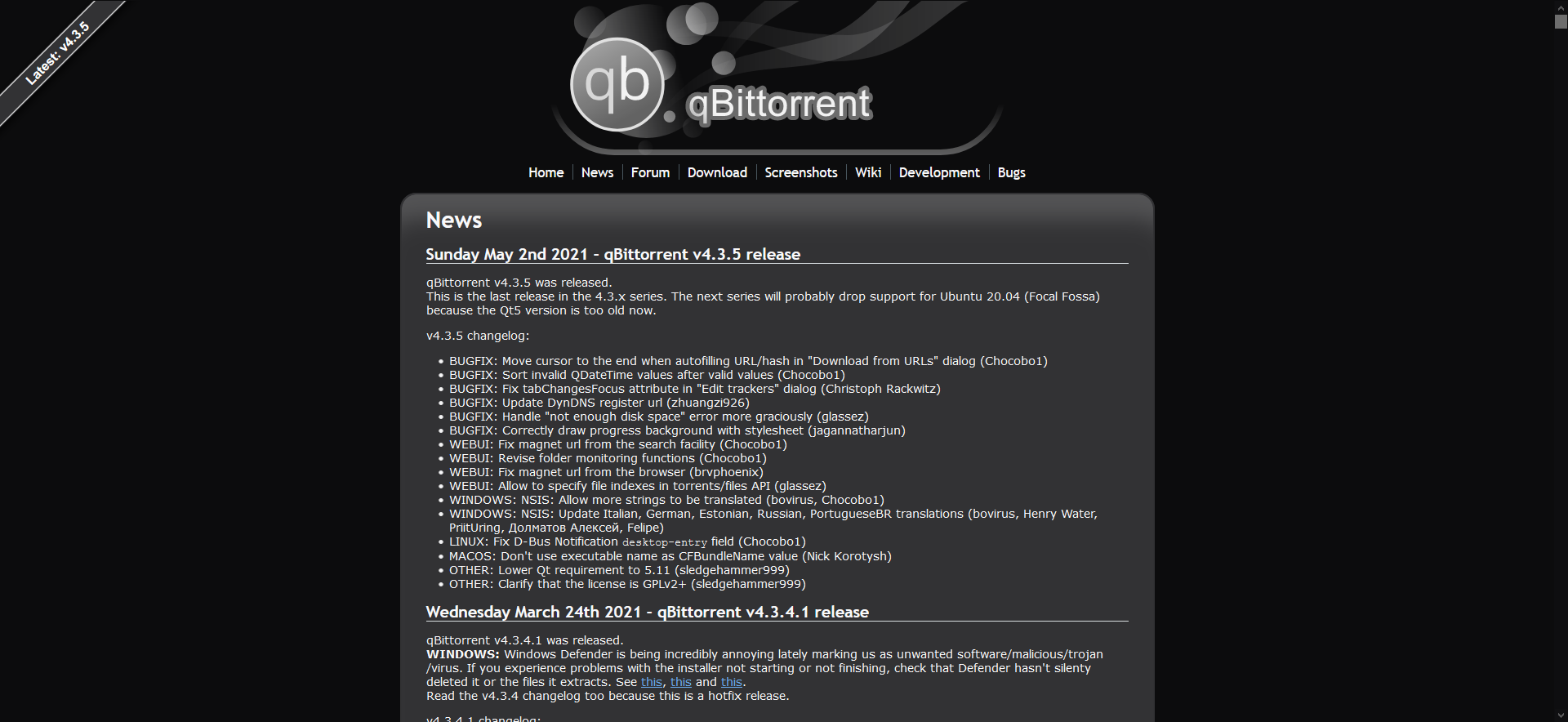
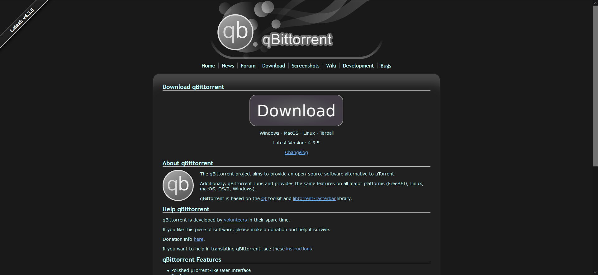
Screenshots:
Dark mode

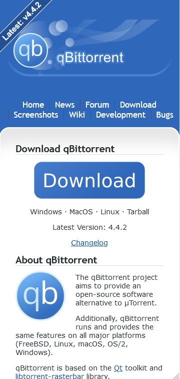
Mobile version
Mobile scroll to top button
Replaced Windows 10 logo with Windows 11 (I thought it didn't look as good as the 10 logo but I understand)
Screenshots:
The banner looks a off centre because the little dragon in the egg isn't there. Could you move the qBittorrent logos to the right a bit?
@Poopooracoocoo Looks good the way it is to me but I'll try and post the result here when I have the time.