Add Financial Overview Visualizations to Collective Profile Pages
Kick off and plan
Recording (TBC)
We spoke about the proposal below, the issues with respect to rendering and the possibility of sending reports by email to contributors instead, classification of expenses and the risk that we end up with a lot of fragmentation and our strategic design priorities around profile pages. Generally, the plan is to initially focus on use of funds:
- To drive the classification of expenses through tags (which we can rename if needed)
- To allow submitters to include tags when expenses are submitted
- To limit the ability of submitters to modify tags once submitted
- To show the most-used tags in the tag picker to encourage homogenisation but allow freedom
- To add visualisations to the 'budget' section that show expenses by tag and type, hidden behind the 'expenses' tab to remove issues with load times.
We acknowledge that there's value in showing information on how users are contributing (recurring contributions are much better for projects, so encouraging that behaviour is a priority), but for the moment, the focus is on how projects are using money.
Some quick sketches of how this might look:
| Expenses page |
|---|
 |
Incidentally that graph is made with real data from the 'webpack' project. Note that metabase automatically accumulates tags that have a small %age representation into 'other' automatically. I think this is a pretty decent pattern.
If we wish to see (we may) how the project is changing it's spending over time we might want to show something a little more like this:
| Expenses by year |
|---|
 |
Background & Context
This proposal emerged from:
- Research into open-source projects hosted by OSC about what can be done to make it easier for corporate funders to fund open-source projects. One of the core needs that were identified was to gradually provide funders with more information about the impact of their investments.
- A followup inquiry into tagged expenses on the OC platform (seed pitch and discussion ).
- A proposal that surfaced on slack on how to visualize contributions.
Proposal
Add visualizations that provide an effective overview of a collective's contributions (incoming funds) and expenses (outgoing funds).
When a funder is considering funding an open-source project hosted as a collective on OC, they want to get a sense of how the project is doing financially (among other signals and indicators). They are trying to decide if the project is capable of handling funding. The current collective profiles provides:
- overall totals
- current balance
- a speculative (not clearly explained) yearly budget
- open/transparent ledger
- number of recurring funders at each funding tier
This information is insufficient and difficult to integrate into a coherent financial view that answers questions such as:
- How long has the project been actively raising money?
- Is the funding that it has consistent or erratic - what part of it is recurring and what part is one-time?
- How does the project spend the funding that it currently has?
Ultimately, a funder is looking for funding opportunities that are most like to be impactful. These visualizations will not in and of themselves answer this question but they are one step in the right direction. Just having this data visualized clearly is a kind of badge of trustworthiness that a collective is managing its finances. The recently redesigned ESLint website and its donate page exemplify what this can look like.
Providing this as a given service on OpenCollective to collectives is also a badge of trustworthiness for the platform itself.
The proposal includes two visualizations:
- Expenses
- Contributions
It is probably preferable to offer the two together, however from the OSC perspective, expenses are currently more important.
Expenses
1: Data integrity preparations
At this point in time this proposal builds upon the existing tagging capability with the following modifications:
- Signal "accounting" - change the label "tags" to "categories" in order to change the narrative from "just tag this with whatever seems relevant to you" to "select a sensible accounting category"
- Limit categorizing to collective admins - collective admins are the ones creating context and order within the expenses. Currently this can be disrupted by expense submiters (payees) being able to modify expense tags. In the future, in order to protect the data integrity shaped by collective admins it may be necessary to limit payees ability to tag expenses (especially after expenses have been approved and tagged by a collective admin). This is NOT in the scope of this pitch.
- Default Tags - in order to account for expenses that are not yet tagged, default tags should be added to them. This will ensure that all visualizations will have and provide some context - even for collectives that have not tagged their expenses or done so only partially. As collective admins encounter the visualizations they will be able to go back and tag expenses and witness the visualizations change. The default categories are derived from the way the expenses were submitted:
- Receipts
- Invoices
- First Tag - in order to prevent double spending (when an expense is assigned to more than one category) we need to:
- Only use the first tag when creating the visualizations.
- Communicate in documentation that this is the case.
- Consider making it possible to indicate in the UI "this is the first tag" by mechanisms such as :
- Adding a visual queue to highlight the first tag (to emphasize that this is the one that will be used for accounting).
- Drag and drop manipulation to drag a tag to make it first.
- Transactions within the platform to other collectives should be incorporated into this; 1. Transactions from other collectives should be incorporated as contributions. 2. Transactions to other collectives should be incorporated as expenses.
2: Visualization

- By default the visualization is a pie-chart showing the aggregation of expense categories for the selected period.
- By default the graph should appear loaded for the current fiscal year.
- Enable the user to select a fiscal year (or all time accumulation).
- Optional: enable the user to switch between pie-chart and bar-graph presentations.
Contributions

- By default the visualization is set to "all time" + "summary" + "quarterly."
- The user can choose to focus on a given year, to alternate between number of contributions and value of contributions and to change resolution "quarterly, monthly, weekly"
- Both visualizations (count/summary) discern between one-time and recurring contributions.
Integration in Profile Page
- Integrate both visualizations into one new profile section - "Financial Overview.;"
- Select default placing in the profile page.
- Default to displaying the section.
OSC Community Engagement
attention @RichardLitt
- Add to documentation guidance about an initial set of suggest categories (+ crediting Nicholas Zakas and referencing the ESLint website as an implemented example) and make sure those categories are already in the platform (correctly typed) so that collective admins can easily find and utilize them.
- Engage with first cohort of admins of collectives who have and use funding and tag their expenses (/ESLint, /transaidcymru, /webpack, /agora, /wwcodeportland, /wwcode) to communicate new feature and talk about how to complete or recategorize in order to communicate effectively with funders.
- Select and prepare to engage with a second cohort (5-10) of admins of collectives who have and use funding but do not tag their expenses (after engagement and outcomes from first cohort) who have funding but are not yet tagging and invite them to also utilize this capability.
Future Potentials
- Tools for customizing (scope, colors) and embedding visualizations on other websites.
- Clicking on graph elements as direct links into the ledger to see the details of expenses and contributions.
- Further refinement of visualizations to portray project expenses.
- Emphasizing LARGE one-time contributions in relation to many small one-time contributions.
I love this! I think an issue I previously submitted, https://github.com/opencollective/opencollective/issues/5553, can also be an input into this work.
I think an idea to hold as we shape this proposal is that other kinds of organizations will want other kinds of metrics, so I would love for the way this is built to have flexibility around that. The above issue lists a bunch of metrics that are useful for organizations - though some would perhaps be more useful internally rather than for the public.
@natehn
- can you add to this pitch specific proposals for increasing clarity on the "estimated yearly budget" field. If you wish, I'm happy to connect and talk this through
- I agree, there is potential for more metrics. My intention is that the initial capabilities described in this pitch become a doorway into being able to do and offer more.
Engage with first cohort of admins of collectives who have and use funding and tag their expenses (/ESLint, /transaidcymru, /webpack, /agora, /wwcodeportland, /wwcode) to communicate new feature and talk about how to complete or recategorize in order to communicate effectively with funders.
This sounds good to me, and I am willing to hold this space and invite them in. Let me know when makes sense to start doing so.
@iamronen I think my main concern is that I would like people to know the specific function/equation that led to that calculation, since it is just that - a calculation. And I think it should be separated from the real data in some way
I really like the feeling of this project! I think it has to do with a lot I've been hearing for some time now. I do think, though, that it would need some preparation work before jumping straight into a solution. I'll elaborate:
This issue describes a problem very well:
When a funder is considering funding an open-source project hosted as a collective on OC, they want to get a sense of how the project is doing financially (among other signals and indicators). They are trying to decide if the project is capable of handling funding. The information we currently provide with the Collective page budget section is insufficient and difficult to integrate into a coherent financial view that answers questions such as: How long has the project been actively raising money? Is the funding that it has consistent or erratic - what part of it is recurring, and what part is one-time? How does the project spend the funding that it currently has?
And then assumes that the straightforward solution to this problem is to add visualizations to the aforementioned 'Budget' section. I think this problem deserves some thinking + exploration work to rethink the budget section, which has plenty of room for improvement; then, with a more precise definition of that section, we can add some graphics and visual aid to the information displayed. Not to mention we already have a very similar project documented here: https://github.com/opencollective/opencollective/issues/3998.
I wouldn't jump straight into adding the data visualizations without investing some time structuring a better 'Budget/Transparency' section for Collectives. In the same way, we didn't start building #4893 immediately without clearly understanding how the contribution experience works as a whole and solving the original problem more holistically.
cc @iamronen @BenJam
thank you @Memo-Es :)
1. Wow!!!
Great looking designs which means that if prioritized we even have designs roughly in place.
2: Process
- I would have liked the work you did on #3998 to surface sooner.
- I don't feel that issues are a good home for mature works like this, I feel it gets lost ... this issue is even labeled as "stale."
- I would like to find ways to get better at holding this kind of information. Seeing 3998 made me wonder what else is out there designed that I don't know about.
- If there are more such works buried in our issues, perhaps you can surface them by tagging them with something like "design-concept" and creating a board that presents them?
- I would have liked to see "fat-marker" versions of this packed as pitches and offered into our collective space BEFORE committing precious design resources to the detailed work you've already done. In my mind, this detailed work should typically take place after prioritization and tightly coupled with the development implementation work (especially with detailed graphic work like this that will ultimately depend on what components dev will decide to use to implement the designs).
3: Strategy/Priority/Sequence
I agree with you that this will not directly solve the problem space. It is one piece of many - especially in the context of OSC (we have an extensive research document that we are currently summarizing into a strategy for the coming year that will soon be published).
I also agree with you that it would be better to implement this as part of a wider move of rethinking the budget section.
However:
- There are more changes I would like to explore in the budget section (which are not currently reflected in the designs in 3998) regarding access to the ledger itself (which is not necessarily directly tied in with the overview visualizations).
- I feel that an overhaul of the budget section would be better served after we take on the challenge you have raised numerous times of redesigning for a logged-in/logged-out user experience with clear differentiation between public facing profile and an "internal" work area.
I think that overview graphs can be approached as a contained scope and integrated into the existing collective pages as is. I think it will have immediate impact AND it will enable us at OSC to move forward with plans to engage with projects to tag their expenses accordingly. Then we can re-integrate and evolve the visualizations as/when we progress on the revamp of the collective profile page and the logged-in/logged-out experience.
I would be happy to allocate time already in the coming weeks to start shaping a pitch for the logged-in/logged-out strategy so that it is well defined and scoped and can be pitched for Q3S2. Then, during Q3S2 we can do a similar process for a revamp of profile pages that can be pitched for Q4S1. If, as was the case in this issue, you have already done some work on these subjects please do share it with me and lets get it ready for pitching :)
For OSC, waiting 3-5 months (2 or 3 cycles) with the overview graphs is too long.
This is a really great idea. Just wanted to add that its not only helpful to funders of OSS projects, but really to funders of any kind.
also, another note in response to @iamronen about potentially buried projects/issues: is it possible to add a step of human confirmation before issues are marked as 'stale'?
What's the benefit of having that on the public profiles? To me, these look like admin stats that are usually not helpful for random contributors visiting the page. I understand that having this as public info can be nice for transparency, but I would separate it to a different page (like /transactions or /expenses) as charts can significantly impact the page's load times.
@Betree the research into OSC funders revealed that they look at collective pages as part of their funding-process. They look to see if a project is able to receive money (=on the platform) and if they are able to handle funding well (=the funding is more likely to be used effectively). These visualizations are intended to address the second point. The current available information (totals + ledger) do not address this well.
I think (though have not researched this outside of the context of OSC) that this can have a positive impact for other collective and funders. The ability to "at a glance" see a historical perspective of a collective's fundraising & spending says a lot about the sustained vitality and viability of a collective. I think that even private/individual sponsors may be interested in this in their decision to contribute to a project.
Also, as you point out, I think that visualizing information this way (verse manually digging into past expenses and transactions) amplifies the commitment to transparency.
As for its location on the collective page, that may change as we delve deeper into two related projects that @Memo-Es has been holding:
- Separating a public-view and a workspace view.
- The collective profile revamp.
As these two projects mature these visualizations (along with many other things) may change (but continue to be a valuable building block both in the present and in the future).
We should always default to things being public unless there is a strong reason something needs to be hidden.
I realize my previous message wasn't clear, so to clarify: my concern is not that the charts will be public (I agree we have no reason to hide them), but I'm trying to understand the added value of having that on the profile page instead of a separate one, like /transactions.
My concern here is the fact that charts have a significant impact on page load/render times. To me, the goal of the profile page is not to give full transparency on the collective's activity but to be a funnel to redirect people to the info they want to see (for most of them, /contribute).
To caricature my thinking, would you prefer:
- Having a profile page with 3 charts that nicely summarize the collective's financial activity but load in 3 seconds
- Or having a page with a small link like "View our financial activity" that renders instantaneously
I tend to prefer the second approach. Many (most?) people who arrive there are looking for a way to quickly contribute and already know the project for the page they're visiting. How many of them need to see a historic view of the financial activity before contributing? How many are going to be turned down if we increase the load time of the page? How many (mobile users) are going to be confused because the page they ended up on is too complex and "Contribute" ends up being hidden in a sea of information?
I would agree about putting it on a separate page and linking from the main profile
@Betree thank you for surfacing the issue of performance price.
1: Performance
For me a good starting point for a solution would be something like a gradual page loading mechanism. The initial page could load as is with a placeholder indicating "loading financial overview" ... and then, whenever that is ready populate the page with the visualizations.
I feel this capability may serve us well in the future as we serve more processing intensive results (which are already visible on the OSC roadmap - see for example #5745 ) ... and if I've not mistaken I think already exists on some of our pages (I think I recall blank gray "card elements" loading before being populated with actual content.
2: User Experience
For OSC institutional funders these visualizations are more useful then almost everything else on the current profile page. I suspect this may also be true for some individual sponsors. Anyone who is asking "will my contribution" be impactful is currently in the dark. These visualizations will shed a lot of light into this darkness.
Moving these visualizations to another page will demand more work (finding where to click and clicking to a new page) from the people who can benefit from them and decrease the likelihood of people discovering it.
I also prefer to defer changing our page structures for after we've developed some kind of overall strategy (a project that @Memo-Es is holding and I hope we can advance soon).
Solving for performance by decreasing the odds of this information reaching eye-balls does not feel to me like a good trade-off ... it almost feels like it defeats the purpose of making it available.
3: Caching
In addition to the gradual page loading, I want to suggest thinking (longer term) about some kind of archival caching mechanisms that can reduce loads and increase load times. I am happy to talk more about this.
@iamronen We already have intensive caching on this page. The reason why I was referring to load/render time is that not only do we need to fetch the data (that part can be optimized, even though it's additional work) but we also need the client's device to render it. This cost can be a small delay until the page becomes interactive, but it can also slow down the device itself if not enough resources.
Another approach that @opencollective/design took in the past with host reports was to hide the heavy charts under a View historical data collapsable section. It helped to contain the performance impact (the data gets loaded & rendered only when you click on View) and also simplifies the UI.
I understand the need for OSC and the assumption that it will help their hosted collectives (at least the large ones) seem reasonable to me. I have some doubts that this will benefit smaller collectives, especially the ones under different hosts. Overall adding them on the collective page is not a blocker for me, but please consider these issues seriously: this is the most fetched page of our website and loading/rendering time/complexity have an impact on project revenues.
@Betree I want to make sure I understand you correctly: are you saying that the 3 second delay would be due to client rendering load (and NOT backend data processing/)?
I will also give more thought to the collapsible pattern you mentioned. It may be possible to couple that with some kind of low-load preview that tells a "preview story" of what can be expected inside ... something like summary information / useful stats that have value in their own right (instead of just "view historical data") ... so users can make an informed decision if they want to go deeper.
Another option to explore would be how to roll this out. Maybe we can find a set of criteria for collectives for whom this would be on by default and others would need to explicitly add it to their pages. This may (substantially) reduce initial loads as we roll out this feature. But I think a mid/long term working assumption should be that this is operational for most collectives aspiring to be real operational collectives (raising and spending money).
The "3 seconds" thing was a caricature, I can't estimate the impact without more precise specs. But surely:
- There will be an impact on the loading time (mostly when the page is not cached yet or when we clear the cache)
- There will be an impact on the rendering time (esp. on mobile devices)
The two solutions that you mentioned above seem to go in the right direction:
- Have an efficient design that takes these concerns into account and tries to reduce the complexity
- Rolling out the feature only for the right people, analyze the impact for different kinds of host/collectives
I won't be there to discuss this for the kickoff as it has been planned on a Wednesday afternoon, but @kewitz will be there to provide some engineering perspective.
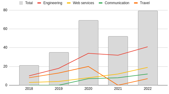
@poohlaga mentioned that it might be helpful for you all to see some of the math in action. Here are some of the metrics calculated (with my limited skills) in Metabase (note: the dates have to be manually updated)
Q3S2W2 update
Last week we had a couple of conversations about this project, I confirmed that it is indeed our intention to deliver something this sprint. @Memo-Es has pushed on with the design, based on previous thoughts and the pitch by Ronen. I would love for us to be able to start development this week if possible so my goal is getting to a place where engineering is happy to proceed.
- [ ] reviewing the deisgns with @znarf @Betree
- [ ] discuss further work on expenses process to support
- [ ] discuss mods needed from eng side
- [ ] ? discuss engineering on the project
Design update
This is the first design proposal I presented on the demo day on August 5th: https://around.co/playback/965e723a-161e-4825-ba24-39ffeefc9596?sharedKey=0b1fa27a-b031-4d9d-8194-1222738d7a14
After today's review meeting, I did some updates to ensure consistency in the experience and interface:
| Expenses | Contributions |
|---|---|
 |
 |
Takeouts
- We are releasing this feature for OSC only for the MVP
- We are including this feature as an opt-in, folks are invited to start using it and tag their expenses up to the point they are ready to display the data and turn it on
- This sprint cycle the engineering work will focus on spec out the project, including optimization strategies
- We should schedule the front-end development for the next sprint cycle
Next steps
- We will work on a complimentary design for the turned-off visualizations
- We will focus on having the design ready for implementation this sprint cycle
- On the engineering side, we will work the following weeks to spec-out the project
1: Design
Thank you for these designs memo, they look good and feel promising.
- We discussed the possibility to remove time filtering from the bar charts. They show an effective all time view. This would make implementation easier both in terms of UI and performance.
- The time filtering feels like it is necessary for the pie-charts since it provides context to what is being displayed. I would limit this filter to "all time" or one selected year from the past.
- I think we can avoid showing the index twice (once for each graph) on the same page. The two graphs have the same index and I think it can be designed as one element along the bottom ... which may also give space to showing more elements.
- For expenses I think we should aspire to be able to show 5 or 6 tags + other.
- Can the bar-chart on the contributions also be updated to include the tiers (and also relying on the same index)?
- I feel like the tabs "expenses/contributions" could use better visual containment ... since they encompass a lot of screen real-estate (the graphs + leader boards). Not sure if this is a priority for this cycle ... maybe we can tend to this when we do the profile page revamp?
- To my understanding we do not need a complementary design for collectives that do not opt-in - they will continue to see the same element that is currently displayed on profile pages.
2: Tags
I'd like to re-iterate the constraints we have around tags:
- There should be no disruption to the way tags currently operate so as not to take away freedom from collectives/hosts who do use tags (however they use them).
- For accounting purposes we need to have one tag which acts as an accounting category.
- Expense submitters can NOT add/edit tags AFTER submission (after submission tagging is exclusively in the hands of the admins).
Here is a proposal for how to handle this on the UI:

- Transform the "x" control (for deleting tags) into a dropdown.
- In the dropdown display a "remove tag" control and add a "use for accounting" option.
- Automatically select the "use for accounting" option for the first tag that is added.
- Add a visual queue (eg: highlight) to indicate the tag that has been selected to be used for accounting.
- When there is only one tag and the user tries to disable the "use for accounting" option respond with guidance "one tag has to be selected for accounting purposes"
- When there are multiple tags, another tag can be selected to be used for accounting and that removes the selection from the previously marked tag.
@Betree / @znarf I suggest adding a field to the database for the one selected field (and this would require some data initiation choices to populate that field for past expenses).
I like the proposal above for tags uniqueness, the UX looks simple and the engineering part should be rather straightforward.
I however think that it's out of scope for this project. This feature still has a lot of unknowns (how are we going to motivate people to use this new tagging strategy? will they do it? how long will it take until people end up with meaningful values there?) and needs to be processed and iterated on by design, possibly with some user testing and feedback gathering first.
To simplify the design and implementation of this project, I strongly think we should proceed in smaller steps and not try to solve everything at once:
- How can we display the data that we already have in a meaningful way
- How can we improve the way we collect transaction metadata (incl. the tags uniqueness proposal above)
- Update the charts to use this new data only on collectives that are using the new tagging strategy
In my opinion, this issue/project should be solely focused on (1). That way:
- We reduce the complexity of the project
- We can release (and thus try and learn) earlier in the process
- We have a fallback solution for all collectives that won't be using the new tagging strategy
Ideas for making sense of the current data
Tags breakdown
We can use a chart type meant to display a collection of non-unique values, like a Polar area chart. Compared to the pie chart, I don't feel like we're losing a critical aspect of the feature here.

Radar charts can also work

Historic view
A line chart can be used to represent the tag's breakdown, without requiring their uniqueness.


A bar chart (with optional line combo) also works.

Great work on these visualizations!
- Can it say 'Other/No tag' ?
- IMO, 'Today's Balance' is more important than 'Estimated Annual Budget' and should be the one in gray - I'm not sure if this is true for OSC's groups. But it took me a while before I realized I'd been looking at the wrong number when determining a collective's true budget.
- I think that adding these visualizations will help incentivize people to use tags on expenses- when they see these images, they'll want to see a more accurate representation.
- That being said, my bank has options for tags for visualization, and I still don't use them, its too many expenses to try to keep up with. I do appreciate the auto-tagging they do as a rough estimate of my breakdown.
- Is auto-tag or 'suggested tag' something that's do-able? That way people don't have to keep track of terms for consistency, especially if they have multiple Admins who might make it complicated. And they can just click on an existing tag instead of typing and searching
- Or, we set ~7 categories for tags, they have to choose from those (maybe that's already what's proposed here?)
- What do visualizations look like for Contributions? Tags aren't relevant here, correct?
@iamronen
I feel like the tabs "expenses/contributions" could use better visual containment ... since they encompass a lot of screen real-estate (the graphs + leader boards). Not sure if this is a priority for this cycle ... maybe we can tend to this when we do the profile page revamp?
Yes, I didn't want to propose a lot of new stuff, so, as you say, I would wait until we tackle the Collective page redesign to do these kinds of UI updates
To my understanding we do not need a complementary design for collectives that do not opt-in - they will continue to see the same element that is currently displayed on profile pages.
Showing the current budget overview falls short of meeting the main goals for this project. I think there's a way of meeting those goals with a graph-less design.
@Betree
-
Can you help me understand the difference between the charts we have in the proposal and those you propose? I did a small research and found no clear answer on what's the difference between unique and non-unique values
-
I agree with you that we should focus on rendering what we currently have in a more meaningful way.
-
I will iterate on this design and present it in this Friday's demo.
@Betree
First on behalf of OSC I can say:
- There are collectives that are already tagging expenses and we are going to be approaching them as role models for the community of open-source projects.
- We are working at the community level to offer open-source projects training, guidance, and possible services to help with tagging expenses (as one of many other issues).
- Your question "How can we display the data that we already have in a meaningful way?" is missing context - meaningful to whom, when and why? In the context of OSC the answer that is guiding us is so that open-source projects can communicate effectively that they are serious about how they use their funding and that they can trusted to use funds effectively in order to make it easier for funders to contribute more funds to them. For maintainers, being able to raise more funds in order to be available to working on the open-source projects they care about is a powerful driver. Funders on the other hand are allies of open-source that want to increase the funding that goes into open-source. To do this they need to be able to "sell" open-source funding within their organizations. This project is a first step (with many more coming) to support this mutual interest and need.
- A "single accounting category" is a critical piece of presenting reliable and trustworthy and unbiased information about expenses. Tags are an inappropriate solution for this. However it is what we have and we need to make the best of it. For this reason, the scope of this project includes a minimal and non-intrusive investment in identifying an "accounting category" from the data that we have.
- The polar area and radar charts are not intuitively clear to me - I don't know how to read them without making an effort to understand what they are displaying. I am assuming that most people will have a similar response to them.
- The other charts you suggested answer other potential curiosities about how funding is used such as "how much have we spent on webservices over time?" which may be legitimate questions ... but they categorically avoid the question of the budget as a whole. And it is the budget as a whole that needs to be reliably accounted for in this scenario.
- This is why I've asked that the tag-uniqueness be in the scope of this project.
@kaylarep
Yes, there are different potential approaches to explore assistive tagging but this is not in the scope of this project. We may decide to invest in this more in the future, if the circumstances are right. At the top of this discussion thread is a link to some work around categorizing expenses that touches on some of these potentials.
Yes, tags are NOT relevant in contributions. At minimum contributions will be differentiated using one-time/recurring. We are aiming to enhance that by breaking down recurring contributions based on tiers.
@Memo-Es
Showing the current budget overview falls short of meeting the main goals for this project. I think there's a way of meeting those goals with a graph-less design.
I think it is better to invest in tag-uniqueness than in a graph-less alternative.
Can you help me understand the difference between the charts we have in the proposal and those you propose? I did a small research and found no clear answer on what's the difference between unique and non-unique values
@Memo-Es Sorry, I didn't choose the right term - unique was not the clearest here; I should have used "mutually exclusive".
Pie chart
A pie chart is great to represent the repartition of mutually exclusive values among a collection. A count of all the fruits I have in my fridge, for example, would be a great fit because each fruit can only have one family: it's either an apple, a banana, or a peach. It cannot be an apple and a banana.
Layed out on a pie chart, this dataset would help me to clearly visualize that half of the fruits in my fridge are apples.
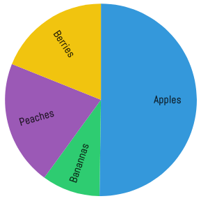
Why it doesn't work with tags
Tags are a different beast because they're not mutually exclusive. It's a very permissive system where people can put whatever they want. If we look at what we have today on Open Collective, folks submit their travel spending bundles as one expense, and we, therefore, end up with some tagged with food, transportation and accommodation. food and accommodation are not mutually exclusive, it's fine to have both sets on an expense.
Let's take an example: Open Potatoes has the policy to tag all expenses coming from the core team as core team and from other people as contributors. They also do some categorization, with tags such as food, tools, and travel.
In this context, they have expenses tagged like [core team, food, tools] (when the core team members organized an event where they bought food and kitchen tools at the same shop). Summarizing their 10 expenses, we end up with raw data like:
| Core team | Contributors | Food | Tools | Travel |
|---|---|---|---|---|
| 8 | 2 | 9 | 2 | 1 |
- 10 expenses were submitted
- 8 were from the core team, 2 from contributors
- 9 expenses included some food shopping
- 2 expenses included some tools shopping
- 1 was about travel expenses
If we put that on a pie chart, we end up in this situation:
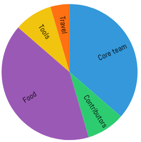
This chart is fundamentally wrong because it lets me think that about half of the expenses were from the core team, while in practice it's 80%.
Why a polar char works
A polar chart doesn't try to communicate any sense of repartition, it just shows how frequent each item is by making it larger or smaller. Having more of one item doesn't reduce the size of the others.
Applying the same data as before:
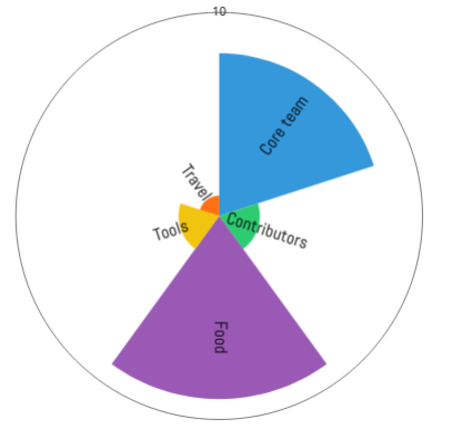
Now, this graph tells me that most expenses were coming from the core team, and most of them were about food. I still have the main information displayed, but there's no risk of misinterpreting the repartition.
Stacked bar chart
A stacked bar chart serves the same purpose as a pie chart, only it's meant to display it across time. This graph will not work with the tags as they're used today, because it would create the same false sense of repartition mentioned above:
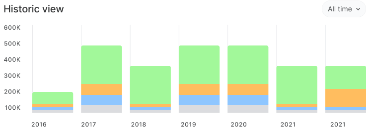
The lines + bar char combo proposed above, while ugly (I used the quickest tool I could find to generate it), doesn't lie about the data: increasing the count of a given tag won't reduce the size of the others.
- Your question "How can we display the data that we already have in a meaningful way?" is missing context - meaningful to whom, when and why? In the context of OSC the answer that is guiding us is so that open-source projects can communicate effectively that they are serious about how they use their funding and that they can trusted to use funds effectively in order to make it easier for funders to contribute more funds to them. For maintainers, being able to raise more funds in order to be available to working on the open-source projects they care about is a powerful driver. Funders on the other hand are allies of open-source that want to increase the funding that goes into open-source. To do this they need to be able to "sell" open-source funding within their organizations. This project is a first step (with many more coming) to support this mutual interest and need.
This is where our goals differ: your goal is to solve a specific problem for OSC. My goal is to make sure that, while solving this problem for OSC, we don't release a feature that will look trashy for other fiscal hosts and collectives. This is a good situation; if we successfully find a consensus we'll have a solution that we can proudly release for everyone.
I will keep pushing until I'm confident that the proposed solution will be useful for everyone, and I hope you'll continue pushing if the choices we make don't provide satisfying answers to OSC.
- A "single accounting category" is a critical piece of presenting reliable and trustworthy and unbiased information about expenses. Tags are an inappropriate solution for this. However it is what we have and we need to make the best of it. For this reason, the scope of this project includes a minimal and non-intrusive investment in identifying an "accounting category" from the data that we have.
I'm not saying we shouldn't do it, I'm proposing incremental steps to get there with two goals in mind:
- Offer a solution that works for everyone
- Continuous release
We used to have giant projects where we tried to do everything at once, and we learned with time that this is not the best approach to solve things: we get into technical rabbit holes, and by shipping later we're losing an opportunity to learn with user testing, therefore missing regressions with existing users. Working with incremental steps served us well in the past and I stand with the idea that it's necessary to do it here.
- The polar area and radar charts are not intuitively clear to me - I don't know how to read them without making an effort to understand what they are displaying. I am assuming that most people will have a similar response to them.
You're projecting your biased opinion on others, this kind of assumption needs to be verified with user testing and feedback loops.
And even if a pie chart ends up being a better option for displaying expenses usage (I too, prefer to see a pie chart) you're obscuring the fact that most collectives won't use this new tagging strategy and that the graph will be meaningless for them. We need a fallback solution that works for everyone, not just a few collectives that will collaborate with OSC to tag their expenses with this new strategy.
- This is why I've asked that the tag-uniqueness be in the scope of this project.
Again, I never said we shouldn't do it. In the plan proposed above, I clearly state that (2) and (3) should be about improving the way we collect and display tags in these charts.
Thank you for the radar chart explanation @Betree - that was informative. However, now that I somewhat understand it, I can't see how it is useful. The real story, as you told it had two tiers: internal/external & utility. The visual presentations tells neither of those stories nor that there are two tiers. It is a visualization of raw-data with no narrative to it. I think narrative is critical in user experience.
The second chart "lines+bar" is interesting and creative and I will mull over it some more. I am concerned that there is a narrative issue - that the visualization implies that things should add up when they don't.
Regarding "useful for everyone":
- I am not sure this is a valid requirement. Not every feature is useful for everyone.
- I don't think our goals differ (in this case), I think the drive in this case is coming from OSC but I think the feature is as valid for any collective and or fiscal host that wants to take advantage of it (personally, I think it is long overdue).
- How many will actually use it is indeed an unknown (though I suspect that, as least for now, probably more then oAuth) and as with many investments we make it is a gamble. In this case it depends more on social dynamics then technology. It is also important to view this question in a long term perspective: initially only a few may use it but hopefully, over time, more collectives will find their own incentives to do so.
- Since this is opt-in, there is no reason this should look "trashy" for anyone. Collectives that choose to use this feature have complete control over how it appears by tagging their expenses.
- I take your point on past giant risky projects and I subscribe to the approach of gradual release and development that is iterative and responsive to real needs. I don't think this is the case here.
- Per my bias on the charts, you are right, however I believe that in this case "this kind of assumption needs to be verified with user testing and feedback loops" would be much more expensive than tending to the "accounting-tag-category."
Most importantly though: do you feel that we have decision making mechanisms to properly address these apparent differences in value or priority?
I am not sure this is a valid requirement. Not every feature is useful for everyone.
If executed right, I think this feature can be useful for many people. I'd love to see this data for our internal collectives, I'd love to see that data for collectives I'm a core contributor of, and I'd love to see that for old projects I'm contributing to. Why limit the feature for OSC when we already identified that we were missing simple ways to visualize budgets for all collectives? (cf. the feedback on host reports - "we want the same thing for collectives")
How many will actually use it is indeed an unknown (though I suspect that, as least for now, probably more then oAuth)
Can you explain why we're comparing it to oAuth? I fail to see the relationship between the two projects.
I think the feature is as valid for any collective and or fiscal host that wants to take advantage of it (personally, I think it is long overdue).
With the current proposal, yes, anyone can take advantage of it. With a very high cost for host admins and collective admins.
The solution I'm proposing above offers a fallback for all people who are not ready to invest the time it takes to update their full expense history and adopt new practices while, for OSC, resulting in the exact same final deliverable proposed in the issue.
Do you feel that we have decision making mechanisms to properly address these apparent differences in value or priority?
Yes. We're using a feedback-seeking process. It's the responsibility of project owners to gather feedback, review it and make decisions that - in their views - represent the best compromise for the project. According to the issue assignees, the project owners here are @BenJam and @Memo-Es. I trust their judgments, even if that means going against my views of how this project should be conducted.
from what I've seen and heard here and in previous conversations:
- the need to show how projects are using their money, both in general and over time is valuable for Open Source Collective and Open Collective Foundation
- we're leaning into patterns that we already see (people are using tags, people who use tags a lot are using them to categorise expenses)
Yes there's a wrinkle around using >1 tag, and yes we should try to ship something that doesn't involve additional complexity. We can and will prove that doing this is useful for projects before suggesting others spend the time to categorise expenses like this.
@Betree on the visualisations presented:
- they should all be $ amount rather than frequency if we're going to provide something useful (I dont think the polar chart meets the use case here)
- I think people would still misinterpret those graphs and read them as a double count if they were $ based.
for me an MVP is 'show the first tag, work with collectives that want to categorise their expenses, show the data, see whether there's interest from both collectives and funders'. And I think that's the approach we should take.