Add the Goose logo to the README
I've added the 2x version in the README and committed the 1x and 2x versions in the repo. The rest of the logos, including the original square ones and the aseprite source files are in – goose.art.zip.
I see some very solid progress in here. Good luck with the library!
P.S: Y'all should kick me off of the Github organization 🦀
Hey @kitallis thanks a lot for this logo. I had 3 thoughts:
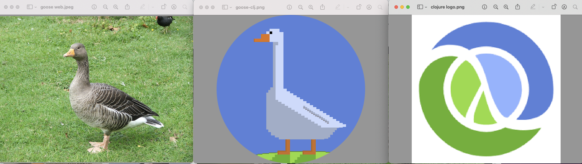
- Goose seems a little to the right. Can we put it in centre? Or is a slight alignment to either side considered a good thing?
- In the circular image,
bluecolour is filling a lot of space. Can we reduce the neck size a little more? That way, Goose will have more area I think - The
greencolours are very minuscule? Can we increase the grass a couple of millimetres from bottom? If we were to reduce the length of the neck, I think Goose will become centre and grass part will increase automatically.
Attaching a Goose image I took from Wikipedia for comparing bodily dimensions & link: https://en.wikipedia.org/wiki/Goose
Thanks @olttwa. Let me give this a shot... next weekend.
- The goose is centered based on the feet, not the body. It is a few pixels to the right, so that the beak wouldn't crash on the circle edge too close on the left. In other words, I've tried to keep the distance between the tail on the right edge the same as the distance between the beak and the left edge. I'll see if I can do anything about this. Not sure.
- I kept the neck size longer, because this is a caricature of a goose, not an exact representation. Goose necks are typically exaggerated to be long and windy because they can extend them to be very long. I don't think I can reduce the neck size further because then it will feel disproportionate to the body.
- I'll try increasing the green a bit more. Maybe wind behind the legs and feet.
I've increased the green a bit more and cut it a bit more proportionally across sizes. The uneven blue on either side is still there, can't really do much about that since the shape is oblong. Don't think I can do much more than this on a fundamentally rectangular artwork.
All the files including source: goose.art.zip
Hope this helps!