blackbird-jetbrains
 blackbird-jetbrains copied to clipboard
 nickcernis
Add some little contrast or border for balloon tooltips
First of all thanks for the great theme, so far I like it a lot and with a few tweaks in the Color Scheme settings I've been able to make an almost perfect theme that suits my taste. I use it in PHPStorm. However, there are some small problems that I can't change through the Color Scheme settings - balloon tooltips have the same background as the editor and no borders, which sometimes makes it hard to distinguish where they are because they can visually blend with other content.
One such example is argument info when you press Ctrl+P on a function/method argument:

Other examples are info balloons from the IDE for events like finished file upload or updates info:


Could you make some distinction for these tooltip layers so their boundaries are more visible? They don't have to be in high contrast but anything visually discernible. For example, function documentation (Ctrl+Q) looks very well:

Another example, popup windows like open file (Shift+Ctrl+N) or search in files (Shift+Ctrl+F), they blend with the background:
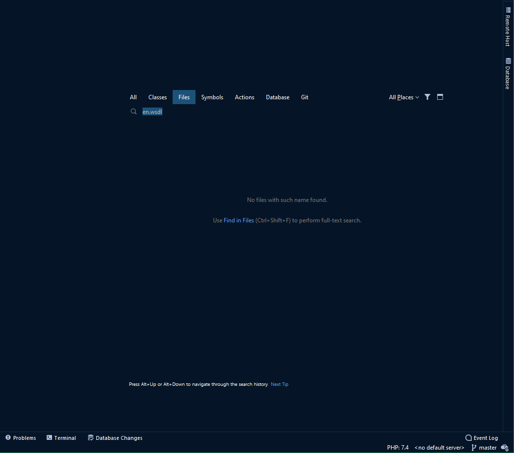
The background colour of these popups looks good but maybe some border around them would help?
Thanks for the suggestion, @lemon-juice.
I haven't been able to find a way to style the borders for those floating palettes yet. The UI inspector says they're called ResourceViewBorder UIResource (com.intellij.ui.components.JBViewport$ResourceViewBorder@743ef6f6), but there's nothing similar available in the theme.json that I can change.
I'll leave this open in case someone passing happens to know more.
Ok, so I tried finding a way to style these borders and fortunately it turns out I can easily edit the theme.json file in the plugin installation folder and the IDE will apply the changes. By looking at how other themes managed to style various borders I've finally come up with these settings that need to be put within the ui section:
    "Menu": {
      "borderColor": "strokeOfMidnight"
    },
    "Notification": {
      "background": "pastMidnight",
      "borderColor": "strokeOfMidnight"
    },
    "ParameterInfo": {
      "background": "strokeOfMidnight",
      "borderColor": "pinchOfMidnight"
    },
    "Popup": {
      "borderColor": "strokeOfMidnight"
    },
These are settings for menu borders, notification balloons, parameter info balloons and floating popups like the search for files, methods, symbols, etc. So far these tweaks resolve all the issues I could find with popups blending with the background. Feel free to use them with the colours you find most appropriate.
So the whole blackbird.theme.json file looks like this:
{
  "name": "Blackbird",
  "dark": true,
  "author": "Nick Cernis",
  "editorScheme": "/blackbird.xml",
  "colors": {
    "midnight": "#051527",
    "midday": "#91d1ff",
    "pinchOfMidnight": "#1d5278",
    "strokeOfMidnight": "#0f3049",
    "pastMidnight": "#030b16",
    "portal": "#97ecc7",
    "closingPortal": "#347056",
    "nevermore": "#34b5b3",
    "potion": "#ff709d",
    "poisonPotion": "#701141",
    "obliterate": "#fff423",
    "spirit": "#ffffff",
    "limbo": "#8995ac"
  },
  "ui": {
    "*": {
      "background": "midnight",
      "foreground": "spirit",
      "borderColor": "midnight",
      "selectedBackground": "pinchOfMidnight",
      "selectedForeground": "spirit",
      "selectionBackground": "pinchOfMidnight",
      "inactiveBackground": "strokeOfMidnight",
      "underlineColor": "portal",
      "inactiveUnderlineColor": "strokeOfMidnight",
      "disabledBackground": "strokeOfMidnight",
      "textBackground": "strokeOfMidnight",
      "warningBackground": "strokeOfMidnight",
      "errorBackground": "poisonPotion"
    },
    "Menu": {
      "borderColor": "strokeOfMidnight"
    },
    "Notification": {
      "background": "pastMidnight",
      "borderColor": "strokeOfMidnight"
    },
    "ParameterInfo": {
      "background": "strokeOfMidnight",
      "borderColor": "pinchOfMidnight"
    },
    "Popup": {
      "borderColor": "strokeOfMidnight"
    },
    "ToolWindow.Header.background": "strokeOfMidnight",
    "ToolWindow.Header.inactiveBackground": "strokeOfMidnight",
    "StatusBar.hoverBackground": "pinchOfMidnight",
    "FileColor.Green": "pastMidnight",
    "FileColor.Yellow": "pastMidnight",
    "FileColor.Blue": "pastMidnight",
    "FileColor.Orange": "pastMidnight",
    "FileColor.Rose": "pastMidnight",
    "FileColor.Violet": "pastMidnight",
    "EditorTabs.hoverBackground": "strokeOfMidnight",
    "EditorTabs.inactiveColoredFileBackground": "midnight",
    "EditorTabs.inactiveUnderlineColor": "midnight",
    "EditorTabs": {
      "underlinedTabBackground": "strokeOfMidnight",
      "underlinedTabForeground": "spirit",
      "underlineHeight": 3
    },
    "EditorPane.inactiveBackground": "pastMidnight",
    "EditorPane.inactiveForeground": "pastMidnight",
    "DefaultTabs.underlineHeight": 3,
    "DebuggerTabs.underlineHeight": 3,
    "Popup.Header.activeBackground": "strokeOfMidnight",
    "Popup.Header.inactiveBackground": "strokeOfMidnight",
    "Separator.separatorColor": "almostMidnight",
    "Borders.color": "strokeOfMidnight",
    "Borders.ContrastBorderColor": "strokeOfMidnight",
    "TabbedPane.contentAreaColor": "midnight",
    "ProgressBar.passedColor": "portal",
    "ProgressBar.indeterminateStartColor": "portal",
    "ProgressBar.indeterminateEndColor": "nevermore",
    "ProgressBar.failedColor": "portal",
    "ProgressBar.failedEndColor": "nevermore",
    "window": "midnight",
    "windowBorder": "midnight",
    "SearchMatch.startBackground": "midday",
    "SearchMatch.endBackground": "midday",
    "ActionButton.pressedBackground": "strokeOfMidnight",
    "ActionButton.pressedBorderColor": "strokeOfMidnight",
    "ActionButton.hoverBackground": "pinchOfMidnight",
    "ActionButton.hoverBorderColor": "pinchOfMidnight",
    "Button.default.endBackground": "pinchOfMidnight",
    "Button.default.startBackground": "pinchOfMidnight",
    "Button.endBackground": "strokeOfMidnight",
    "Button.startBackground": "strokeOfMidnight",
    "Button.startBorderColor": "strokeOfMidnight",
    "Button.endBorderColor": "strokeOfMidnight",
    "WelcomeScreen.Projects.selectionBackground": "strokeOfMidnight",
    "TextField.background": "strokeOfMidnight",
    "ComboBox.background": "strokeOfMidnight",
    "ComboBox.ArrowButton.nonEditableBackground": "strokeOfMidnight",
    "ComboBox.nonEditableBackground": "strokeOfMidnight",
    "Panel.background": "midnight",
    "Viewport.background": "midnight",
    "List.background": "midnight",
    "VersionControl.Log.Commit.currentBranchBackground": "midnight",
    "VersionControl.Log.Commit.hoveredBackground": "pinchOfMidnight",
    "Plugins.lightSelectionBackground": "pinchOfMidnight",
    "Menu.separatorColor": "strokeOfMidnight"
  },
  "icons": {
    "ColorPalette": {
      "Actions.Grey": "#b2bfdd",
      "Actions.Red": "#ff8785",
      "Actions.Yellow": "#fff423",
      "Actions.Green": "#34b5b3",
      "Actions.Blue": "#91d1ff",
      "Actions.GreyInline.Dark": "#8995ac",
      "Objects.Grey": "#b2bfddff",
      "Objects.RedStatus": "#ff7883ff",
      "Objects.Red": "#ff7883ff",
      "Objects.Pink": "#ff8785ff",
      "Objects.Yellow": "#fff423ff",
      "Objects.Green": "#34b5b3ff",
      "Objects.Blue": "#91dfff",
      "Objects.Purple": "#701141ff",
      "Objects.BlackText": "#000000FF",
      "Objects.YellowDark": "#d8d23bff",
      "Objects.GreenAndroid": "#207b79ff"
    }
  }
}
I've spotted a few more cases today and have used these fixes:
    "ToolTip": {
      "borderColor": "strokeOfMidnight"
    },
The common mouse hover tooltips on buttons and other elements were missing any distinction:
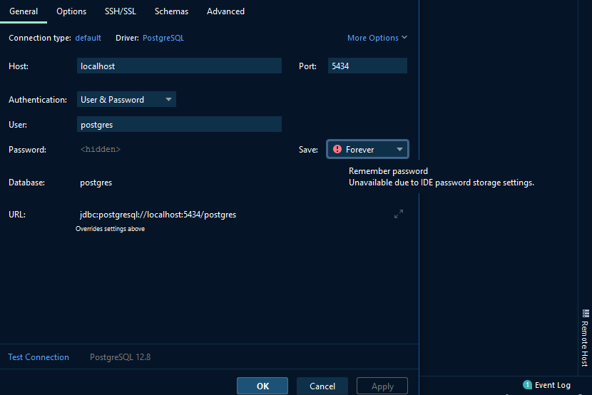
And then it turned out that password fields were also blending with the background so I added:
    "PasswordField.background": "strokeOfMidnight",
    "TextArea.background": "strokeOfMidnight",
    "FormattedTextField.background": "strokeOfMidnight",
I've also added backgrounds for TextArea and FormattedTextField just in case although I couldn't find these field types in the UI. In the screenshot above also the Database and URL fields have no background. The Database field sometimes has background depending on how I invoke the dialog window and the URL field always stays black. In other places the expandable text fields have background so possibly it's a bug or some other inconsistency but it's minor so it's not a big problem.