react-image-turntable
 react-image-turntable copied to clipboard
Published
20 hours ago •
 nerdyman
nerdyman
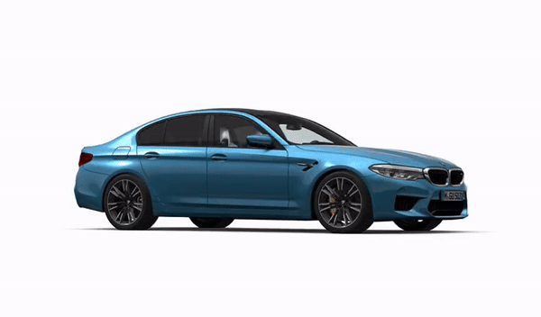
Display a set of images as a draggable 360 degree turntable.


Features
- Accessible
- Responsive & fluid with intrinsic sizing
- Supports keyboard navigation
- Teeny Tiny (less than 1kb gzipped)
- Zero dependencies
- Type safe
Install
npm i react-image-turntable
# Or
yarn add react-image-turntable
# Or
pnpm i react-image-turntable
Usage
Props
| Props | Type | Required | Default Value | Description |
|---|---|---|---|---|
images |
string[] |
✓ | undefined |
List of image src attributes. |
initialImageIndex |
number |
0 |
Index of image to show first. | |
movementSensitivity |
number |
20 |
The amount a "drag" has to move before an image changes to next or previous. |
Example
import React from 'react';
import { ReactImageTurntable } from 'react-image-turntable';

const images = [
  'https://via.placeholder.com/1200x800?text=1',
  'https://via.placeholder.com/1200x800?text=2',
  'https://via.placeholder.com/1200x800?text=3',
];

export const Turntable = () => <ReactImageTurntable images={images} />;
Also see the example code in the repo.
Custom Styling
The library uses the first image passed to intrinsically size the component, it also exports following
classNames to apply custom styles when needed.
className |
Purpose |
|---|---|
CLASS_NAME_IMG |
Base class for images. |
CLASS_NAME_IMG_PRIMARY |
Class of first rendered image (sets the size of the main component). |
CLASS_NAME_IMG_SECONDARY |
Class of subsequent images. |
Contributing
See the contributing guide to get started.
Browser Support
The library is built for ES2021.
Notes
- It's recommended you use a minimum of 24-36 for a smooth experience
- Legacy v2.5.4 Demo
- Original version by @andrewmcoupe
 nerdyman