respond
 respond copied to clipboard
Pimp my Ux
The new release of Respond UI is faster.
In the same time the new User eXperience need a significant number of click from the User to find what he need like @axis80 mentionned it.
So we talked with @axis80 and @madoublet by email about UI (as requested in the contributing guidelines) and some UI ideas like "Reveal admin controls on hover instead of on click? #557" had emerged.
We think it would be a good addition to the project than to start a reflection on the overall UX in order to make Respond evolve in helping Users find what they need. Ensure usability to increase engagement.
What do you think about adding icons in the admin menu and to let the user fold the menu ? The purpose here is to give more space to the content and give to the menu entries visual to catch attention.
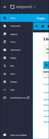
I really like the icons. I am not opposed to the menu option, but want to stay with a two column layout. I believe some Respond users put their own custom top bar on top of the UI.
I also really like the icons a lot. The only change I would suggest is to use this icon for the plugins: http://fontawesome.io/icon/plug/
Matt, is it better for you if we keep all UI discussion under this issue, or if we open a separate issue for each proposed change?
@axis80 Matt, is it better for you if we keep all UI discussion under this issue, or if we open a separate issue for each proposed change?
What do you think about creating a project for that ?
Funny video @axis80 I love it… but whatever were the icons come from (found or created) the important thing is to make sure icons are relevants for most of us.
@madoublet : I believe some Respond users put their own custom top bar on top of the UI.
Definitely that's why I think it is interesting to add the logo in the application white-label 😉
Here is my suggestion for the header :

This proposal include :
- The admin logo. Same as the
env.file# white label LOGO_URL=?, - the user account. Where we can found : User information, credit card information
- an alert icon for new submission, expired card, …
@AKAsebu I think the top bar would break some Respond installs. Plus, it is a lot of wasted space.
On a side note, I added the icons and the hover work flow to my dev build last night.

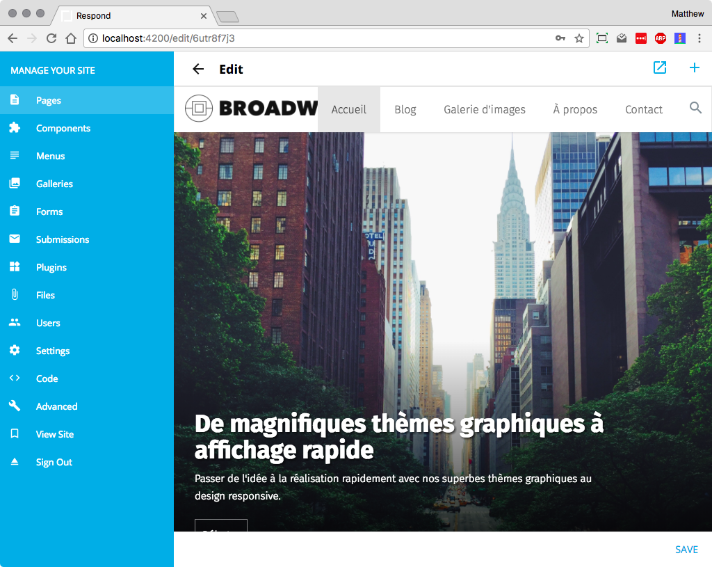
The first round of UI improvements is now in my dev build. I should release it in a few weeks. I would like to get some of the aspects of your top bar example in the next release (January). Perhaps, we can look at adding the brand or user image in the left bar. Here are some screenshots of the updates.
New List:
New Editing:

New Messaging:
So you don't switch to Firefox Quantum 😄
Great job I like the way you move forward.
May I suggest some improvements :
0#. Internationalization : We need to think about integrate all the alert messages and UI wording in the process
1#. What do you think about adding the "Trial message" on the top of the header in order to see it whatever the context ?
2#. (gain some space n°1) maybe we can move the search on the <menu class="app-menu">?
3#. (gain some space n°2) can we let the user make the choice to fold the menu and see only icons ?
4#. Like you suggest maybe we can add the brand & user image in the left bar.
This looks nice. I actually have been using the new Firefox on my work machine. But, old habits are hard to break. I have been including the error and success messages in the i18n files. Let me play with your design in the app and see how it works.
Dev build now has drawer collapse/expanded options. Also, the subscription status is at the top and persistent.
Menu Expanded:
Menu Collapsed:
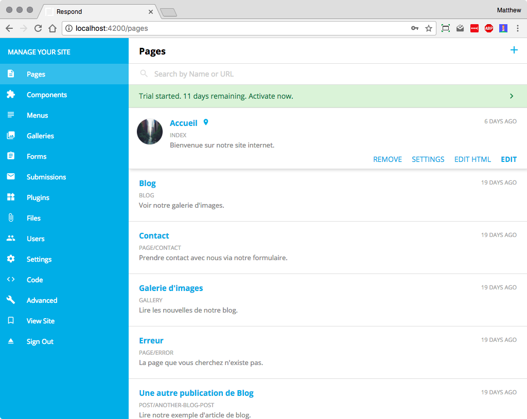
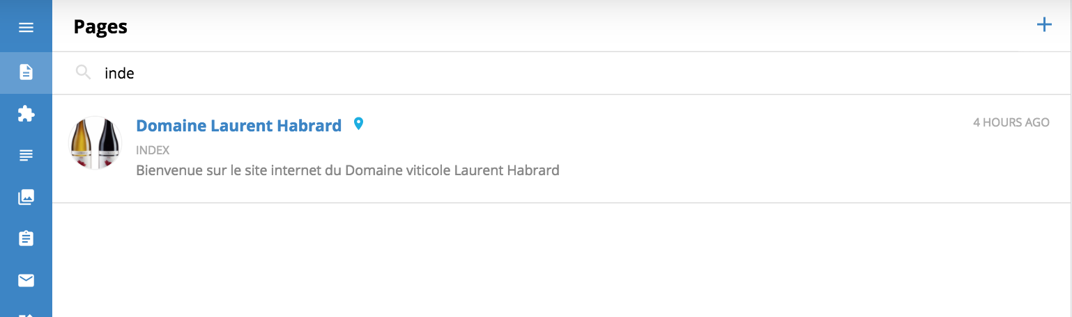
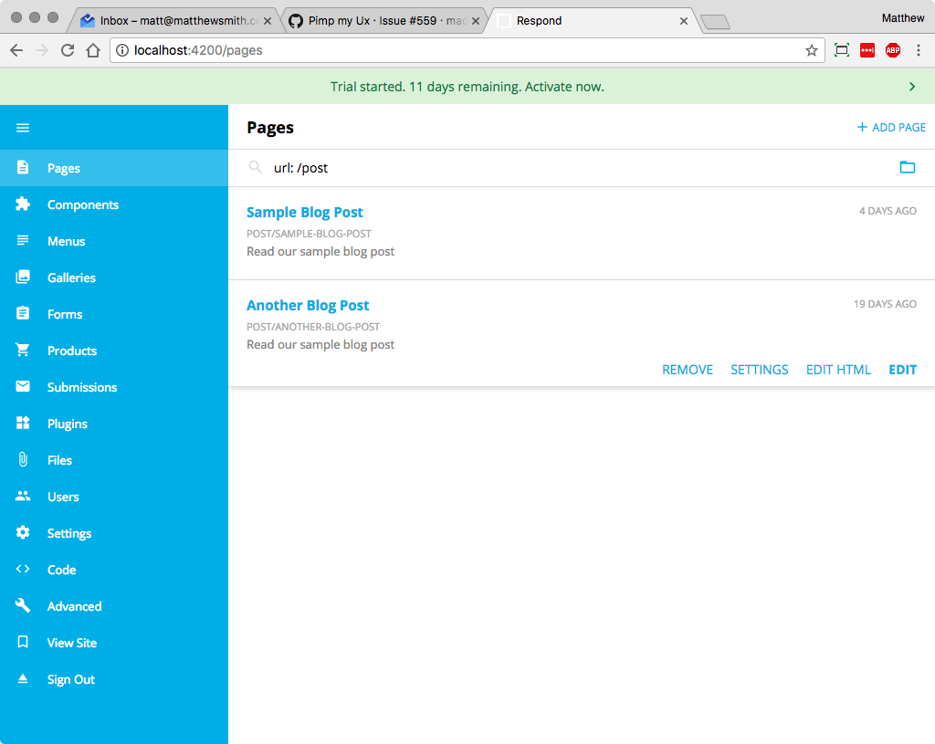
I notice that in the respond/pages there is no way to organise pages when your website has many pages as you can see in the screenshot below (find more after the picture)
 The Search is the the only way to find a page (thanks @madoublet for that).
 On the other hand we have the respond/menus in order to create the menu -> add entry -> link the entry to a page. We can also move the page in order to organise menu entry and nested entry.
What do you think about merging respond/pages in respond/menus ?
I believe we could thereby keep the respond/menus UX but create page & menu entry at the same time in order to streamline and speed up the process.
@AKAsebu To be honest, I love the Pages UI. I use it on a regular basis for the respondcms.com site. Respond has a ton of pages and I usually can find what I am looking for in a couple key strokes. It is probably my favorite thing about Respond. Can you imagine managing a large amount of pages in the other big name CMS solutions? It would be really painful. With that said, I think it can be improved. I like the idea of a quick way to see what is in a folder. I typically just type "pages/" and I am there. But, this is not 100% intuitive. So, perhaps, I can build some UI around that.
At first glance, I don't like the idea of combining Menus and Pages into a single UI. It probably would make sense for small sites. But, it would make managing large sites difficult because the majority of the pages don't fall into the navigation. Perhaps, some improvements are in order for the Menus UI. It could really use drag-and-drop reordering. But, I am not sold on combing the two.
I see your point and I totally agree with you about the search.
- I agree with you about managing pages in big name CMS solutions. It is painful and that is the reason I choose Respond to fit the users needs 😉
I propose a merge because both admin/page and admin/menu share sames visual organisation & UX for creation but the logic between "menu" and "pages" is not obvious.
Like every system Respond should follow this 10 Usability Heuristics for User Interface Design proposed by Jakob Nielsen.
The system should speak the users' language, with words, phrases and concepts familiar to the user, rather than system-oriented terms. Follow real-world conventions, making information appear in a natural and logical order.
It is customary that when you create a website you organise your menu/tree first and then after you create the content in your pages. To do that we need 6 steps :
- go to admin/menu
- create the menu entries,
- go to admin/pages
- create the pages
- go back to admin/menu
- link the pages with every menu entries
It could be relevant to reduce the process with only two steps :
- go to admin/menu
- create the menu entries by creating the pages
Of course we need to keep the best of both admin/pages and admin/menu like the search.
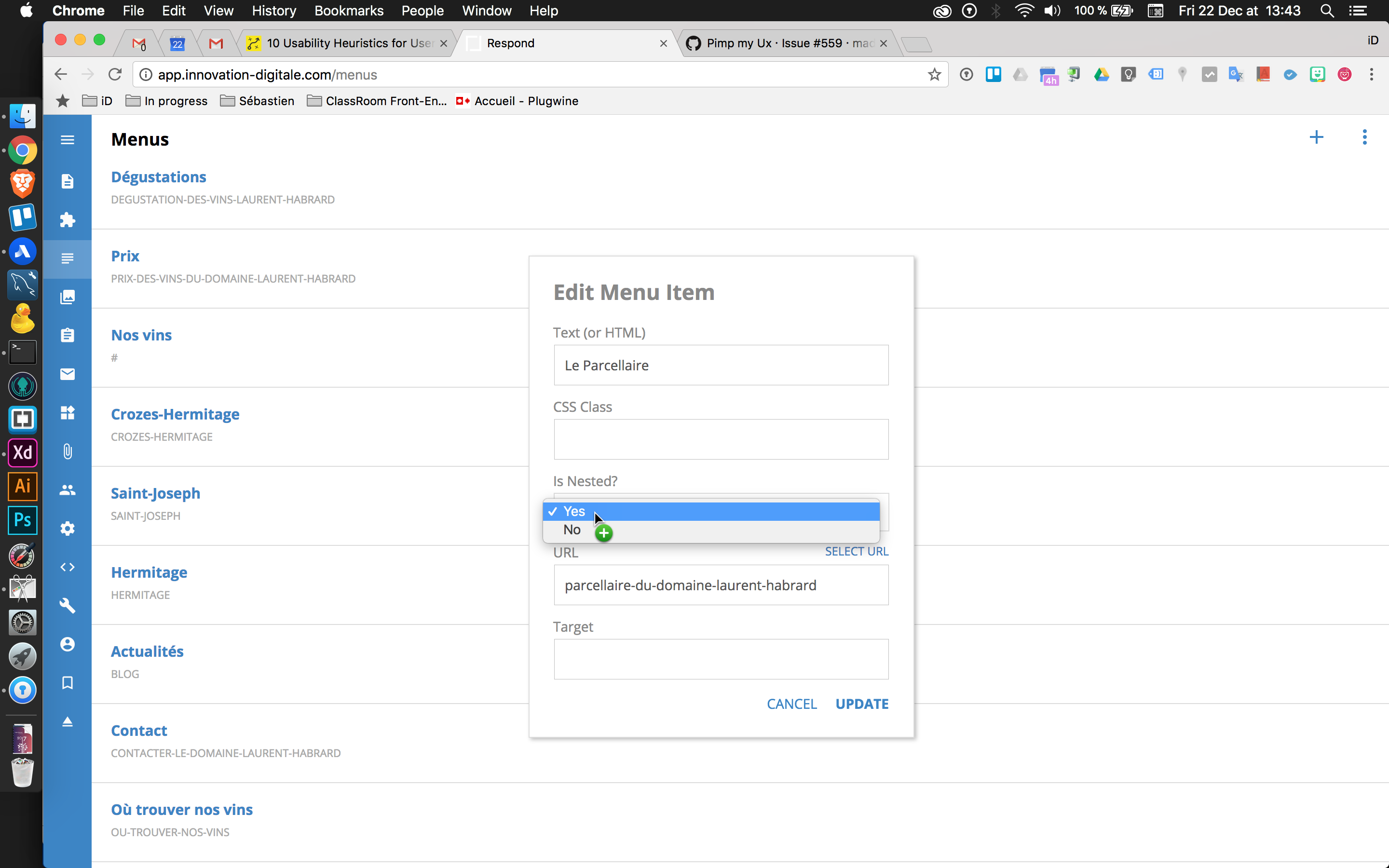
++ with many entries in a "menu" this is complicated to understand the website menu tree organisation. You need to click on the "Edit Menu Item" to see if an entry is nested or not.
Maybe this UI could be relevant (with your drag n drop idea included).

What do you think @madoublet ?
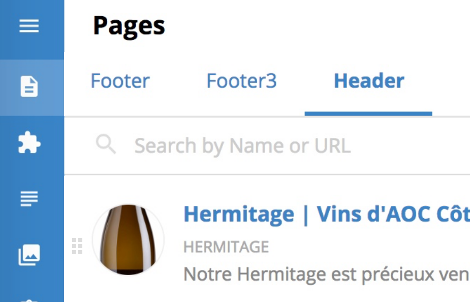
I agree with @AKAsebu that there should be a better way to organize pages. I like this mockup that he created:
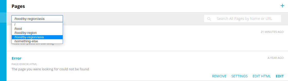
However, if I am not mistaken, Respond will support any number of folder levels, e.g. /food/by-region/asia/japan/side-dishes/salad.html . So I worry that it would not allow the user to traverse up and down through the folder hierarchy. How about something like this, similar to Respond 5?
The style of that mockup is not very good but hopefully it gets the idea across. Maybe a folder icon could be added, and even a "+" button to add a subfolder.
I agree with @madoublet that the pages list should not be combined with the menu editor, for the same reasons he stated.
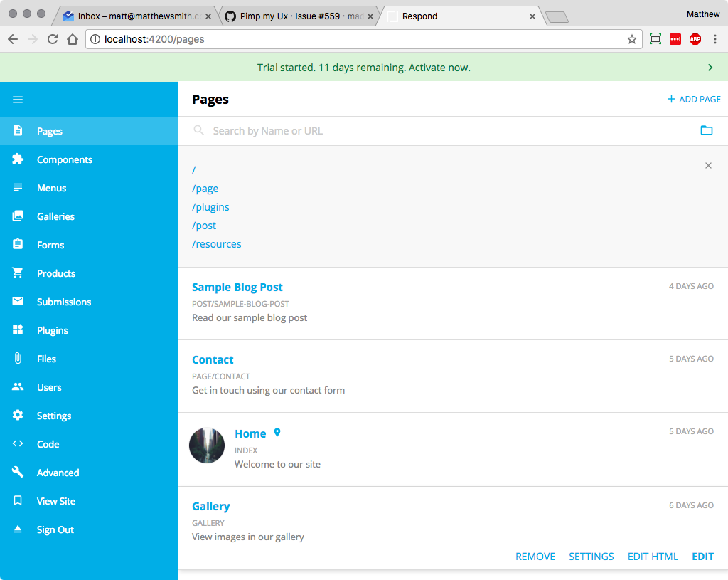
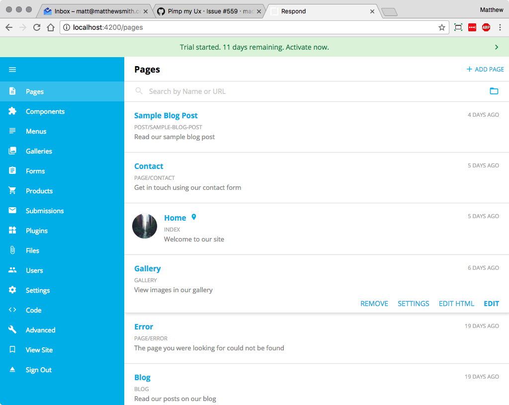
@axis80 I am still working on adding a folder option to the search. This is a great idea. But, I wanted to tackle the UI on the menu page first. See Screenshot below.
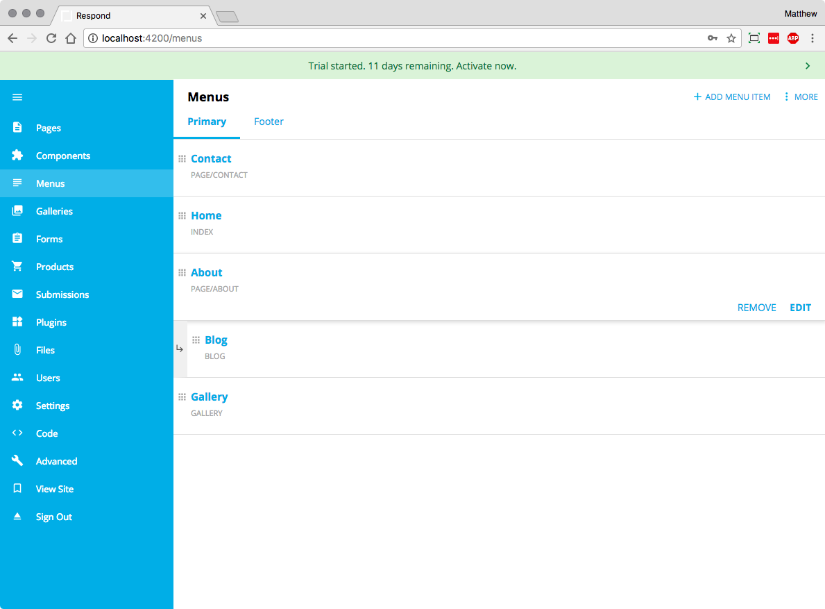
This is getting much closer to @AKAsebu mockup. You now have an indication of nesting and you can reorder using drag-and-drop.
@madoublet Maybe one of these tree widgets would work for this situation? https://angular-ui-tree.github.io/angular-ui-tree/#/basic-example or http://thienhung1989.github.io/angular-tree-dnd/demo/#!/table .
@axis80 I had time to work on this one today as well. This is what I was thinking:
Sorry, those are out of order. The Github image upload is horrible. Basically, the folder icon would expose a list of folders and that would start a search that looks for the specific folder.