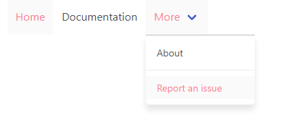
 jgthms
Highlighting the active page in a navbar
This is about Bulma.
This is a question/I need help.
I have a navbar, and I want to highlight the active menu entry. I can set extra classes on the active menu (I currently add is-selected but I could add any other); I'd want to achieve the visual effects of is-active but without the menu remaining dropped-down. Is this possible?
This is about the Bulma CSS framework I'm using Bulma version 0.6.2 My browser is: Chrome I am (fairly) sure this issue is not a duplicate
Are you talking about the dropdown menu or the burger-menu? Because with the latter using is-active on navbar-item is no problem.
This might be a good chance to make the a.navbar-item.is-active style more noticeable on the default bulma skin (no coloring of the navbar) since it goes from #0a0a0a (active) to #4a4a4a (not active).
Also the active background is transparent. Shouldn't it be some kind of gray?
I hope I explained myself clearly. I can provide some HTML samples if necessary.
Can I request that .navbar-item.is-active gets an example in the documentation?
@Lucretiel what kind of example are you missing?
The last paragraph of the navbar-item section in the documentation already mentions:
You can add the following modifier classes:
is-expandedto turn it into a full-width elementis-tabto add a bottom border on hover and show the bottom border usingis-active
Adding is-tab to my a.navbar-item's fixed the visibility problem mentioned by @rodrigoaguilera, for me. The item having is-active is noticeably highlighted, now.
since it goes from #0a0a0a (active) to #4a4a4a (not active)
Indeed. It seems that the current rule is simply to darken the color by 5%. Accessibility wise this clearly fails. Especially since this is only text and not an area (this makes it even worse).
Since the 5%-logic obviously fails, you need to add another hint for activation (i.e. migrating to a tab look or adding a background colour as mentioned before) or you can visually 'inactivate' the inactive colour even more. For instance something like this:
With SASS/SCSS
$navbar-item-color: lighten($text, 30%);
CSS
.navbar-menu .navbar-item, .navbar-link {
  color: #9C9C9C;
}

Or something like this: (same styling as an item when hovering)
nav.navbar a.active {
    background-color: hsl(0deg, 0%, 98%);
    color: #FA7C91;
}
See example: CodePen - active navbar-items - Bulma
PS: class is-active is used for opening a hoverable item, not for showing if the current nav-item is the active page.
You can add the following modifier classes:
- is-expanded to turn it into a full-width element
- is-tab to add a bottom border on hover and show the bottom border using is-active
Am I missing something here when I read this? There is definitely no border being applied to a.navbar-item.is-active. If the intent is for is-active to be applied as a modifier only for dropdowns, the point stated above in the docs is incorrect.
You can add the following modifier classes:
- is-expanded to turn it into a full-width element
- is-tab to add a bottom border on hover and show the bottom border using is-active
Am I missing something here when I read this? There is definitely no border being applied to
a.navbar-item.is-active. If the intent is foris-activeto be applied as a modifier only for dropdowns, the point stated above in the docs is incorrect.
I agree and did check this. I think docs are wrong. We need to have both is-active and is-tab to have bottom border on active page.