celeste
 celeste copied to clipboard
Published
20 hours ago •
 hwittenborn
Improve UX for sync errors
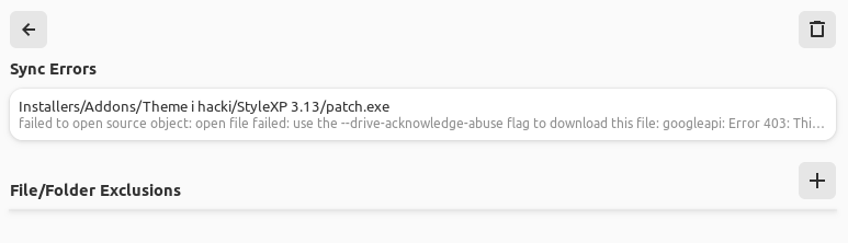
Currently when a long sync error is shown I have to make my window very wide to be able to read the error.
Some proposals:
- wrap the text to show it in full
- show it in a tooltip on hover/focus (for keyboard users)
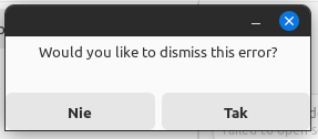
- show it in full in a window that opens when I click the error:
I didn't think about there being any way to view the error once it's too long, I can definitely see how that could be an issue. I'll try to get something going for that soon.