sentry
 sentry copied to clipboard
 getsentry
feat(tabs): Add new Tabs component
Add a new Tabs component as a replacement for NavTabs, with a composable implementation and full accessibility support (via react-aria).
Sample usage:
import {Item, TabList, TabPanels, Tabs} from 'sentry/components/tabs';
<Tabs>
<TabList>
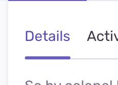
<Item key="details">Details</Item>
<Item key="activity">Activity</Item>
</TabList>
<TabPanels>
<Item key="details">So by colonel hearted ferrars.</Item>
<Item key="activity">Draw from upon here gone add one.</Item>
</TabPanels>
</Tabs>
One notable feature is the overflow menu: https://user-images.githubusercontent.com/44172267/190467998-b6baf2a6-85ac-4713-a9cd-137a8f3bed34.mp4
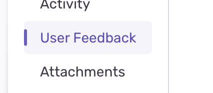
I kinda want the little visual indicator to have some left padding here I think
Also IMO we don't need a border radius on the little purple active indicator bar here either
I kinda want the little visual indicator to have some left padding here I think
The design for the vertical orientation hasn't been approved by the design team yet – I'm only adding it here as a preliminary implementation. We can definitely consider adding some left padding to the purple indicator!
size-limit report 📦
| Path | Size |
|---|---|
| src/sentry/static/sentry/dist/entrypoints/app.js | 63.24 KB (-0.03% 🔽) |
| src/sentry/static/sentry/dist/entrypoints/sentry.css | 70.6 KB (0%) |
![github-actions[bot] avatar](https://avatars.githubusercontent.com/in/15368?v=4 "Published by a pub.dev verified publisher")