CyberChef
 CyberChef copied to clipboard
 gchq
gchq
Misc: Mobile UI
Summary
The current UI isn't very good on mobile devices. We should start thinking about how we can improve it.
Possible solutions
There are two paths we could go down:
- Create an entirely separate UI for mobile devices
- Make modifications to the current UI so that it adjusts better to fit smaller screens
I'm keen to hear people's opinions on which route they think is best. There are definitely pros and cons to each one. If we create an entirely new UI, it will break a lot of the code in src/web/ which is currently tightly coupled to the existing DOM. However, modifying the current UI to work better on mobile could result in messy code if it isn't done well. This could be a good time to start building index.html in a more modular fashion so that the code becomes easier to maintain.
If anyone wants to mock up some designs for what a mobile UI could look like, please go ahead. The focus should be on simplicity.
I'd vote for a responsive UI using a flex-grid or similar. I do not back my frontend skills enough to take this on though.
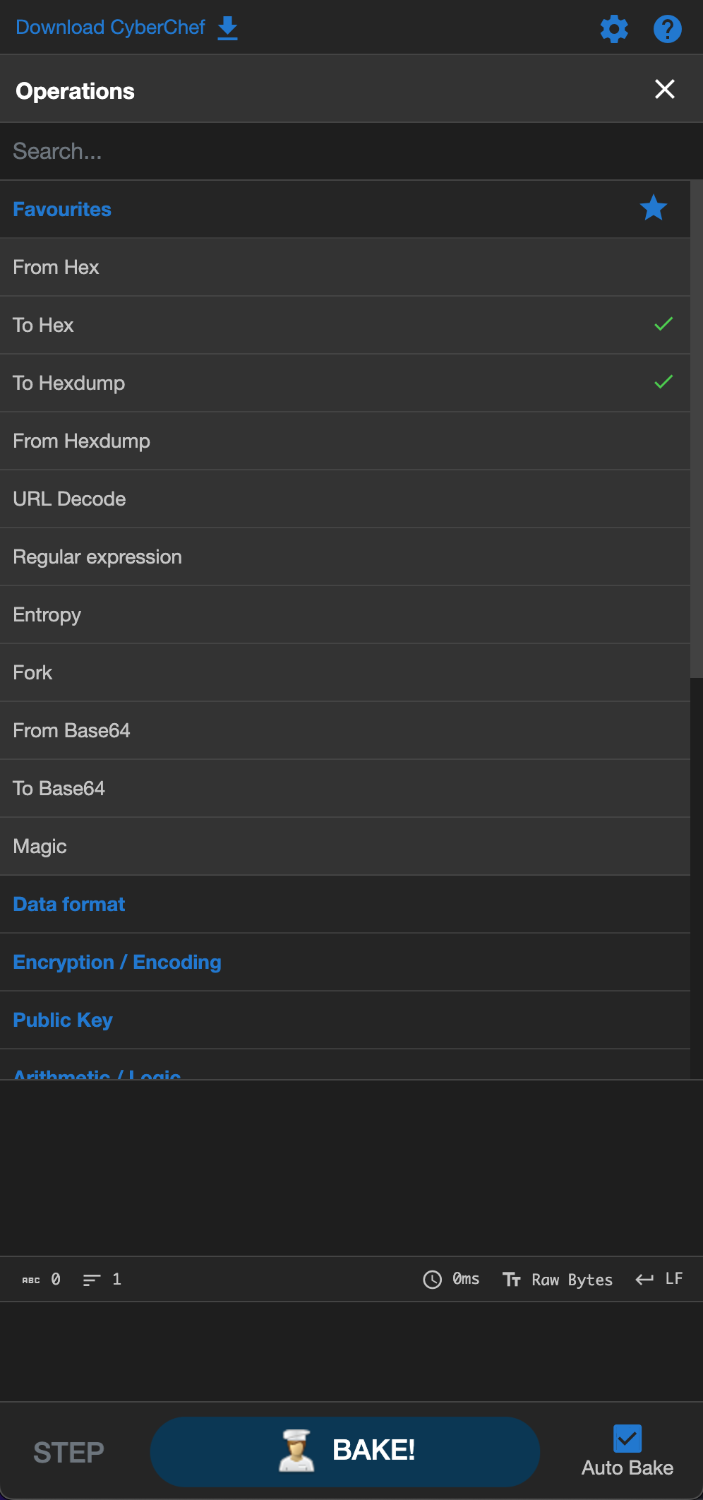
I support one responsive UI. The main issue when designing for smaller mobiles (i.e. iPhones, such as the SE, in portrait mode) is that the space is very limited. As I see it, there are four main* elements to the CyberChef page, defined as:
- Operations Bar
- Recipe List
- Input
- Output
*There are additionally auxiliary elements, such as the options, support, and download buttons.
Cramming the 4 main elements into one screen is difficult. The commonsense solution would seem to be to separate them out into pairs of two - however, recipe theoretically needs to be seen with both operations and with output (for making a recipe and then stepping through it purposes). Therefore, I would propose a design with a fixed bar at the top showing options and support, a fixed bar on the bottom showing download and latest release, and then a 4-row stacked column, stacked in the following order:
Operations
Recipe
Output
Input
I'm not an amazingly talented developer, but I'm competent, I'm willing, and I've got free time. If y'all can think of any conflicts, I'd be glad to hear what you think of the proposed design. I'll send up a visual template of the design I'm proposing this weekend. No guarantees on speed with this, but seeing as the issue has been untouched for ~2 years, I don't foresee that being a problem.
@Cal-Hagner I'd maybe change the order of Output and Input.
Would be interested in seeing a visual template!

Notes:
- There is a third possible screen configuration --> Recipe & Output (for walkthroughs of recipes
- The addition of a scroll-bar to recipe will need to be handled (should be minor changes from current configuration
- Overflow-y of both recipe and operations will need to be handled
- Options and support will remain fixed at top of page, & download and build info at bottom -- Build info shortened to “Last build: _ days ago – v_”
- Options page will also need proper resizing
Notice: As I begin to work from my fork of CyberChef, I may need some assistance with figuring out how to view my edits in my fork in the GitHub page at https://cal-hagner.github.io/CyberChef. I'm familiar with front-end, it's just GitHub I don't understand. 🙃
Happy holidays!
Heya CC,
I've been working a little on this and so far I've landed on the following mobile UI layout:

A few choices I made and why:
- I'm thinking to set the breakpoint for this UI to 768px, then use the current UI as is from that point. As soon as is usable, I think the UI should jump to the current UI
- I'd like to make
operationsa dropdown - Disable resizing of columns and maximise output on this view ( hence the relevant icons have been removed on this mobile UI )
magictool andstale-indicatorappear to the left of the icon row if applicable.- The
noticein the top banner would not be displayed on mobile - I removed the text for
Options,About / Supportin the top banner to save space. I think the icons alone are straightforward enough
Please do share your thoughts!
https://user-images.githubusercontent.com/40611703/233067276-7132f97b-1694-4126-a6af-84c6fa9a3cbd.mov
- Desktop layout restored & some issues resolved that caused some lingering layout inconsistencies.
There are a bunch of little things left to fix up but overall, getting there!
After some testing on a mobile device, a few observations and possible solutions.
For the operations dropdown:
-
Dragging and dropping won't be an option on mobile ( and should be disabled ), because it makes scrolling the list very uncomfortable ( and enraging ). Possible solution:
- Let users add operations to
rec-liston mobile viadouble tap, then add a checkmark at the right end of the op-list item. - The checkmark acts as much needed visual feedback to see what was / wasn't added.
- Let users add operations to
-
The above causes a problem for adding favourites though... I'm not sure what would be best to do. I don't think dropping the favourites category on mobile is desirable, especially on mobile devices with more finnicky UI it's nice to have 'short cuts'. Possibly a long press > then drag and drop?
-
I think the
popoversneed to be disabled on mobile. They are hindering normal UX and are quite annoying. There isn't enough space for them imo.
On window widths < breakpoint, where we cannot see the operations lists and the recipe panel at the same time:
- a checkmark gets added on double clicking or double tapping an operation ( to be removed once recipe gets deleted from list )
- drag events are no longer possible, except in the 'edit favourites' modal where favs can still be rearranged as desired
- popovers are disabled
- the check icons are not displayed on desktop view, as the UI remains the same as the current UI ( but could opt to leave it on desktop view as well )
This leaves the following issue:
- how will a user on mobile add an operation to their favourites ( now that they cannot drag to 'favs' category anymore )?
Possible solutions:- add a star icon ( outlined ) to the operation that will be filled when tapped, and added to favourites
- long press, then allow drag and drop to the favourites category
to complete the cut off commit message above: "add 'add favourite' capability for mobile UI
On mobile, I found that scrolling through the operations and the drag and drop of an operation to the favourites category was very finicky.
- I have added outlined star icons to the start of the
operationrow - a user may press it to add it to the
favourites list - the star icon then fills in to indicate it is a favourited operation
- the
favourites categorydropdown opens as per current behaviour after adding a favourite ( I think it may be nicer if it wouldn't ) - note that the icon is not a toggle, removing a
favourite opmust still happen the same way as per current behaviour ( through the modal )
I also added the capability to maximise recipe, input and output panes on mobile UI:
Maxed panes
Recipe
- user may edit
ingredientshere as normal - double tap to delete one
ingredient - change order by pressing on an
ingredientwith a delay of 200ms: there is some visual feedback when theingredientis grabbed and the order can be changed as normal
All of the above can also be done outside of the maximised pane, but the pane is just rather small and it's not comfortable to do so ( hence the maximised pane view )
Input
- for more comfortable UX
Output
- to comfortably view the
output
On desktop, everything remains as normal. Only the output pane is able to be maximised.
- I have updated the
controlscomponent to50pxtall on mobile.70px( previous ) was taking up a lot of space that can be used more efficiently. - Please note the chef icon has been removed on mobile view.
- Please note the 'Auto bake' text has been shortened to just 'Auto' ( as the
controlscomponent is already in the context of 'baking' ) to save space and reduce resizing complexity. - On desktop the
controlsheight is70pxas per usual. The icon is also visible as normal.
Just a quick demo for the smallest possible screen before the layout would jump into mobile UI mode:
This would be a width of 768px.
Everything looks normal ( albeit cramped, but that is expected ) and all buttons etc. can be pressed, no weird overflows. Optionally, we could decide to set the breakpoint higher of course.