securedrop-docs
 securedrop-docs copied to clipboard
Diagrams should indicate that SecureDrop is a shared inbox
Description
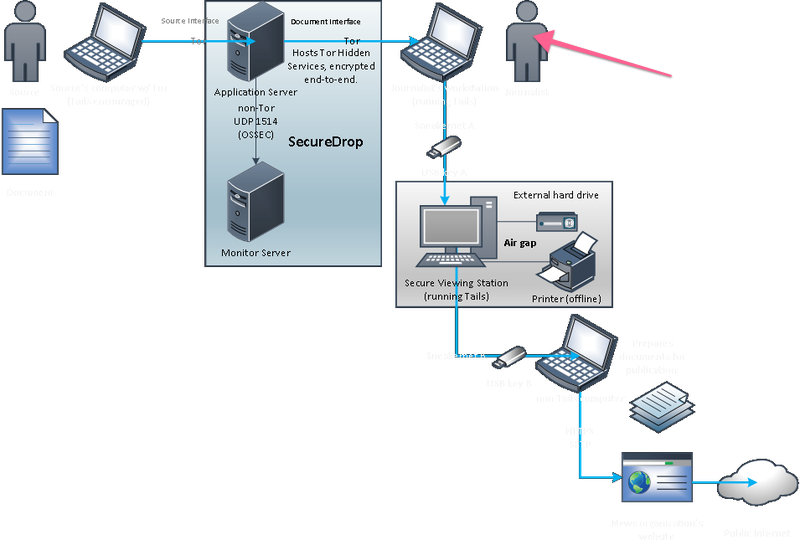
Current language and images suggest that sources communicate with individual journalists rather than organizations. The 1-to-group (rather than 1-to-1) communication model can be made more explicit. Example of current explainer below.
Quick fix
Make the person on the right a group of three and update language around that.
Better fix
Clear up language around "journalist", "organization", "instances". Make sure buttons say things like "share with [organization name]".
@bumbleblue!! So good to see you here! :)
Agreed, thank you for flagging this! The more eyes and minds on these subtle user-facing bits, the better.
I created the below, 2 years ago... when I was first getting my head around both Tor and SecureDrop. The 3 little "Newsroom Weebles" should at least be carry-over-able. Maybe the Source Weeble, too (if it doesn't seem like too much of a ripoff of Signal's branding?).
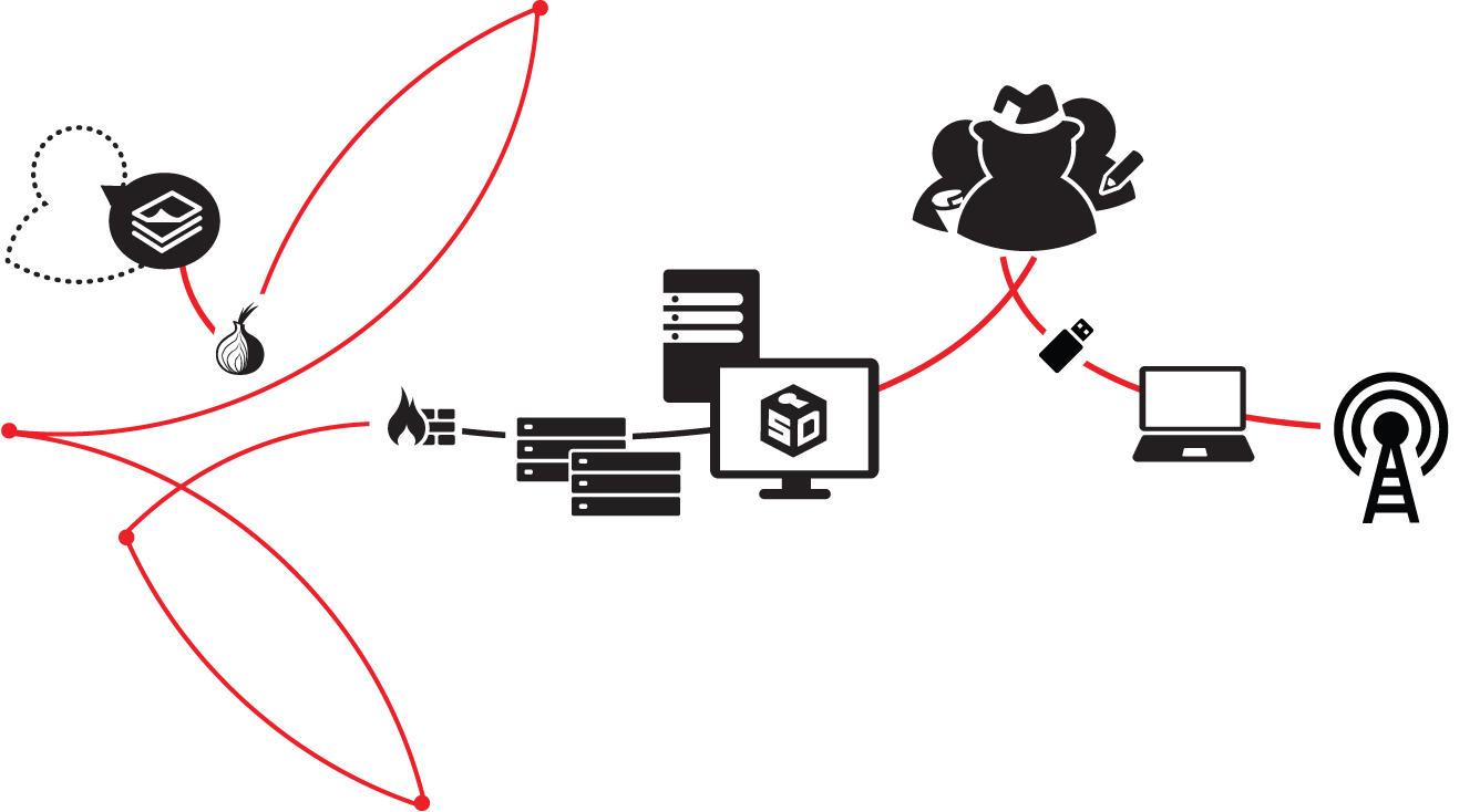
I think for communicating how all this works to Source users (whom we've also got to start calling something more human/clear-sounding to folks unfamiliar with Journalism jargon, than "Source") a clearer illustration with clearer language should absolutely be in order. I wouldn't be surprised if the FPF training team has already come up with something, come to think... (@huertanix?).
Thanks again for flagging. We should also get this (and any improvements) in front of users to get their thoughts; and this would be a terrific tidbit for group user testing.
@ninavizz We don't have anything in terms of illustrating the whole workflow yet. We do have a slide talking about how Tor hidden services in general work (technically three hops on each side with a rendezvous point in between):
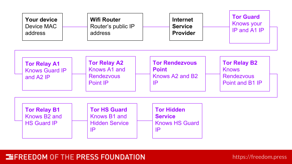
@huertanix Oh, that's a great step-thru! I don't believe users will be able to grok it w/o a visual, though. I'm happy to make a clearer graphic than what's on the site now, that takes all of these things into consideration. Not this Sprint, tho, maybe next one @eloquence?
Longer-term, it would be nice to chat through some of the Source experience pain-points with @eloquence and @redshiftzero to see how those might get prioritized in the work over the next 6mos. It'd be nice to at a minimum, poke at this and that here and there, as we're all able to—and to have some of those things prioritized.
Also, I don't believe most users will know what to make of all the IP hops. A potential option is to provide a "Basic" version, and an "Advanced" version; by default, show the "Basic" version, and if a user wants more details then have a clearly discoverable link to an advanced version (which could even just be the workflow chart).
I don't believe most non-technical users (so, the majority of Sources) even know what a MAC address or an IP address really are. I know I sure don't really understand the technical implications of the flow chart you shared—for my tech it's cognitively abstracted as "Squirrel A hands Acorn 01 to Squirrel B..."
@ninavizz Yes, I'm up for working together on a new graphic that better communicates the core concepts, in the near future. The old graphic is outdated in one other important way; it refers to the "Document Interface" which is now called the "Journalist Interface". Perhaps we can aim to create a similar graphic for the Qubes architecture at the same time, so we can use a consistent style to explain both.
It's worth noting that a handful of individual journalists do operate SecureDrops, but I agree that this particular graphic should default to the more common case of multiple journalists.
I suggest that we keep this issue scoped to the documentation aspect, and treat any proposed changes to the source interface (which does not use this graphic) separately.
@ninavizz To be clear, this is one slide which follows an entire deck of slides walking an audience through identifiers in networks, including mac addresses and IP addresses. This is 5th from the last slide, iirc.
Hi @ninavizz, how nice to meet here! And what a cool graphic!!
I really like the group of journalists in your graphic. I also like how you're trying to add information on Tor hidden services. The thing I would do here is make those two different graphics - for the first case, people only need to see an onion / sth that signifies anonymity. And then, if people want to find out how it works exactly, you can offer a graphic explaining onion routing - or link directly to whichever explainer Tor is using. Otherwise I think the red lines may be a little confusing.
Another thing: labels might help here as well. Technical graphics can be ambiguous (e.g. a laptop can also be a server), so labels could make this graphic more explicit.
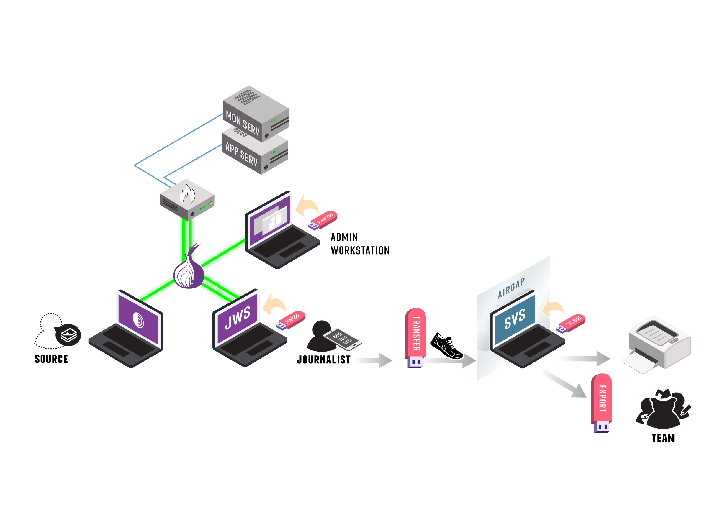
Retitled for clarity. Note that the diagram in the issue body is only used in the website FAQ at this point; the overview in the docs uses a different diagram. We should standardize on a single diagram soon, and as part of that, more clearly indicate that the current architecture uses a shared inbox.
I totally grok where Eileen is going with this, but I don't actually feel the broader system diagram is the best place to introduce the shared inbox concept. Especially since each user has a unique login—which is Yet Another Mental Hurdle. I'm very curious to see how Basecamp, Harvest, and Redmine (or other shared inbox but unique login systems) present the shared inbox concept in their docs.
Might there still be a desire to update all user-facing (vs admin) diagrams in the docs to align with the ones below (fedora free, of course)?
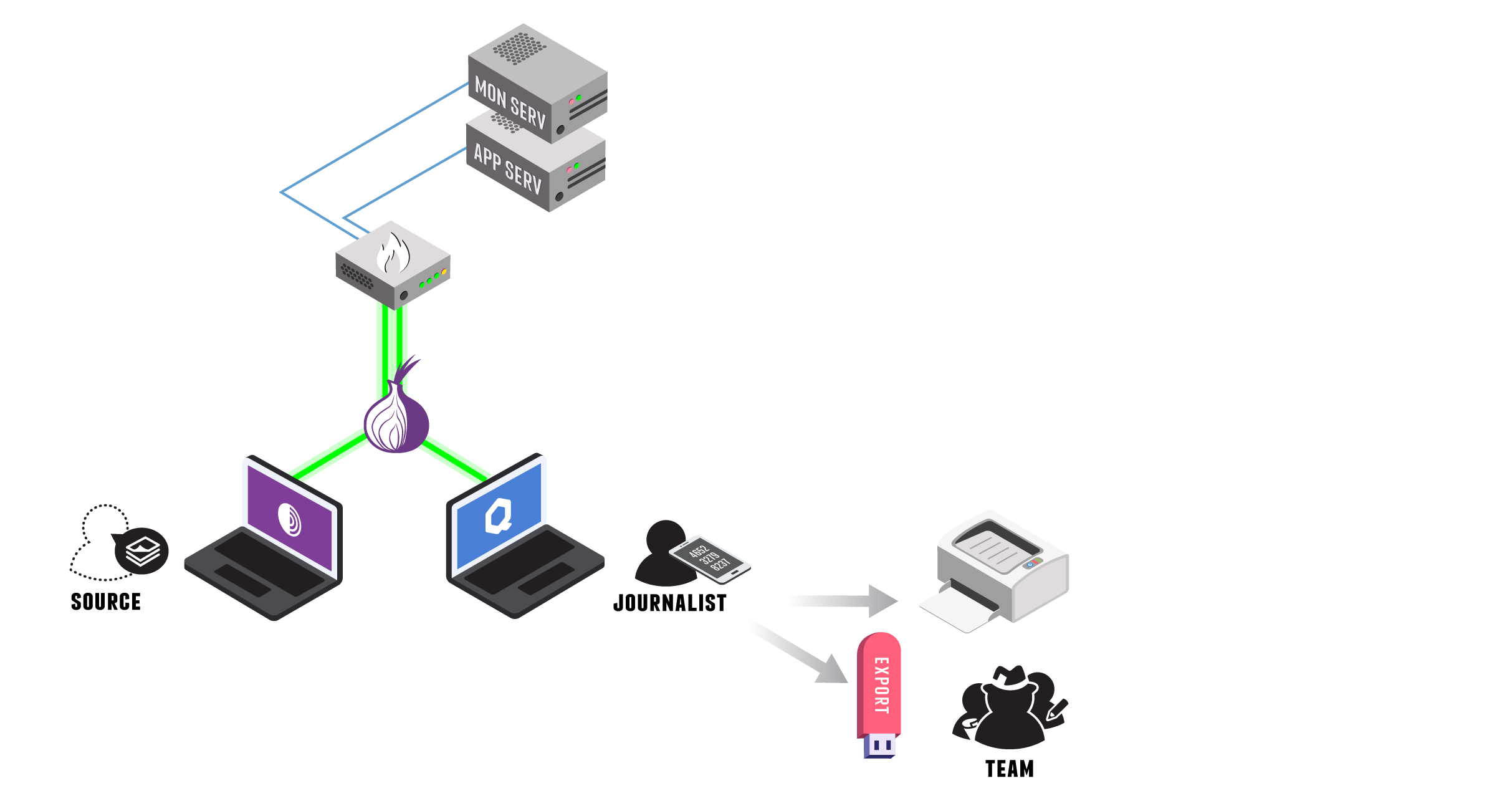
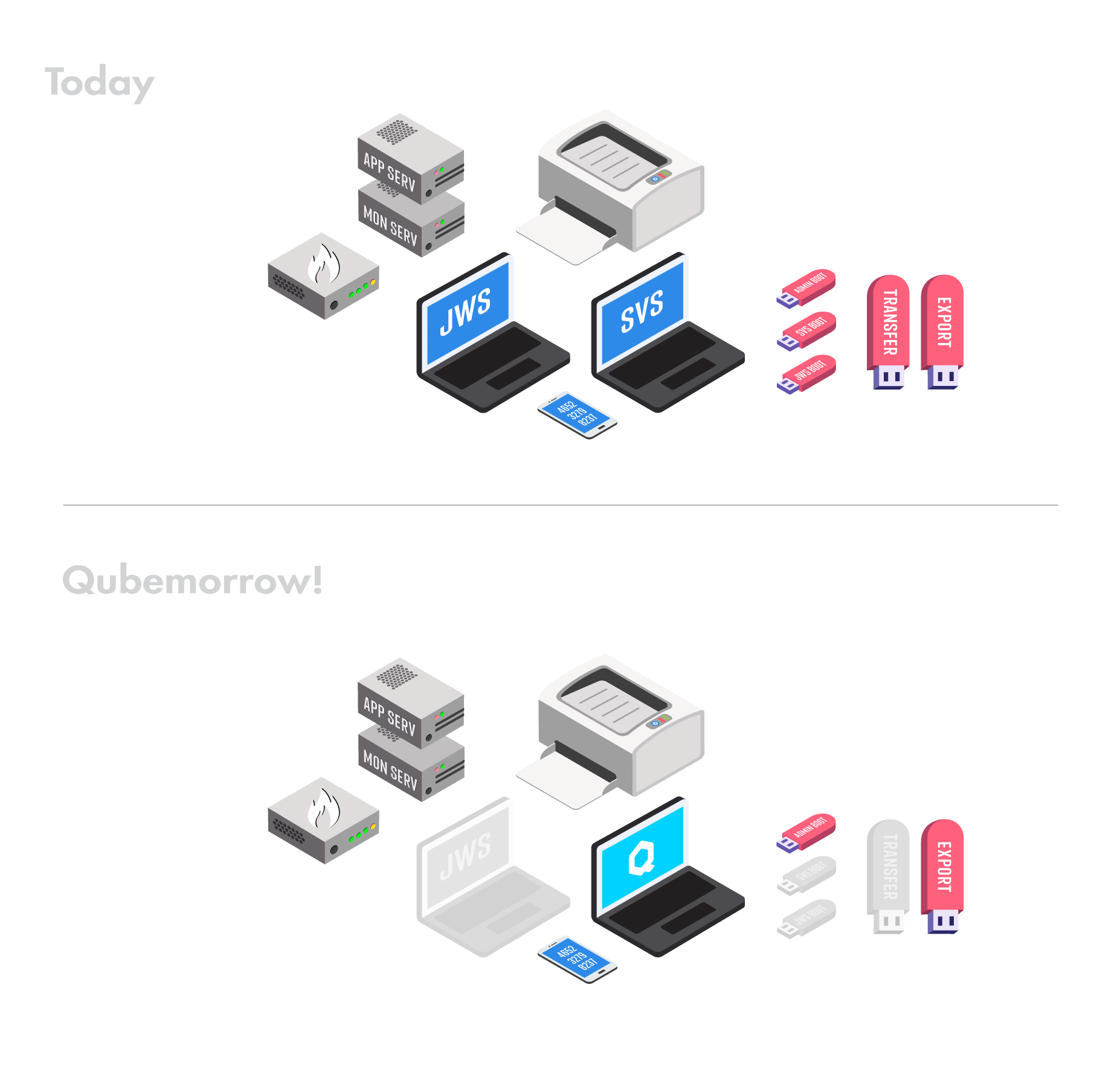
Might there still be a desire to update all user-facing (vs admin) diagrams in the docs to align with the ones below
IMO that would be desirable, yes. The one that's at the top of this issue is currently used in the FAQ, here: https://securedrop.org/faq/about-securedrop/#how-does-securedrop-work
Your SecureDrop classic diagram is a pretty good drop-in replacement for that. For the overview diagram in the docs we'll have to do some more scheming to come up with a good replacement -- ideally one that we can empower the whole team to make small tweaks to, in order to keep it up to date.
Who is the "overview diagram" intended to serve? Where is the unique value it offers separate from the how-does-securedrop-work diagram, and has it been validated that "x" audience group desires "y" information? I personally find it to be really overwhelming and confusing.
Between fonts management issues, quality concerns with available FOSS fonts, and limitations with software availability for Linux environments, I'm also not sure how realistic for "anyone" on the team to have editing access to files. Would it be acceptable for "3 people have Adobe software and Macs at FPF, therefore..." distribution of responsibilities? The diagrams I made also use the proprietary font used for the SecureDrop Brand, Franchise.
Harris and David have access to all the same software I use, I believe. Jen also has it all, too.