apm
 apm copied to clipboard
[Observability] Overview: Add Service inventory services tables with new health indicator and sparklines
Summary
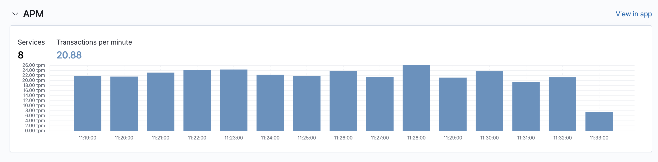
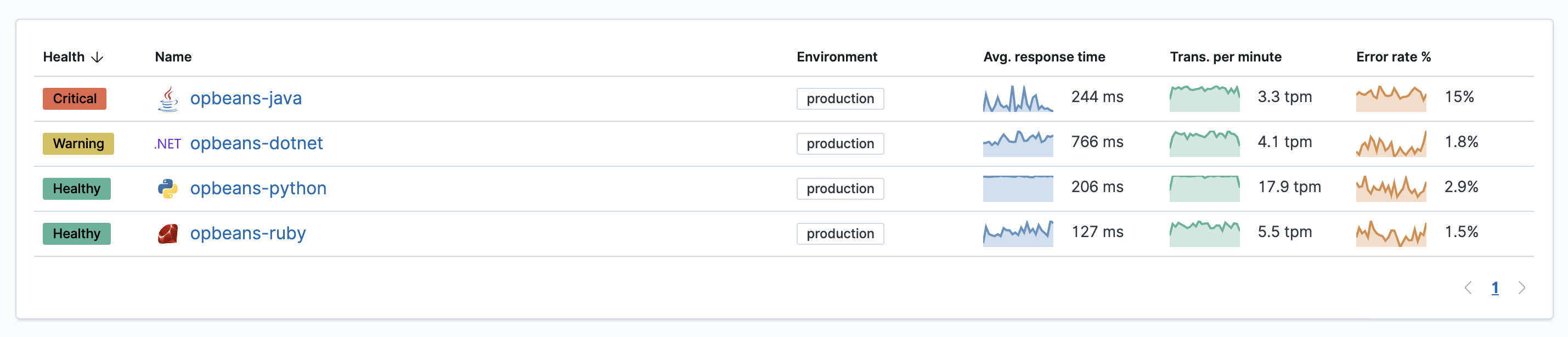
We want to enhance the APM widget on the Observability overview page and make it consistent with the new Service inventory services table.
Replacing...
With this...
Tasks
- [ ] Create new Observability overview mock with the new widget
- [ ] Allow for pagination on the service table, limit to show top 10 sorted by health, and then by traffic.
Quick idea: what if in the new design we offer a choice of either showing top services based on traffic (or other metric) like suggested above; or a configurable option to show most frequently visited services instead (almost like in Sari). This setting would likely be per each user.
The reason behind this suggestion is that in large environments with many services there a big chance that a particular user is responsible for a subset of services, and by checking out those services frequently he/she would promote making them available on top of the observability page.
@alex-fedotyev I like the suggestion of customization, which is something we have discussed as part of the initial design of the overview page. I would prefer this to be considered a page-wide feature meaning that the user would be able to configure for each widget which datasets or services they would like to see. I don't think we're in a place where we can dedicate time to this now, but will hopefully soon to take the feature to the next step.
Re: changing the list of services displayed, the user will be able to sort by any of the metrics in the table (most traffic, latency etc.). Most frequently visited demands us implementing some way of keeping history per user of which services they visit and I actually imagine the selected services would re-arrange in the table very often as a user moves between services to analyze a trace. That's if I understand your suggestion correctly.
cc @cyrille-leclerc