datta-able-bootstrap-dashboard
 datta-able-bootstrap-dashboard copied to clipboard
 codedthemes
Navbar not appearing on mobile view
Description: The navbar is not visible in mobile views.
To Reproduce please execute the steps
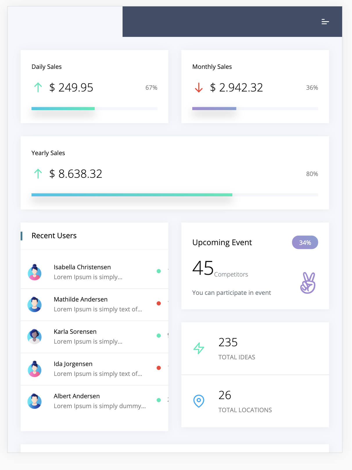
1 - Start Template
2 - Change the resolution to 1048x445 (responsive) or bigger - Navbar is there:

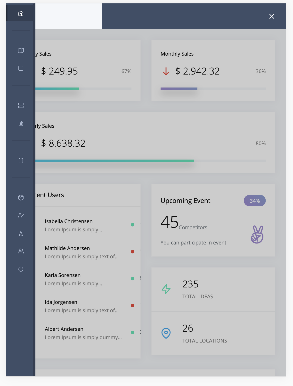
3 - Using a lower resolution, the navbar is not visible anymore - Iphone X screen ratio:

4 - Using responsive 972 x 1156 ratio - navbar is not displayed:

Expected behavior
Navbar should be accessible on all resolutions as a full expanded menu or burger menu on lower resolutions
Desktop tests:
- OS: Windows 10 - Browser Chrome Latest
- OS: Windows 10 - Browser Firefox Latest
same issue here ... any help would be much appreciated ! I spent hours and days working on this theme template, then realized it ain't displaying fine on mobile phones ... it's a shame because it's a great template. Thanks chaps for your help :-)
@jossgillet These steps are for this Flask template. But it shouldn't be much different regarding the HTML. Just add it directly instead of doing step 2.
- Add this to
navigation.html:
<header class="navbar pcoded-header navbar-expand-lg navbar-light d-lg-none">
    <div class="m-header">
        <a class="mobile-menu" id="mobile-collapse" href="#!"><span></span></a>
        <a href="/" class="b-brand">
            <div class="nav-item pcoded-menu-caption">
                <!-- Your logo img here -->
            </div>
        </a>
    </div>
</header>
- Then, in
base.htmladd:
<!-- Top Bar -->
{% include 'includes/navigation.html' %}
So that it is below this line:
<!-- SideBar -->
{% include 'includes/sidebar.html' %}
That should be all for the mobile top bar to appear. Let me know if it works for you.
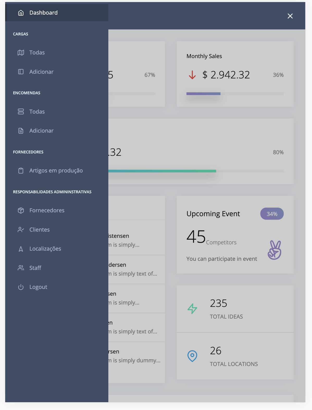
@Teraskull I'm working with the Django template, and this almost worked 100% for me.
With that navigation.html I was getting the following:
| first | second | third |
|---|---|---|
 |
 |
 |
I fixed it by also adding this to styles.css:
@media only screen and (max-width: 991px) {
  .pcoded-header {
    width: 100%;
    margin-left: 0;
  }
}
After:
