cockpit
 cockpit copied to clipboard
Show dialog errors at the top
See @garrett's review in https://github.com/cockpit-project/cockpit/pull/17214#pullrequestreview-930307611 . This makes our dialogs comply with PatternFly form validation design.
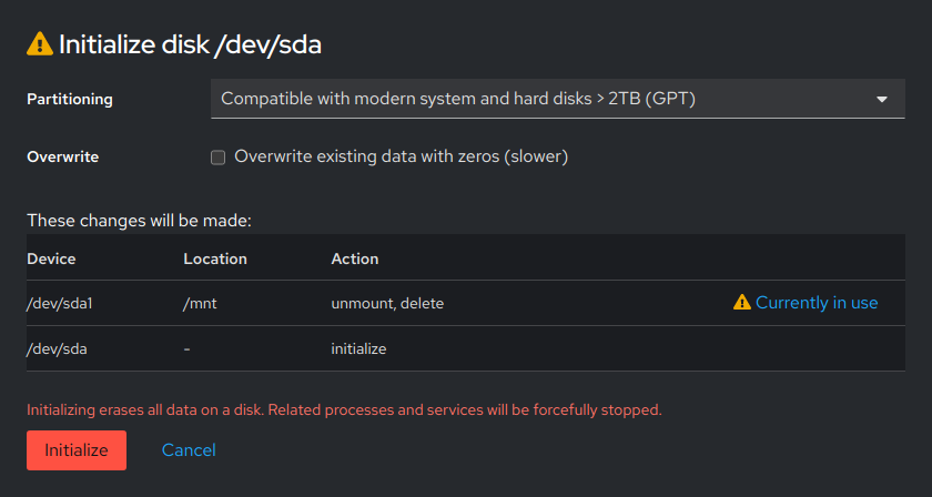
On main they look like this:
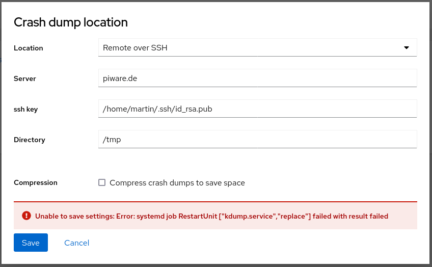

With this PR they look like this:
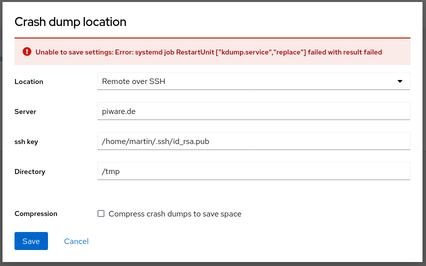

Initial draft which just converts cockpit-components-dialog and a few <ModalError> instances.
- Builds on top of #17220 (spotted during this conversion)
- [ ] tuned
- [ ] shell superuser
- [ ] shell host dialog
- [ ] shell credentials
- [ ] Software Updates
- [ ] Firewall
- [ ] NetworkManager dialogs-common
- [ ] Metrics
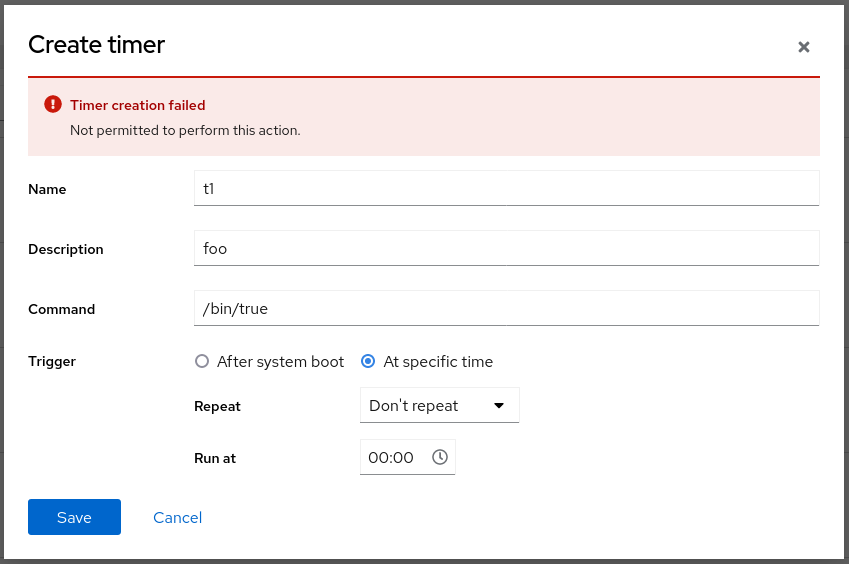
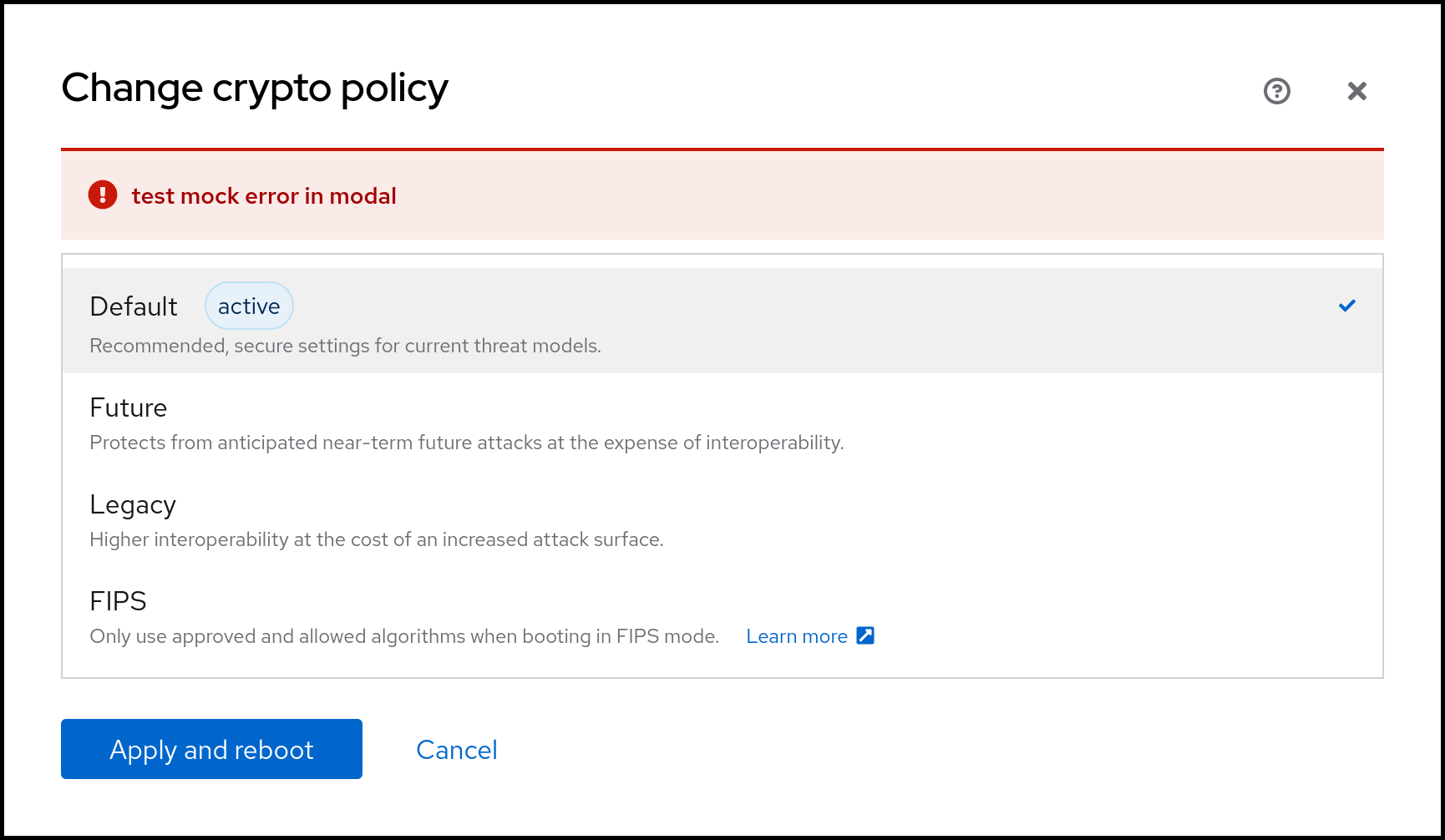
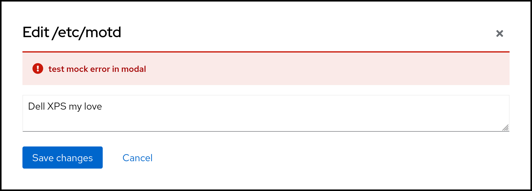
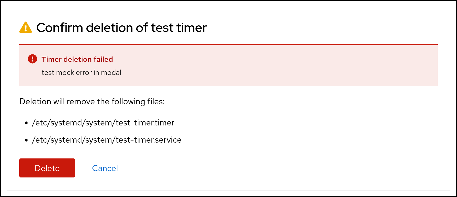
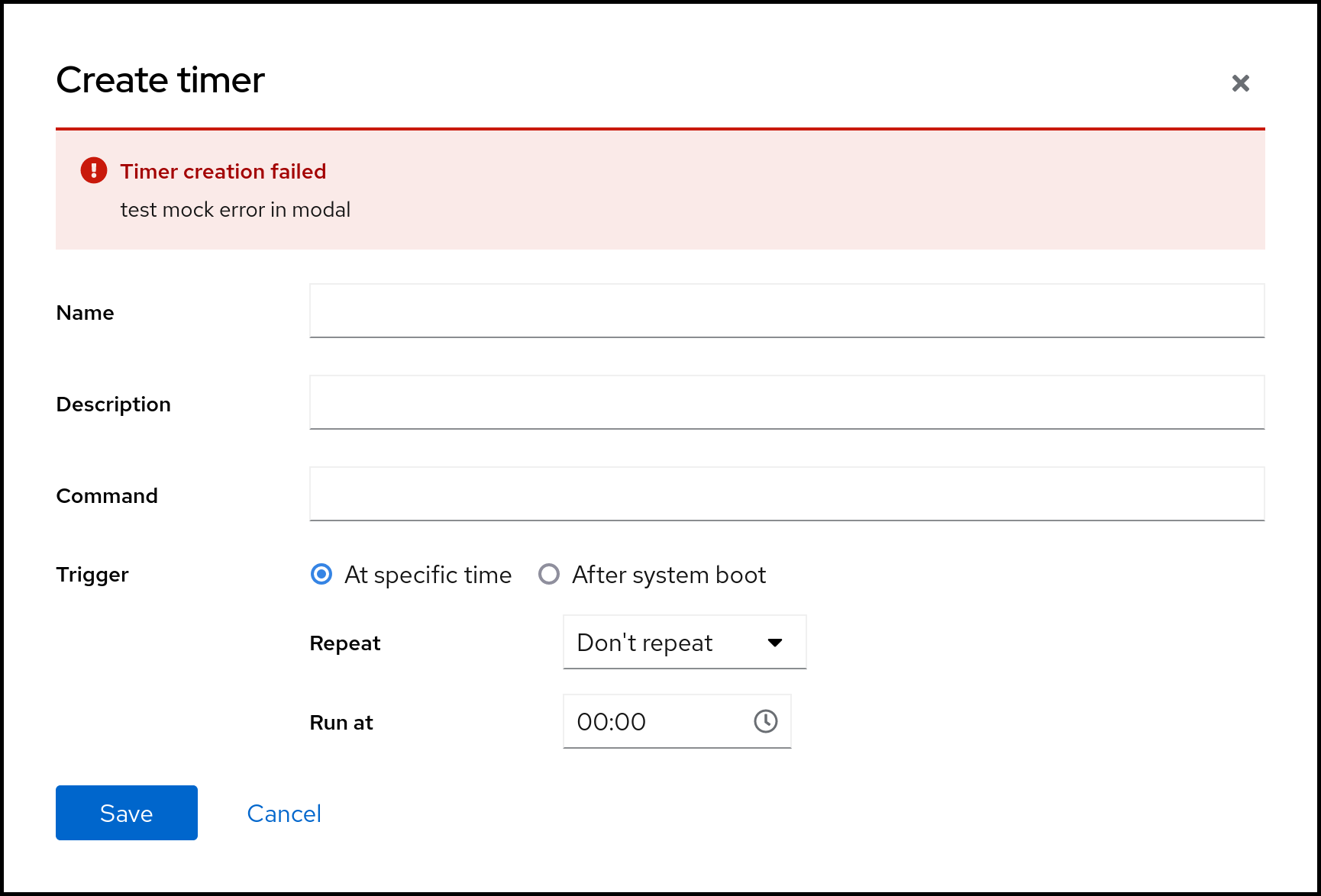
@garrett : Is this the direction that you had in mind? I can't say I like it (it makes the dialog contents jump around), but PF makes this rather clear. So I'm mostly asking whether I am missing something in general, before I spend more time to fix the rest. They all need to be tested individually, e.g. one dialog didn't have a <Form> so the spacing was wrong. And the timer dialog had completely broken error reporting.
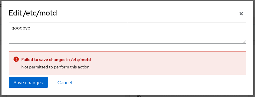
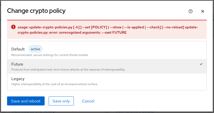
Just had this with kpatches, it is shown at the top but it's missing some spacing in my opinion.
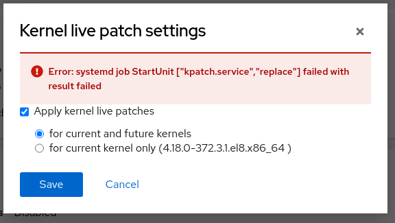
Does this PR handle that too?
@jelly : Thanks for spotting -- I suppose that's another case of missing a <Form> wrapper. As this is an utterly complex endeavour, I'll split up the cockpit-components-dialog PR from the <ModalError> PR -- even individually they are hard enough.
@jelly : Thanks for spotting -- I suppose that's another case of missing a
<Form>wrapper. As this is an utterly complex endeavour, I'll split up the cockpit-components-dialog PR from the<ModalError>PR -- even individually they are hard enough.
Yup, it's missing a <Form> shall I make it a part of the my install kpatches update branch?
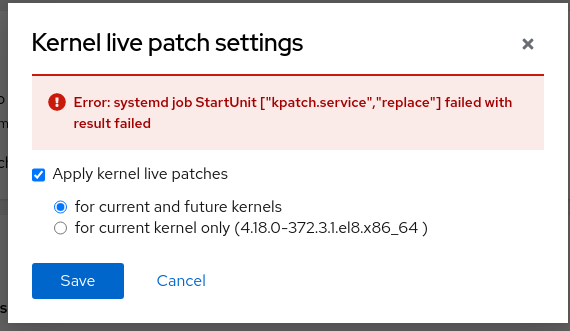
This looks fine now
@garrett : Is this the direction that you had in mind? I can't say I like it (it makes the dialog contents jump around), but PF makes this rather clear.
Yes. And I agree about not liking the contents jump around; I don't like that either and it's probably why it was on the bottom.
But, yes, PF is very clear about this.
And this is why we should, in most cases, have errors situated at the origin of error (as in: the widget that has problematic data, such as inputs with invalid entries) whenever possible.
However, in every single example above, there's no amount of changing the values that can affect the outcome. There's no permission or something going wrong when saving, so there's really no problem pushing down the form which cannot fix the problem anyway... at least in these examples.
So I'm mostly asking whether I am missing something in general, before I spend more time to fix the rest. They all need to be tested individually, e.g. one dialog didn't have a
<Form>so the spacing was wrong. And the timer dialog had completely broken error reporting.
Yeah, thankfully we caught that. Forms really should have a <Form> of some type; the HTML specs are pretty clear about <form> being needed for widgets to be useful (at least without sprinkling in JavaScript to do something not necessarily related to a form). If it happened to work before, then that's just browsers trying to deal with invalid HTML and doing something that approximates what is expected.
If an element is not nested within in a form, then a form association can be attached. Otherwise, its form association is null (which was the case here):
https://html.spec.whatwg.org/multipage/form-control-infrastructure.html#association-of-controls-and-forms
(This is about browser implementations and fallbacks.)
Here's MDN specifically pointing out <input form="formID">: https://developer.mozilla.org/en-US/docs/Web/HTML/Element/input#attr-form
It's best to just nest within a <form> instead of using the form attribute to point to a <form>, as the attribute just makes things confusing and loses context of other form elements. It exists as a fallback mechanism:
The form attribute lets you place an input anywhere in the document but have it included with a form elsewhere in the document.
But then note:
Note: An input can only be associated with one form.
(But it should be associated with a form. Ideally nested within. But rare circumstances require the use of the form attribute instead.)
FWIW: We would ideally have this PR, https://github.com/cockpit-project/cockpit/pull/17221, and PRs similar to the machines one for modals in Cockpit, Cockpit-Podman, etc. all land in the same release.
Just checking in: What's the status of this PR? Is it waiting on anything or anyone? (It's still marked as draft, FWIW.)
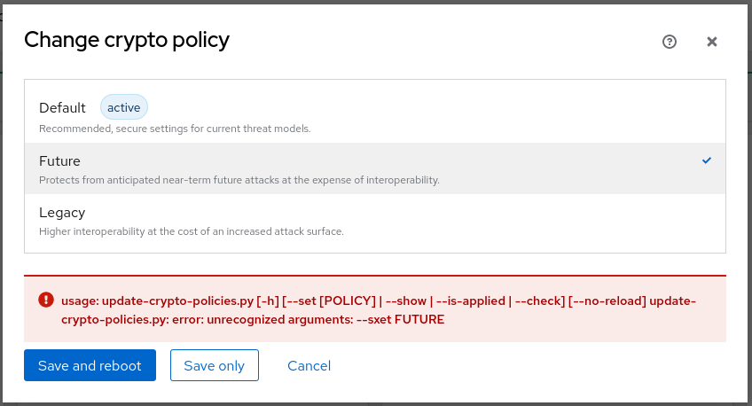
The screenshots look good to me, so I'm happy with what I see so far. Triggering all the errors might be a bit difficult to see it aside from the screenshots, however.
@garrett : Not blocked, I just didn't find the time to look into this again. This is a huge piece of work, but splitting it up into several independent PRs runs the risk of being inconsistent in a release.
Not blocked
Whew. I was worried that I was blocking it. :sweat_smile: :+1:
This is a huge piece of work, but splitting it up into several independent PRs runs the risk of being inconsistent in a release.
Yep. This is definitely one of those massive PRs that touches a lot of the codebase and needs to be all-in-one.
Can we get this looked at again and merged soon, please? Thanks! :sparkles:
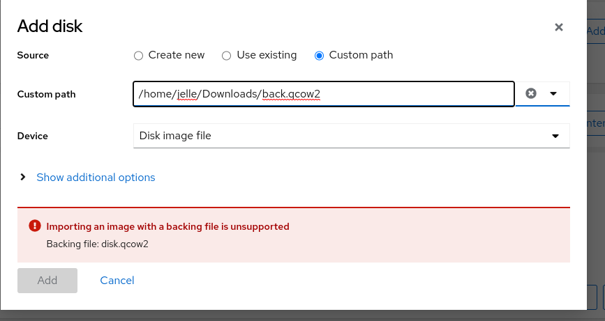
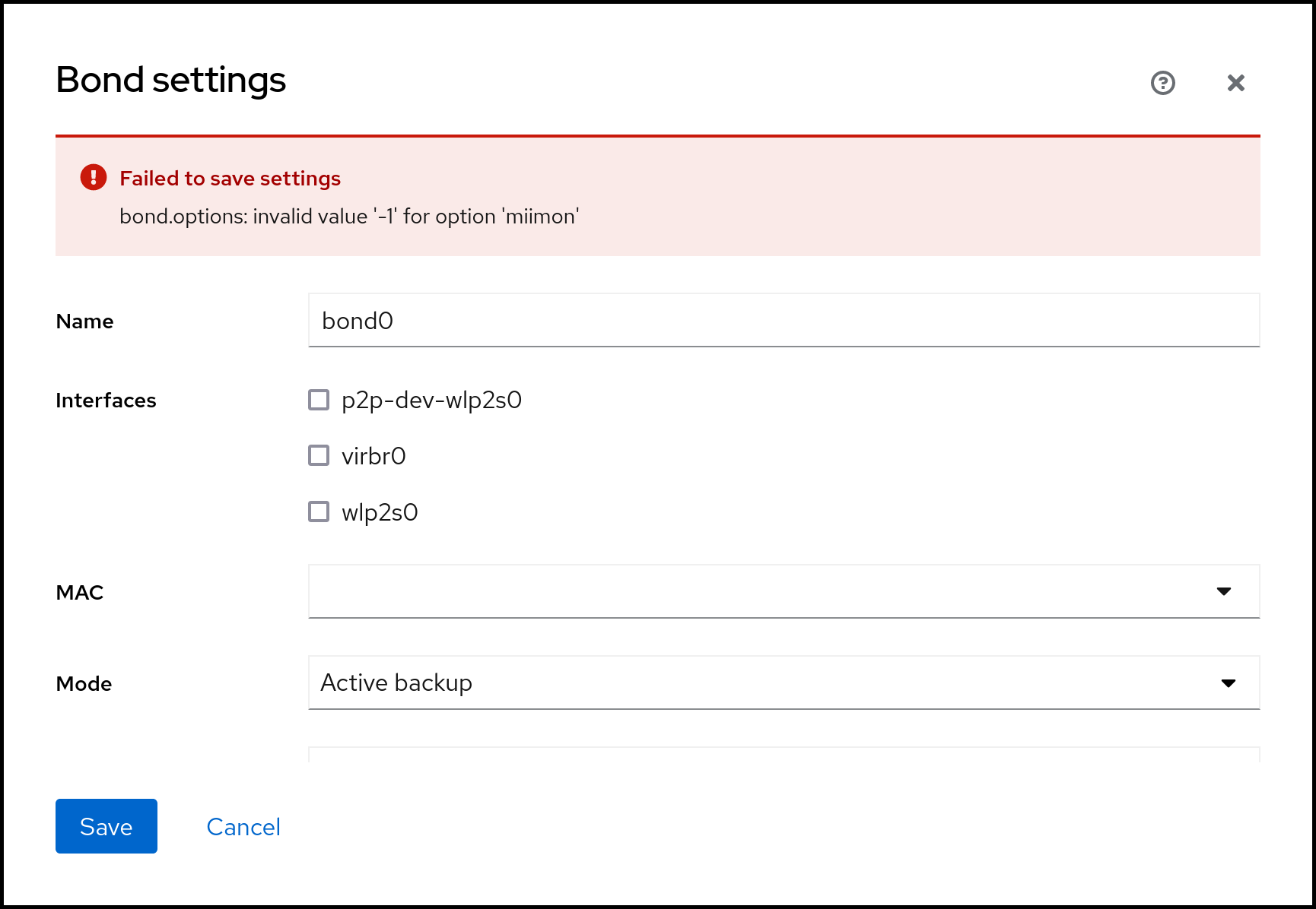
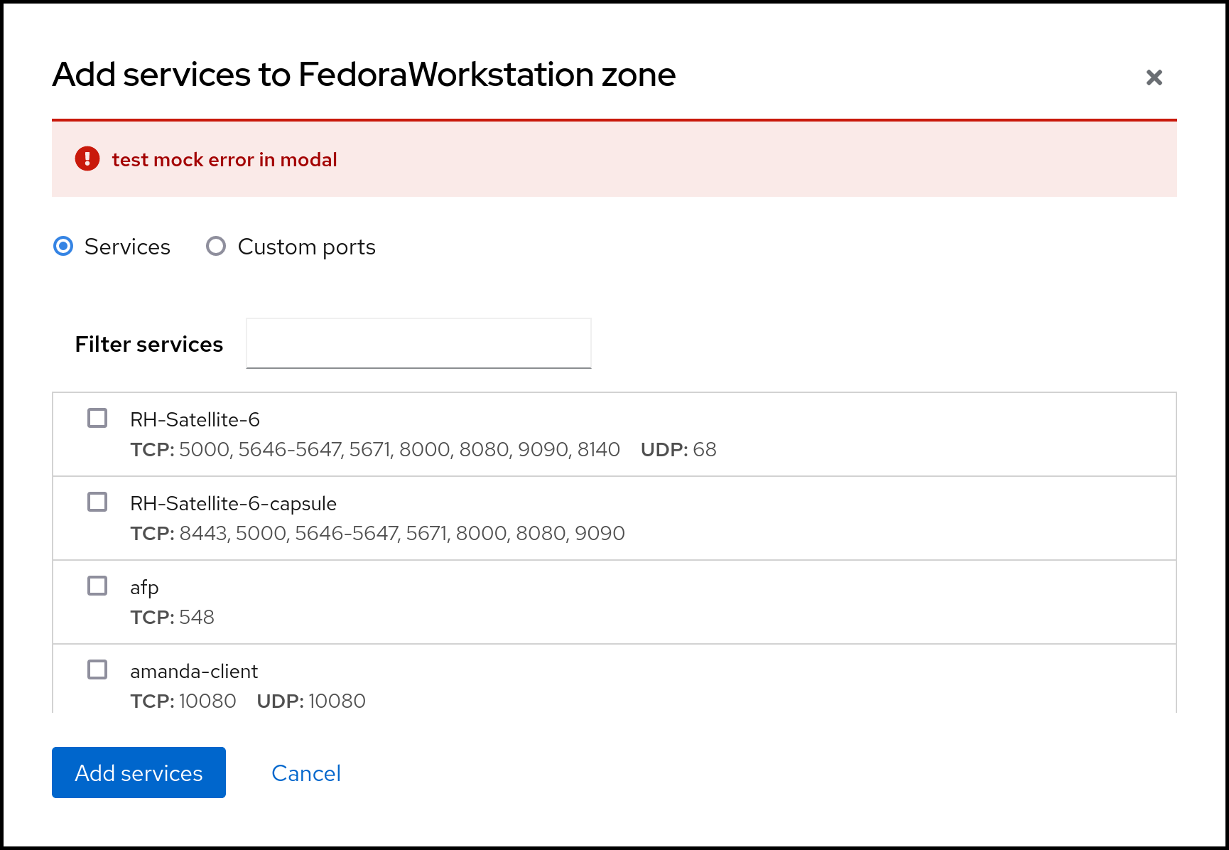
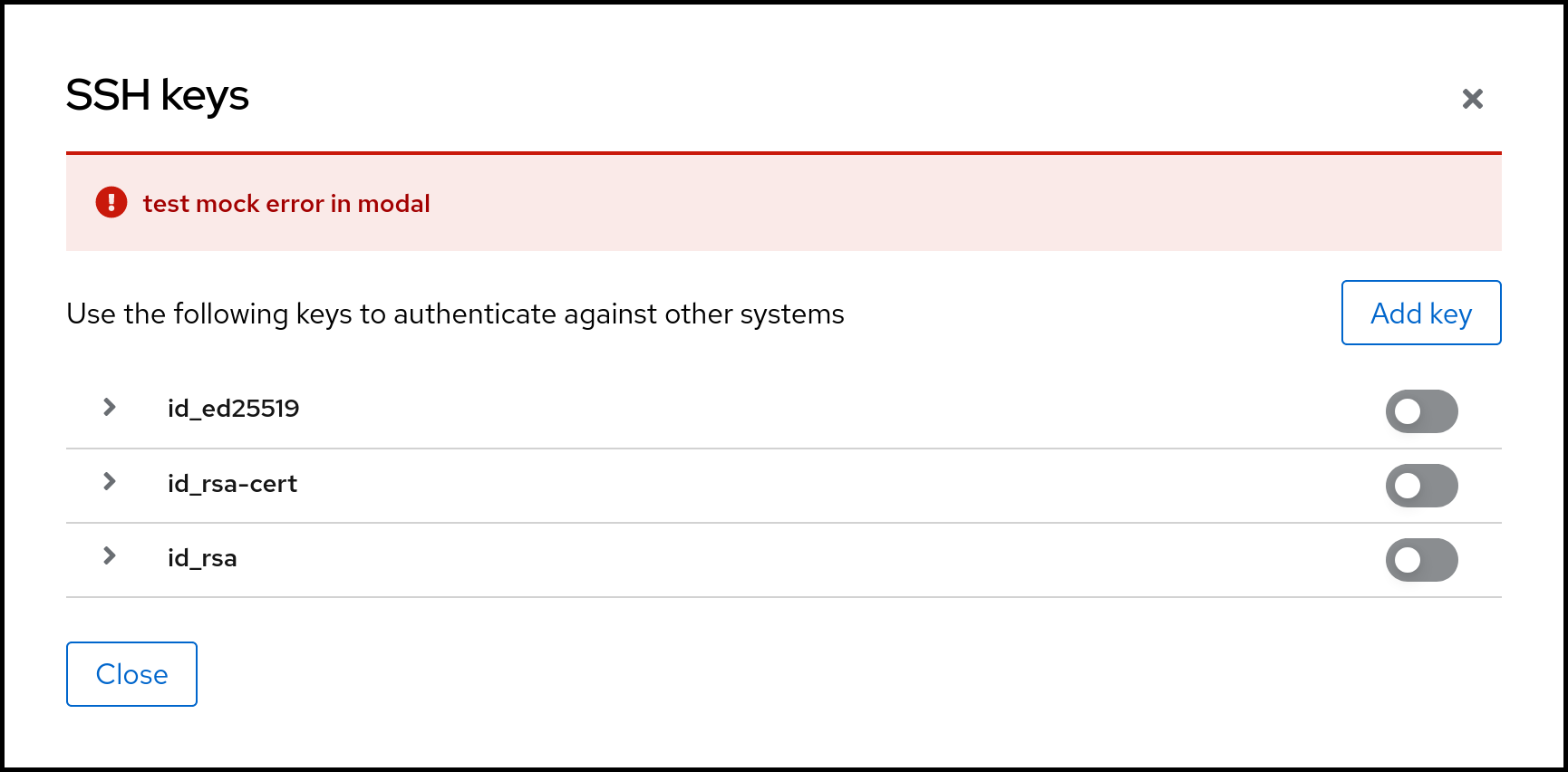
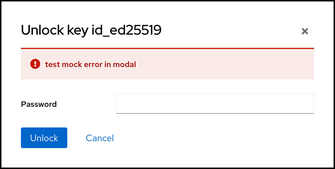
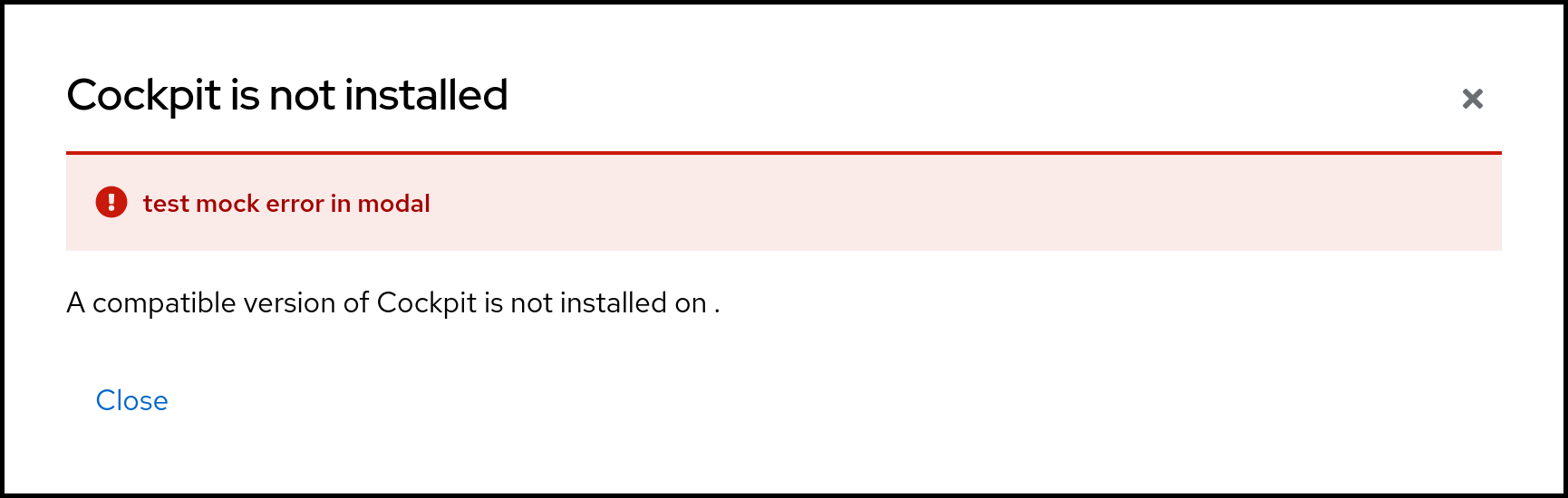
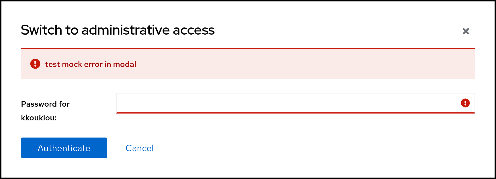
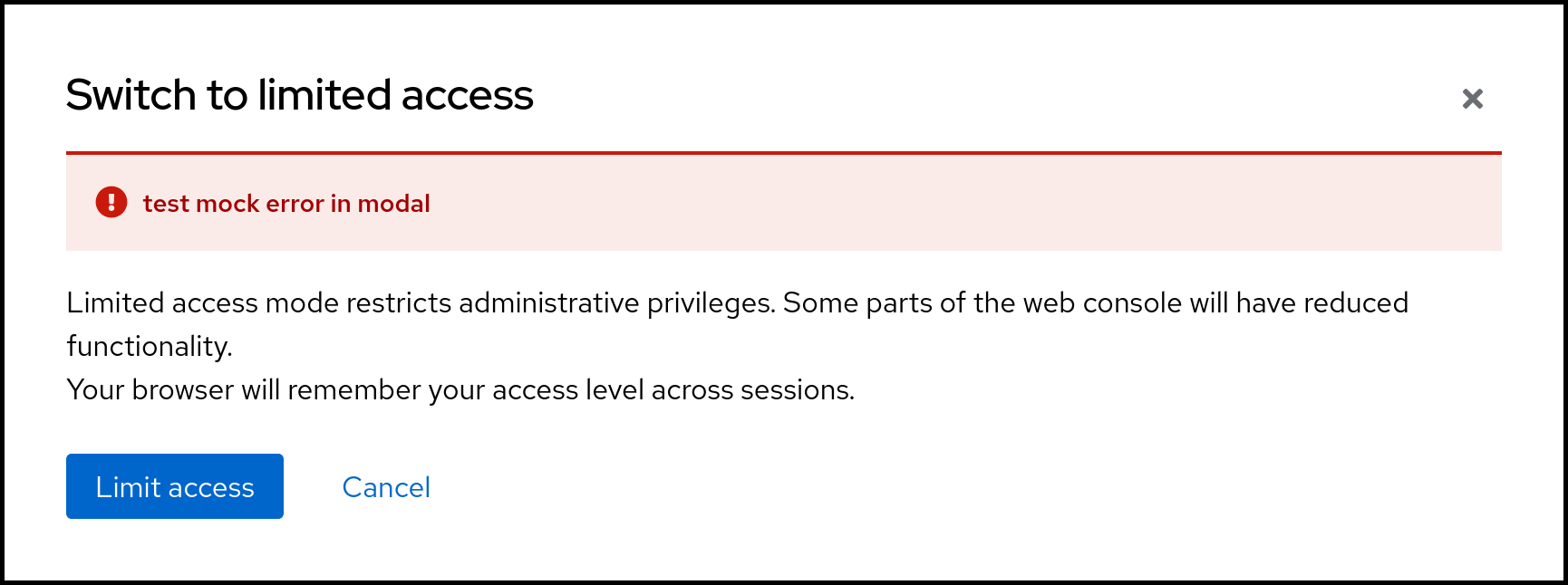
Updated all dialogs I could find with alerts in modal. All affected dialogs seen in the screenshots below.


@KKoukiou : Thank you! This may also affect some pixel tests, or don't we have any errors there?
@KKoukiou : Thank you! This may also affect some pixel tests, or don't we have any errors there?
I will wait for the test results and see :)
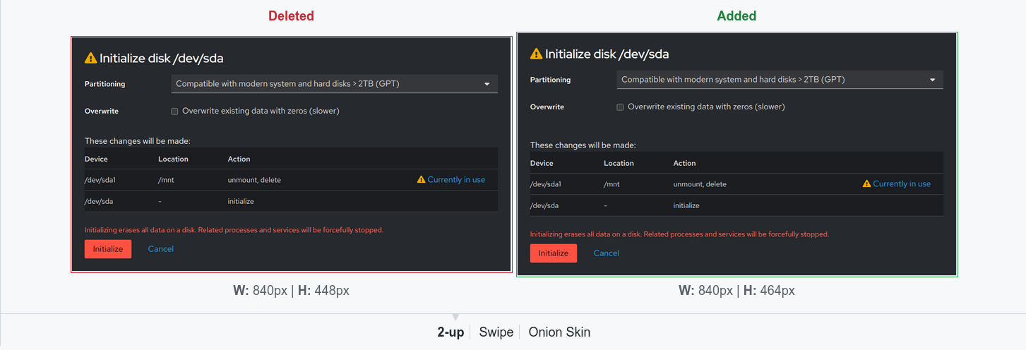
Thanks @KKoukiou for finishing this! The first few changes in the pixel test comparison look like acceptable noise. However, the "Switch to administrative access" dialog got a lot of extra space now, which looks sad. Is this easy to fix?
Thanks for the comparison screenshots!
It's not the only one with extra space, for example:
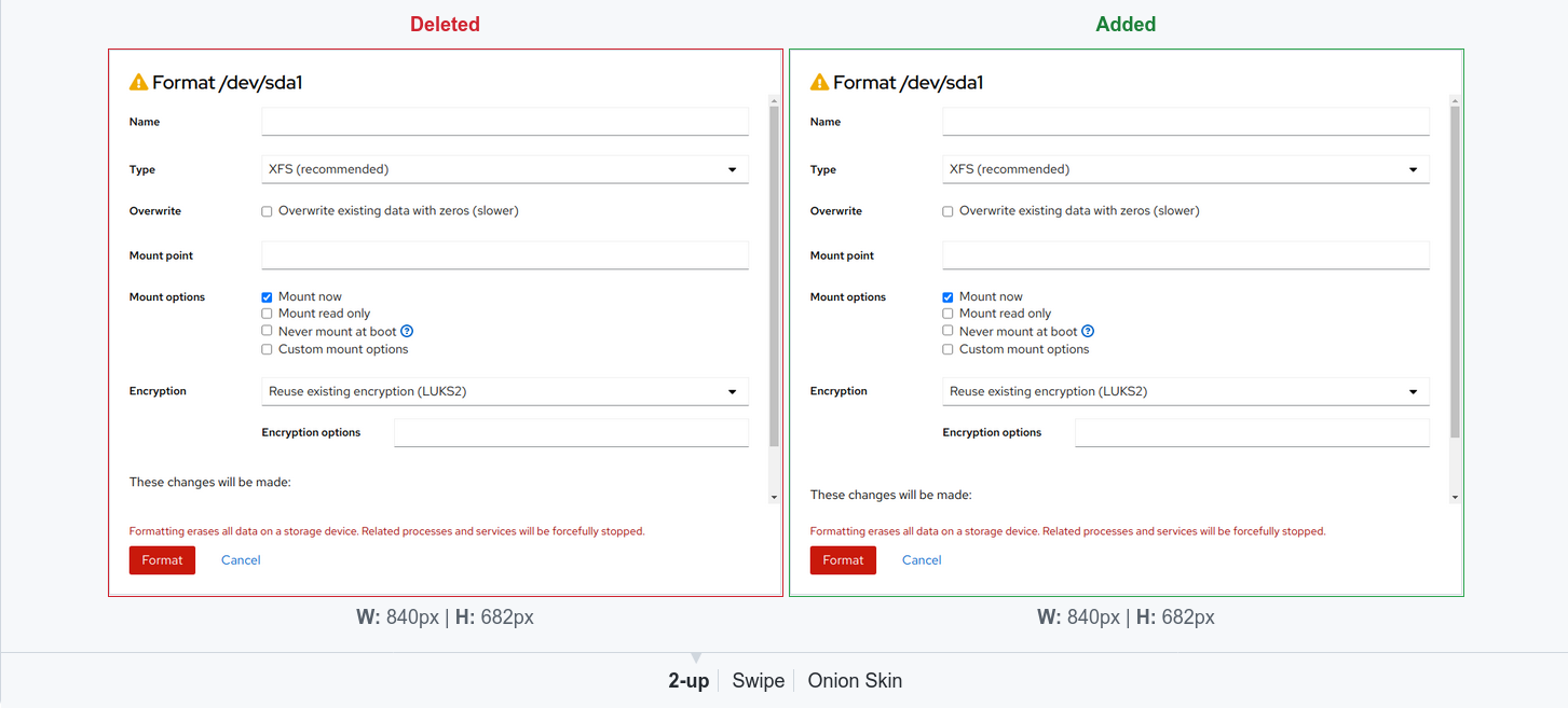
And there's extra space here, too (also above "these changes"; the differentiating space below is due to the scroll region content being different):
(And there are a bunch of others, but I think most are variants.)
Additionally, there's a bug in the dark theme as seen here:
(The white in the table becomes black, whereas the white in the modal becomes dark grey.)
...but it's not a problem in this PR itself; it's just visible here. This one particular bug with the dark theme lists should be fixed elsewhere.