pro-components
 pro-components copied to clipboard
 ant-design
feat(pro-utils): Making defaultActionRender available though pro-components
In pro-utils we have access to the defaultActionRender function to customize / modify action messages. This function is not available through the pro-components which at the ends we would need to install @ant-design/pro-utils to be able to use it.

![github-actions[bot] avatar](https://avatars.githubusercontent.com/in/15368?v=4 "Published by a pub.dev verified publisher")
Codecov Report
Merging #5530 (0630623) into master (f77cfed) will not change coverage. The diff coverage is
n/a.
:exclamation: Current head 0630623 differs from pull request most recent head 199cd5c. Consider uploading reports for the commit 199cd5c to get more accurate results
@@           Coverage Diff           @@
##           master    #5530   +/-   ##
=======================================
  Coverage   99.69%   99.69%
=======================================
  Files         206      206
  Lines        6862     6862
  Branches     2511     2511
=======================================
  Hits         6841     6841
  Misses         21       21
| Impacted Files | Coverage Δ | |
|---|---|---|
| packages/utils/src/useEditableArray/index.tsx | 100.00% <ø> (ø) |
Continue to review full report at Codecov.
Legend - Click here to learn more
Δ = absolute <relative> (impact),ø = not affected,? = missing dataPowered by Codecov. Last update f77cfed...199cd5c. Read the comment docs.
![codecov[bot] avatar](https://avatars.githubusercontent.com/in/254?v=4 "Published by a pub.dev verified publisher")
I don't want to expose this thing, there is a lot of internal dedicated logic, what kind of requirements do you have?
I don't want to expose this thing, there is a lot of internal dedicated logic, what kind of requirements do you have?
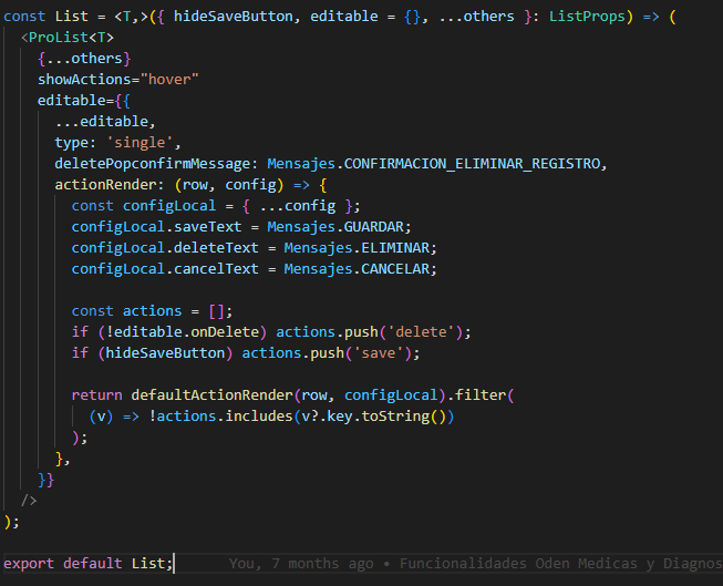
I personally use this to rename configLocal of some of the internal components button logic (save, delete and cancel). Example code:
This is already exposed with the @ant-design/pro-utils. So, that's why I thought I would be great to have this as well in the pro-components
Here:
import { defaultActionRender } from '@ant-design/pro-utils/es/useEditableArray';
defaultDoms is what you want
actionRender: (row, config, defaultDoms) => {
            return [defaultDoms.delete];
          },
defaultDoms is what you want
actionRender: (row, config, defaultDoms) => {
            return [defaultDoms.delete];
          },
How will this help me to rename the text? Not sure if I understand
You are right, thanks for the reminder But I think there should be a props instead of exposing a private method, are you interested in providing a new API?
In my mind he is like this
actionRender: (row, config, defaultDoms) => {
            return [
              <a
                key="delete"
                onClick={() => {
                  config?.deleteRow?.(config.recordKey);
                }}
              >
                delete
              </a>,
            ];
          },
Sorry for the delay. Yea that can workout. Want me to work on that?