altair
 altair copied to clipboard
Using Mark Circle for Bubble Plot. Can we get Bubble map with pie sectors for each bubble?
Altair is a fantastic addition to my python libraries and now is my go-to plotting package.
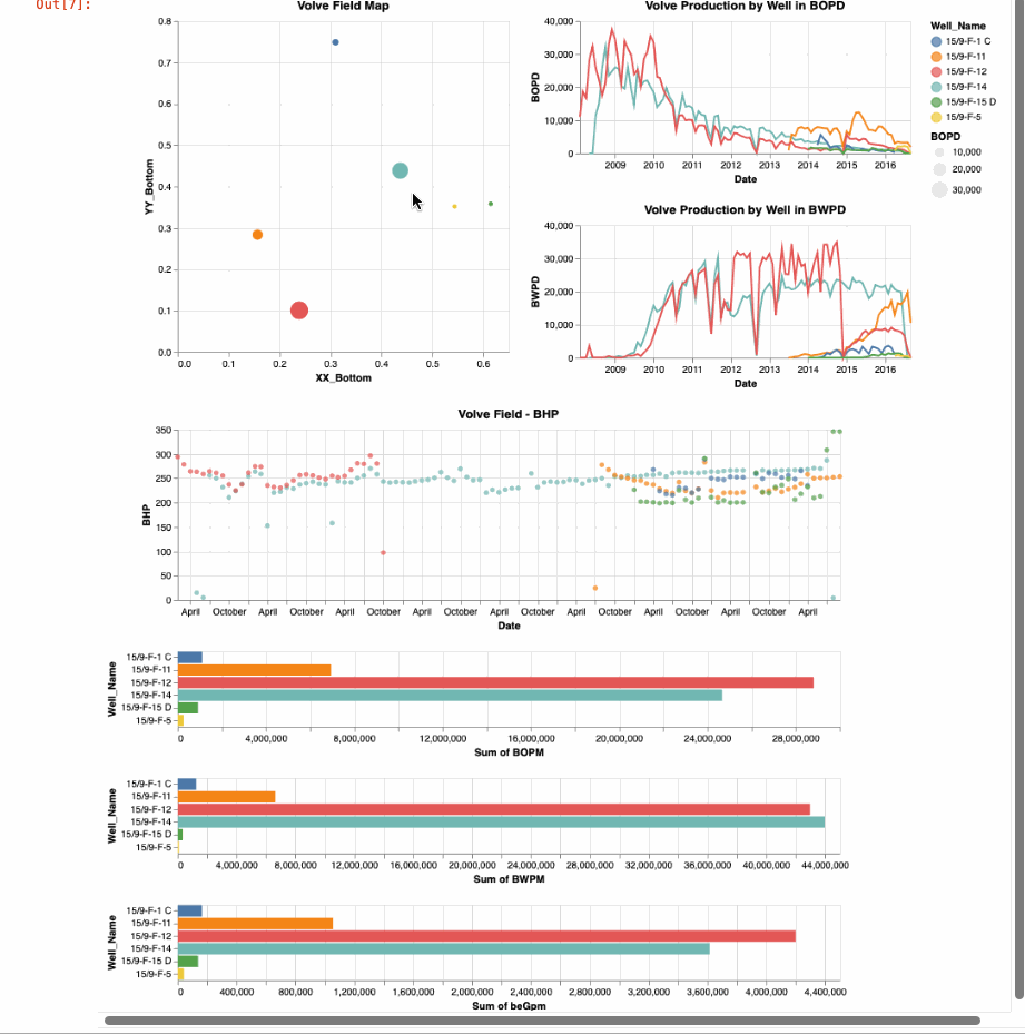
I have an example below where I am selecting oil well locations from a map that are plotted as mark_circles and sized by some value from that well. I have been using Spotfire for this, but now I prefer Altair. However, I was wondering on our bubble maps if we could plot the bubbles showing the pie sectors to add some additional information from this first view.
this is the code I am using now:
interval = alt.selection_interval()
base = alt.Chart(df).properties( width=300, height=300, ).add_selection(interval)
points = base.mark_point(filled=True, size=200).encode( x='XX_Bottom:Q', y='YY_Bottom:Q', size='BOPD:Q', color=alt.condition(interval, 'Well_Name', alt.value('lightgray')), #color=alt.condition(selector, 'Well_Name:O', alt.value('lightgray'), legend=None), tooltip='Well_Name', ).properties( title='Volve Field Map', selection=interval
)
This will be possible in the future with Vega-Lite's recently added Arc marks, but Altair doesn't yet support this.
Thank all of you for this great repository. This will be a nice addition to the interactivity that we already enjoy.
Has there been any updates on showing pie charts for each sample on a cross plot?
Pie charts have been added as shown in https://altair-viz.github.io/gallery/index.html#circular-plots. However, I don't think you can use a pie chart as a marker in another chart (e.g. in your field map scatter plot in the original post). I think you can make your custom SVG shape instead, but that it takes some work (I believe there is an issue or SO question with more details regarding this but I can't find it right now).
Vega-Lite does not yet easily support the kind of chart you have in mind; see https://github.com/vega/vega-lite/issues/7848