spectrum-web-components
 spectrum-web-components copied to clipboard
 adobe
adobe
[Bottom Navigation][New] Add Bottom Navigation Pattern
Summary
PSWeb and other CC web related projects have requested the bottom navigation for mobile to be implemented. There isn't an existing pattern for this in Spectrum CSS or anywhere else, so SWC is going to get a jumpstart on creating a usable component based upon the guidance from the Spectrum website and from designers (just to confirm that we're approaching this in the best way).
Proposed component structure (and resulting questions about it)
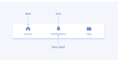
- A container with internal slots for each button and label. The user will supply the name of the icon and its label (if any).
-
- QUESTION: The documentation recommends 3-5 button only, so should we adopt that limit, as well?
- A property that denotes whether a button is disabled.
- A property that asks whether or not the button has notification badges or not.
-
- QUESTION: Do we want an option property for numbered notifications vs a blanket "hey, you have notifications!" dot?
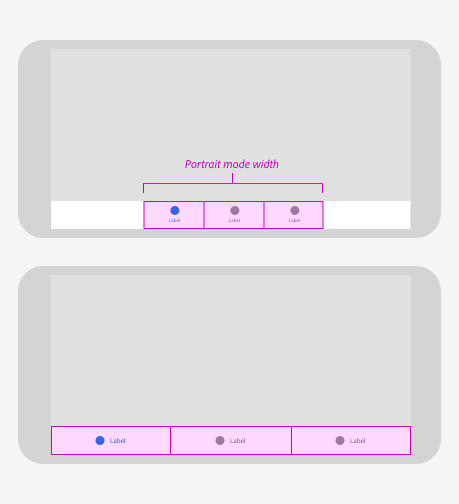
- A property to adjust the background colour to a primary or secondary value. Alternatively, we could just infer this colour based on the overall theme of the parent application. Maybe. This is what the docs site says:
-
Bottom navigation can be given a primary or secondary background color. Primary background is a lighter background color for bottom navigation on all themes. It should be used when an app’s default background is gray-100, gray-75, or gray-300 on light themes, or gray-75 or gray-50 on dark themes. Secondary background is a slightly darker background color on all themes. It should be used when an app’s default background is gray-75, gray-50, or gray-300 on light themes, or gray-100 or gray-50 on dark themes.
- A property for fixed or justified button sizes (similar to what happens with our action groups).
Items for discussion
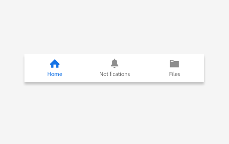
Action buttons
- !! NOTE !!: Our action buttons don't allow for bottom text like is seen in this screenshot. Should we add a new attribute to the action button to account for this? Or should we build "new" buttons for this component from scratch using sp-icons and field-labels, etc?
- !! NOTE !!: Our action buttons currently don't support this type of emphasis (blue icon/text). We can confirm with design if this is the look and behaviour that we want. If so, it may make sense to just utilise the button base and create this kind of component from scratch. Maybe. The bottom labelled buttons have definitely come up before in other places, but this blue emphasis hasn't yet (I think).
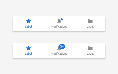
Badges (for notifications)
- How do we want to display notifications to our users? For a first pass, it seems easy enough to include a blue dot to alert users that they have notifications. The numbered notifications call for discussion. How many notifications will the user receive before stopping count; (ie if it's over 99, do we just show
99+or switch to the blue dot? Do we show the number of notifications regardless of how many there are? How does that look when we get into triple or even quadruple digits?)
I've wished for this component before too, thanks for drafting a spec.
QUESTION: The documentation recommends 3-5 button only, so should we adopt that limit, as well?
This seems like a good place for maybe documentation or even a usage warning, but I might not start with a codified limit. Documentation also recommends buttons with concise labels instead of Print the current PDF that you are looking at right now, but we don't codify a limit there either, rather leaving that up to design.
QUESTION: Do we want an option property for numbered notifications vs a blanket "hey, you have notifications!" dot?
Could we design for both? Maybe something along the lines of <sp-some-component badge> for a dot badge and <sp-some-component badge="24"> for a textual badge?
Should we add a new attribute to the action button to account for this? Or should we build "new" buttons for this component from scratch using sp-icons and field-labels, etc?
Either approach could work, but your !! Note !!s above suggest enough uniqueness in this application that I might lean towards building a new type of button rather than making several edits to the existing action buttons. This spec diverges in at least:
- badges & numbered badges
- icons over labels
- different color options & selection indicators
If we were to make these a new type of action-button, what would they look like in an action-group alongside current action-buttons? If they would look weird or out-of-place, that's another indicator that perhaps they are a different "type of thing."