spectrum-css
 spectrum-css copied to clipboard
 adobe
adobe
feat(checkbox)!: migrate checkbox component to core tokens (CSS-99)
Description
This PR migrates the Checkbox component and styles to use core-tokens and includes:
- Create spectrum and express theme styles
- Moving skin.css styles to index.css
- Updating the HTML examples and component description
- Update Windows high contrast mode styles
- Add locale-specific styles
How and where has this been tested?
- How this was tested:
- Tested locally referencing the Components batch XD file
- Tested with VoiceOver on Safari
- Tested WHCM with forced colors Chrome Emulation
- Tested locale-specific styles by manually adding a locale attribute
- Browser(s) and OS(s) this was tested with:
- Chrome on macOS
- Safari on macOS
Screenshots


To-do list
~~- [ ] If my change impacts other components, I have tested to make sure they don't break.~~
- [x] If my change impacts documentation, I have updated the documentation accordingly.
- [x] I have read the CONTRIBUTING document.
- [ ] Windows high contrast mode styles make sense.
- [ ] Spectrum theme-specific styles match design
- [ ] Express theme-specific styles match design
- [ ]
--spectrum-checkbox-CJK-line-heightis applied correctly. Test by addinglangattribute to a.spectrom-Checkbox-labelelement or thehtmlelement e.g.lang="ko". - [ ] This pull request is ready to merge.
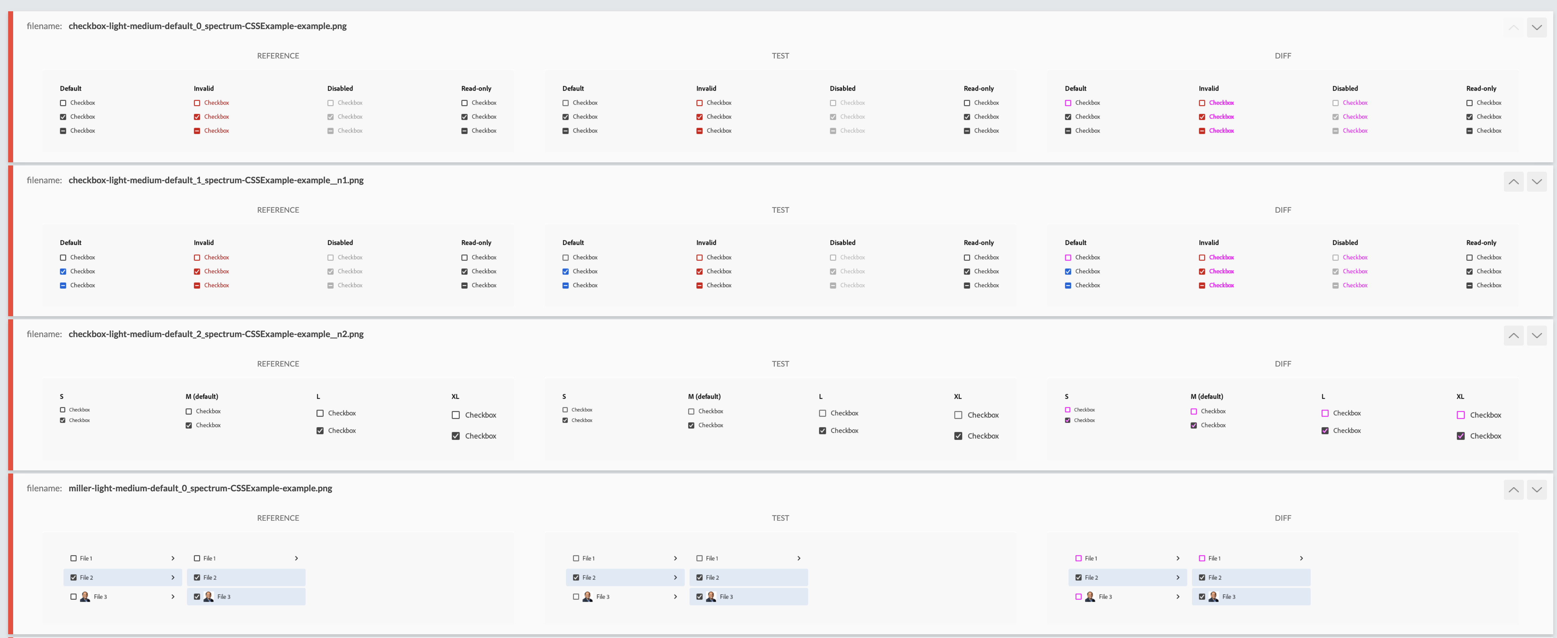
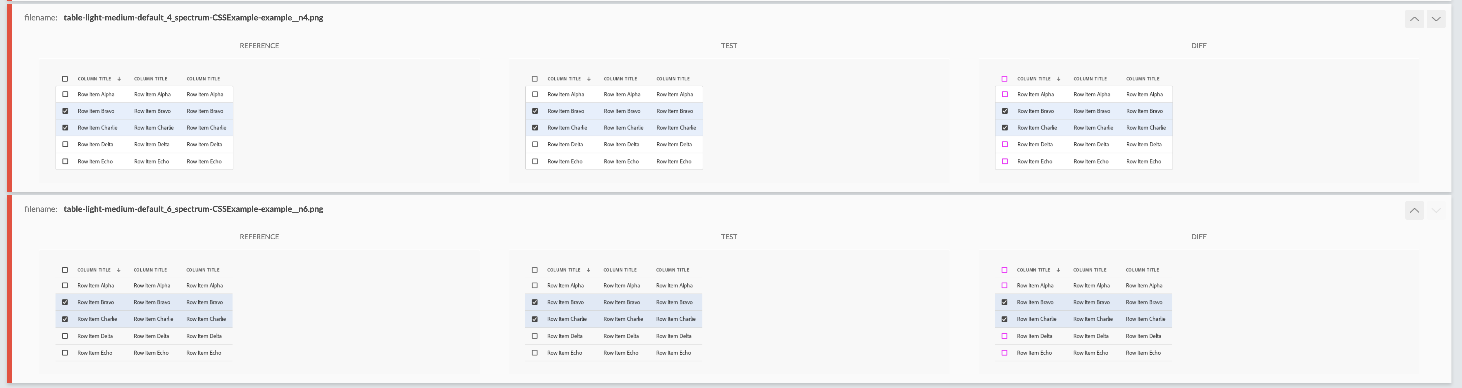
Visual regression tests after running them locally.
We're already asking about the invalid text color change. The only other change is that the default checkbox border color has changed slightly, which is why we see those failures called out in the actual checkbox page as well as in a few other components. All of these changes may be expected and ok, but let's wait on the word from design.
![github-actions[bot] avatar](https://avatars.githubusercontent.com/in/15368?v=4 "Published by a pub.dev verified publisher")
@yosevu - sorry to resurrect this PR, but we found a bug when we tried to integrate the beta with the Spectrum Web Components team.
The issue is with the t-shirt sized versions of the indeterminate state. You can reproduce locally by adding t-shirt size examples for the indeterminate state and noticing that the dash's position is incorrect at (at least) the small and medium sizes.
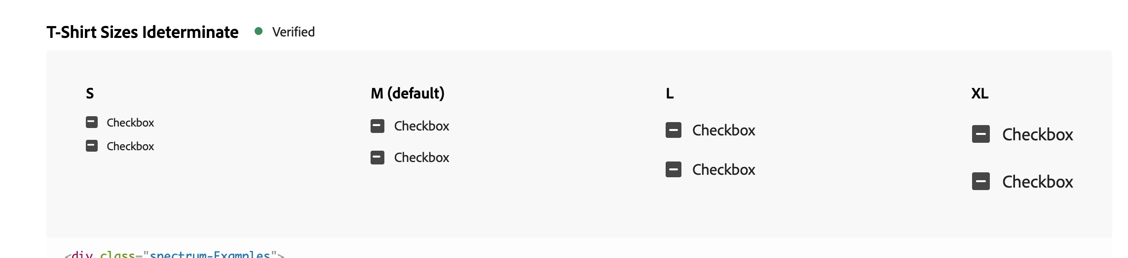
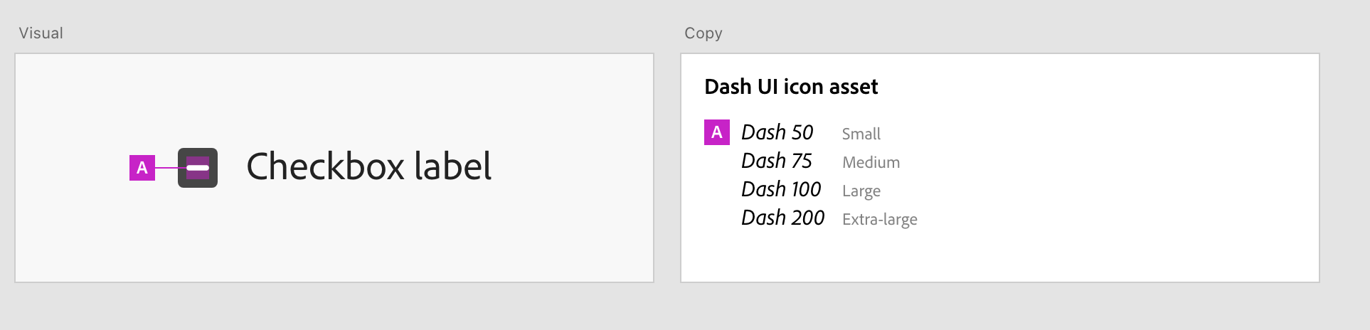
It looks like we just may have missed the tokens for these. They're in the Xd file:
Hopefully, that will fix this issue!
@pfulton Oops, I didn't think of testing indeterminate t-shirt sizes checkboxes since there weren't examples in the YAML file. I'll add some examples and work on fixing this. The tokens are added correctly, but I think the spacing needs to be calculated differently for the t-shirt sizes.
Updated. Switched to centering the icons with flexbox rather than position and margin.
Awesome. Thanks for taking care of this!