Explore less thin secondary font options
Our secondary font, Anaheim, may be too thin for people with low-vision. We should investigate fonts that have similar characteristics, but have heavier weights.

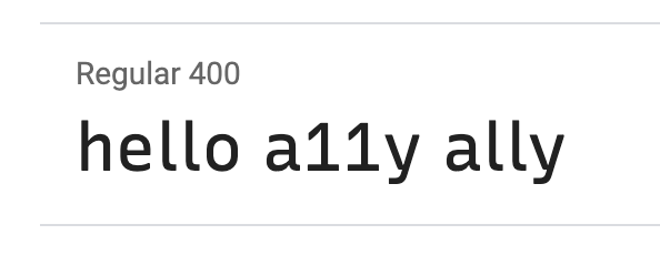
I don't know if it's worth looking at, but the digit 1 and the lowercase letter l in Noto Serif look very similar. I found it hard to read this text saying a11y isn't ally.
Thanks for this, I agree.
I'm also not enjoying the faux italic treatment for Anaheim, but I'm also cautious about the number of fonts we're already importing.
Note for later: apparently we can apparently disallow this with font-synthesis, but of course Chrome hasn't supported it yet.
I'm looking at Recursive as my first choice. It has a similar look and feel to Anaheim, but is thicker and wider overall. I specifically compared a11y and ally and I'm satisfied with the treatment of the number 1.
Added Recursive Mono via https://github.com/a11yproject/a11yproject.com/pull/1107. If we go with Recursive for an Anaheim replacement it'll be us only serving two general families.
I've removed Recursive after evaluating it for a bit. It seemed to drift too far into the other direction.
@emilane Would you be open to exploring other options? Also @tatianamac, have you run across anything?
@ericwbailey I sure can! Can you highlight specifics that you felt were too thick? Specific letterforms, the overall font, any other issues?
@emilane Amazing, thank you 🙏
I think the character width and weight were a little too much. The counter/aperture space was also more open compared to Anaheim, which I think was throwing me off.
@ericwbailey I like Output. It's paid though, so I don't know how much that factors into the decision (free vs. paid).