react-datepicker
 react-datepicker copied to clipboard
 Hacker0x01
Add option to inherit font size
Right now, sizes are set in rem units, which means that the component has a different size than it's parent both for the font and the spacing of the calendar. In my case, this makes the calendar extremely small compared to everything else on my page. I can override that will some clever CSS, but it would be nice if there was a prop to make the component use em units instead to inherit the sizes from it's parent. Something like relativeSize={true}. If this is something others want, I can open a PR.
I have the same problem when using alongside the stylesheet from the react-bootstrap.
I'd also be willing to open a PR that converts this component to use JS styles (quickly becoming the React norm) instead of a global stylesheet that has to be included separately. @Hacker0x01 do you have any thoughts on which direction you'd like to take this?
Same issue as DannyRyman. The Bootstrap stylesheet has a side effect on the component, and the calendar appears tiny.
Thanks @josiahsprague for raising this! Would you share the CSS rules you used to override the default size while the PR is ready?
Here's the CSS I used to make the table work:
.react-datepicker {
  font-size: 1.3rem !important;
}

.react-datepicker__current-month {
  font-size: 1.5rem !important;
}

.react-datepicker__header {
  padding-top: 6px !important;
}

.react-datepicker__navigation {
  top: 13px !important;
}

.react-datepicker__day-name, .react-datepicker__day {
  margin: 0.5rem !important;
}

This is what I'm using;
.react-datepicker {
  font-size: 1em;
}
.react-datepicker__header {
  padding-top: 0.8em;
}
.react-datepicker__month {
  margin: 0.4em 1em;
}
.react-datepicker__day-name, .react-datepicker__day {
  width: 1.9em;
  line-height: 1.9em;
  margin: 0.166em;
}
.react-datepicker__current-month {
  font-size: 1em;
}
.react-datepicker__navigation {
  top: 1em;
  line-height: 1.7em;
  border: 0.45em solid transparent;
}
.react-datepicker__navigation--previous {
  border-right-color: #ccc;
  left: 1em;
}
.react-datepicker__navigation--next {
  border-left-color: #ccc;
  right: 1em;
}
It works for me. Basically just replaces rem values with the same values in em, and adjusts some other things to make it all fit. But I'm not sure how thorough this is. Ideally I think this component should be converted to use JS inline styles, and accept a style prop that can override those, so that it doesn't require including an external stylesheet, and I also think it should use em by default instead of rem, so that the sizes can scale with the page that it's included in instead of needing tedious overrides. Waiting to hear from a maintainer of the package on what direction they'd like to go before I open a PR.
Seems that this project isn't actively maintained anymore. @Hacker0x01 is it up for adoption?
@josiahsprague This project is still maintained. We welcome PRs to improve functionality or fix bugs.
@martijnrusschen I'm willing to open a PR. I was waiting for some feedback from the maintainers about which type of PR they would merge for this. I can do one of two things;
-
Update the global stylesheet to inherit font sizes, similar to the workaround CSS I posted above
-
Update the component to use JS Styles via
react-themeableinstead of a global stylesheet since that's quickly becoming the React norm. Other components, such asreact-autosuggestdo this.
I'd prefer approach 2, but I don't want to start that PR if the maintainers don't like the idea, because it'd be a lot of work to go to waste.
For the people struggling with this: I had to set fixedHeight to true for the DatePicker to make the css of @josiahsprague work correctly.
Once I get a response from the package maintainers about which type of PR they would prefer I'll open one. Until then, I'm closing this issue.
i can't see @josiahsprague response, can someone tell me what's the fix? @pratik-trianz @abury
@localjo's css works for date, but it is missing the following when time select is present:
.react-datepicker-time__header {
  font-size: 0.944em;
}

.react-datepicker__navigation--next--with-time {
  right: 80px;
}
I also needed the following for the background of Time selection (24h):
.react-datepicker__time-list-item {
  width: 50px;
}
Any permanent fix on this besides changing the CSS?
My workaround (somewhat janky, but works):
-
Set html font-size to be 100%
-
If you want html font-size to be at 62.5% let's say: convert react-datepicker.css to LESS or SASS, set a variable called @scale-factor:1.6rem and then ctrl+f and replace all references of
remwith* @scale-factorand everything should work.
Click for my LESS file
Note: I am using version 0.60.2. Your CSS may be different on a more current version.
//@TODO: set to 1 if https://github.com/Hacker0x01/react-datepicker/issues/624 ever gets resolved
@scale-factor: 1.6rem;

.react-datepicker-popper[data-placement^="bottom"] .react-datepicker__triangle, .react-datepicker-popper[data-placement^="top"] .react-datepicker__triangle, .react-datepicker__year-read-view--down-arrow,
.react-datepicker__month-read-view--down-arrow {
  margin-left: -8px;
  position: absolute;
}

.react-datepicker-popper[data-placement^="bottom"] .react-datepicker__triangle, .react-datepicker-popper[data-placement^="top"] .react-datepicker__triangle, .react-datepicker__year-read-view--down-arrow,
.react-datepicker__month-read-view--down-arrow, .react-datepicker-popper[data-placement^="bottom"] .react-datepicker__triangle::before, .react-datepicker-popper[data-placement^="top"] .react-datepicker__triangle::before, .react-datepicker__year-read-view--down-arrow::before,
.react-datepicker__month-read-view--down-arrow::before {
  box-sizing: content-box;
  position: absolute;
  border: 8px solid transparent;
  height: 0;
  width: 1px;
}

.react-datepicker-popper[data-placement^="bottom"] .react-datepicker__triangle::before, .react-datepicker-popper[data-placement^="top"] .react-datepicker__triangle::before, .react-datepicker__year-read-view--down-arrow::before,
.react-datepicker__month-read-view--down-arrow::before {
  content: "";
  z-index: -1;
  border-width: 8px;
  left: -8px;
  border-bottom-color: #aeaeae;
}

.react-datepicker-popper[data-placement^="bottom"] .react-datepicker__triangle {
  top: 0;
  margin-top: -8px;
}

.react-datepicker-popper[data-placement^="bottom"] .react-datepicker__triangle, .react-datepicker-popper[data-placement^="bottom"] .react-datepicker__triangle::before {
  border-top: none;
  border-bottom-color: #f0f0f0;
}

.react-datepicker-popper[data-placement^="bottom"] .react-datepicker__triangle::before {
  top: -1px;
  border-bottom-color: #aeaeae;
}

.react-datepicker-popper[data-placement^="top"] .react-datepicker__triangle, .react-datepicker__year-read-view--down-arrow,
.react-datepicker__month-read-view--down-arrow {
  bottom: 0;
  margin-bottom: -8px;
}

.react-datepicker-popper[data-placement^="top"] .react-datepicker__triangle, .react-datepicker__year-read-view--down-arrow,
.react-datepicker__month-read-view--down-arrow, .react-datepicker-popper[data-placement^="top"] .react-datepicker__triangle::before, .react-datepicker__year-read-view--down-arrow::before,
.react-datepicker__month-read-view--down-arrow::before {
  border-bottom: none;
  border-top-color: #fff;
}

.react-datepicker-popper[data-placement^="top"] .react-datepicker__triangle::before, .react-datepicker__year-read-view--down-arrow::before,
.react-datepicker__month-read-view--down-arrow::before {
  bottom: -1px;
  border-top-color: #aeaeae;
}

.react-datepicker-wrapper {
  display: inline-block;
}

.react-datepicker {
  font-family: "Helvetica Neue", Helvetica, Arial, sans-serif;
  font-size: 0.8 * @scale-factor;
  background-color: #fff;
  color: #000;
  border: 1px solid #aeaeae;
  border-radius: 0.3 * @scale-factor;
  display: inline-block;
  position: relative;
}

.react-datepicker__triangle {
  position: absolute;
  left: 50px;
}

.react-datepicker-popper {
  z-index: 1;
}

.react-datepicker-popper[data-placement^="bottom"] {
  margin-top: 10px;
}

.react-datepicker-popper[data-placement^="top"] {
  margin-bottom: 10px;
}

.react-datepicker-popper[data-placement^="right"] {
  margin-left: 8px;
}

.react-datepicker-popper[data-placement^="right"] .react-datepicker__triangle {
  left: auto;
  right: 42px;
}

.react-datepicker-popper[data-placement^="left"] {
  margin-right: 8px;
}

.react-datepicker-popper[data-placement^="left"] .react-datepicker__triangle {
  left: 42px;
  right: auto;
}

.react-datepicker__header {
  text-align: center;
  background-color: #f0f0f0;
  border-bottom: 1px solid #aeaeae;
  border-top-left-radius: 0.3 * @scale-factor;
  border-top-right-radius: 0.3 * @scale-factor;
  padding-top: 8px;
  position: relative;
}

.react-datepicker__header--time {
  padding-bottom: 8px;
}

.react-datepicker__year-dropdown-container--select,
.react-datepicker__month-dropdown-container--select,
.react-datepicker__year-dropdown-container--scroll,
.react-datepicker__month-dropdown-container--scroll {
  display: inline-block;
  margin: 0 2px;
}

.react-datepicker__current-month, .react-datepicker-time__header {
  margin-top: 0;
  color: #000;
  font-weight: bold;
  font-size: 0.944 * @scale-factor;
}

.react-datepicker__navigation {
  line-height: 1.7 * @scale-factor;
  text-align: center;
  cursor: pointer;
  position: absolute;
  top: 10px;
  width: 0;
  border: 0.45 * @scale-factor solid transparent;
  z-index: 1;
}

.react-datepicker__navigation--previous {
  left: 10px;
  border-right-color: #ccc;
}

.react-datepicker__navigation--previous:hover {
  border-right-color: #b3b3b3;
}

.react-datepicker__navigation--next {
  right: 10px;
  border-left-color: #ccc;
}

.react-datepicker__navigation--next--with-time:not(.react-datepicker__navigation--next--with-today-button) {
  right: 80px;
}

.react-datepicker__navigation--next:hover {
  border-left-color: #b3b3b3;
}

.react-datepicker__navigation--years {
  position: relative;
  top: 0;
  display: block;
  margin-left: auto;
  margin-right: auto;
}

.react-datepicker__navigation--years-previous {
  top: 4px;
  border-top-color: #ccc;
}

.react-datepicker__navigation--years-previous:hover {
  border-top-color: #b3b3b3;
}

.react-datepicker__navigation--years-upcoming {
  top: -4px;
  border-bottom-color: #ccc;
}

.react-datepicker__navigation--years-upcoming:hover {
  border-bottom-color: #b3b3b3;
}

.react-datepicker__month-container {
  float: left;
}

.react-datepicker__month {
  margin: 0.4 * @scale-factor;
  text-align: center;
}

.react-datepicker__time-container {
  float: right;
  border-left: 1px solid #aeaeae;
}

.react-datepicker__time-container--with-today-button {
  display: inline;
  border: 1px solid #aeaeae;
  border-radius: .3 * @scale-factor;
  position: absolute;
  right: -72px;
  top: 0;
}

.react-datepicker__time-container .react-datepicker__time {
  position: relative;
  background: white;
}

.react-datepicker__time-container .react-datepicker__time .react-datepicker__time-box {
  width: 70px;
  overflow-x: hidden;
}

.react-datepicker__time-container .react-datepicker__time .react-datepicker__time-box ul.react-datepicker__time-list {
  list-style: none;
  margin: 0;
  height: calc(195px + (1.7 * @scale-factor / 2));
  overflow-y: scroll;
  padding-right: 30px;
  width: 100%;
}

.react-datepicker__time-container .react-datepicker__time .react-datepicker__time-box ul.react-datepicker__time-list li.react-datepicker__time-list-item {
  padding: 5px 10px;
}

.react-datepicker__time-container .react-datepicker__time .react-datepicker__time-box ul.react-datepicker__time-list li.react-datepicker__time-list-item:hover {
  cursor: pointer;
  background-color: #f0f0f0;
}

.react-datepicker__time-container .react-datepicker__time .react-datepicker__time-box ul.react-datepicker__time-list li.react-datepicker__time-list-item--selected {
  background-color: #216ba5;
  color: white;
  font-weight: bold;
}

.react-datepicker__time-container .react-datepicker__time .react-datepicker__time-box ul.react-datepicker__time-list li.react-datepicker__time-list-item--selected:hover {
  background-color: #216ba5;
}

.react-datepicker__time-container .react-datepicker__time .react-datepicker__time-box ul.react-datepicker__time-list li.react-datepicker__time-list-item--disabled {
  color: #ccc;
}

.react-datepicker__time-container .react-datepicker__time .react-datepicker__time-box ul.react-datepicker__time-list li.react-datepicker__time-list-item--disabled:hover {
  cursor: default;
  background-color: transparent;
}

.react-datepicker__week-number {
  color: #ccc;
  display: inline-block;
  width: 1.7 * @scale-factor;
  line-height: 1.7 * @scale-factor;
  text-align: center;
  margin: 0.166 * @scale-factor;
}

.react-datepicker__week-number.react-datepicker__week-number--clickable {
  cursor: pointer;
}

.react-datepicker__week-number.react-datepicker__week-number--clickable:hover {
  border-radius: 0.3 * @scale-factor;
  background-color: #f0f0f0;
}

.react-datepicker__day-names, .react-datepicker__week {
  white-space: nowrap;
}

.react-datepicker__day-name,
.react-datepicker__day, .react-datepicker__time-name {
  color: #000;
  display: inline-block;
  width: 1.7 * @scale-factor;
  line-height: 1.7 * @scale-factor;
  text-align: center;
  margin: 0.166 * @scale-factor;
}

.react-datepicker__day {
  cursor: pointer;
}

.react-datepicker__day:hover {
  border-radius: 0.3 * @scale-factor;
  background-color: #f0f0f0;
}

.react-datepicker__day--today {
  font-weight: bold;
}

.react-datepicker__day--highlighted {
  border-radius: 0.3 * @scale-factor;
  background-color: #3dcc4a;
  color: #fff;
}

.react-datepicker__day--highlighted:hover {
  background-color: #32be3f;
}

.react-datepicker__day--highlighted-custom-1 {
  color: magenta;
}

.react-datepicker__day--highlighted-custom-2 {
  color: green;
}

.react-datepicker__day--selected, .react-datepicker__day--in-selecting-range, .react-datepicker__day--in-range {
  border-radius: 0.3 * @scale-factor;
  background-color: #216ba5;
  color: #fff;
}

.react-datepicker__day--selected:hover, .react-datepicker__day--in-selecting-range:hover, .react-datepicker__day--in-range:hover {
  background-color: #1d5d90;
}

.react-datepicker__day--keyboard-selected {
  border-radius: 0.3 * @scale-factor;
  background-color: #2a87d0;
  color: #fff;
}

.react-datepicker__day--keyboard-selected:hover {
  background-color: #1d5d90;
}

.react-datepicker__day--in-selecting-range:not(.react-datepicker__day--in-range) {
  background-color: rgba(33, 107, 165, 0.5);
}

.react-datepicker__month--selecting-range .react-datepicker__day--in-range:not(.react-datepicker__day--in-selecting-range) {
  background-color: #f0f0f0;
  color: #000;
}

.react-datepicker__day--disabled {
  cursor: default;
  color: #ccc;
}

.react-datepicker__day--disabled:hover {
  background-color: transparent;
}

.react-datepicker__input-container {
  position: relative;
  display: inline-block;
}

.react-datepicker__year-read-view,
.react-datepicker__month-read-view {
  border: 1px solid transparent;
  border-radius: 0.3 * @scale-factor;
}

.react-datepicker__year-read-view:hover,
.react-datepicker__month-read-view:hover {
  cursor: pointer;
}

.react-datepicker__year-read-view:hover .react-datepicker__year-read-view--down-arrow,
.react-datepicker__year-read-view:hover .react-datepicker__month-read-view--down-arrow,
.react-datepicker__month-read-view:hover .react-datepicker__year-read-view--down-arrow,
.react-datepicker__month-read-view:hover .react-datepicker__month-read-view--down-arrow {
  border-top-color: #b3b3b3;
}

.react-datepicker__year-read-view--down-arrow,
.react-datepicker__month-read-view--down-arrow {
  border-top-color: #ccc;
  float: right;
  margin-left: 20px;
  top: 8px;
  position: relative;
  border-width: 0.45 * @scale-factor;
}

.react-datepicker__year-dropdown,
.react-datepicker__month-dropdown {
  background-color: #f0f0f0;
  position: absolute;
  width: 50%;
  left: 25%;
  top: 30px;
  z-index: 1;
  text-align: center;
  border-radius: 0.3 * @scale-factor;
  border: 1px solid #aeaeae;
}

.react-datepicker__year-dropdown:hover,
.react-datepicker__month-dropdown:hover {
  cursor: pointer;
}

.react-datepicker__year-dropdown--scrollable,
.react-datepicker__month-dropdown--scrollable {
  height: 150px;
  overflow-y: scroll;
}

.react-datepicker__year-option,
.react-datepicker__month-option {
  line-height: 20px;
  width: 100%;
  display: block;
  margin-left: auto;
  margin-right: auto;
}

.react-datepicker__year-option:first-of-type,
.react-datepicker__month-option:first-of-type {
  border-top-left-radius: 0.3 * @scale-factor;
  border-top-right-radius: 0.3 * @scale-factor;
}

.react-datepicker__year-option:last-of-type,
.react-datepicker__month-option:last-of-type {
  -webkit-user-select: none;
  -moz-user-select: none;
  -ms-user-select: none;
  user-select: none;
  border-bottom-left-radius: 0.3 * @scale-factor;
  border-bottom-right-radius: 0.3 * @scale-factor;
}

.react-datepicker__year-option:hover,
.react-datepicker__month-option:hover {
  background-color: #ccc;
}

.react-datepicker__year-option:hover .react-datepicker__navigation--years-upcoming,
.react-datepicker__month-option:hover .react-datepicker__navigation--years-upcoming {
  border-bottom-color: #b3b3b3;
}

.react-datepicker__year-option:hover .react-datepicker__navigation--years-previous,
.react-datepicker__month-option:hover .react-datepicker__navigation--years-previous {
  border-top-color: #b3b3b3;
}

.react-datepicker__year-option--selected,
.react-datepicker__month-option--selected {
  position: absolute;
  left: 15px;
}

.react-datepicker__close-icon {
  background-color: transparent;
  border: 0;
  cursor: pointer;
  display: inline-block;
  height: 0;
  outline: 0;
  padding: 0;
  vertical-align: middle;
}

.react-datepicker__close-icon::after {
  background-color: #216ba5;
  border-radius: 50%;
  bottom: 0;
  box-sizing: border-box;
  color: #fff;
  content: "\00d7";
  cursor: pointer;
  font-size: 12px;
  height: 16px;
  width: 16px;
  line-height: 1;
  margin: -8px auto 0;
  padding: 2px;
  position: absolute;
  right: 7px;
  text-align: center;
  top: 50%;
}

.react-datepicker__today-button {
  background: #f0f0f0;
  border-top: 1px solid #aeaeae;
  cursor: pointer;
  text-align: center;
  font-weight: bold;
  padding: 5px 0;
  clear: left;
}

.react-datepicker__portal {
  position: fixed;
  width: 100vw;
  height: 100vh;
  background-color: rgba(0, 0, 0, 0.8);
  left: 0;
  top: 0;
  justify-content: center;
  align-items: center;
  display: flex;
  z-index: 2147483647;
}

.react-datepicker__portal .react-datepicker__day-name,
.react-datepicker__portal .react-datepicker__day, .react-datepicker__portal .react-datepicker__time-name {
  width: 3 * @scale-factor;
  line-height: 3 * @scale-factor;
}

@media (max-width: 400px), (max-height: 550px) {
  .react-datepicker__portal .react-datepicker__day-name,
  .react-datepicker__portal .react-datepicker__day, .react-datepicker__portal .react-datepicker__time-name {
    width: 2 * @scale-factor;
    line-height: 2 * @scale-factor;
  }
}

.react-datepicker__portal .react-datepicker__current-month, .react-datepicker__portal .react-datepicker-time__header {
  font-size: 1.44 * @scale-factor;
}

.react-datepicker__portal .react-datepicker__navigation {
  border: 0.81 * @scale-factor solid transparent;
}

.react-datepicker__portal .react-datepicker__navigation--previous {
  border-right-color: #ccc;
}

.react-datepicker__portal .react-datepicker__navigation--previous:hover {
  border-right-color: #b3b3b3;
}

.react-datepicker__portal .react-datepicker__navigation--next {
  border-left-color: #ccc;
}

.react-datepicker__portal .react-datepicker__navigation--next:hover {
  border-left-color: #b3b3b3;
}
Thanks @localjo for the CSS. I'm using the react-datepicker with the "showTimeSelect" argument and had to add some CSS to properly display it. I'm using:
.react-datepicker { font-size: 1em !important }
.react-datepicker__header { padding-top: 0.8em !important}
.react-datepicker__month { margin: 0.4em 1em !important}
.react-datepicker__day-name, .react-datepicker__day {
  width: 1.9em !important;
  line-height: 1.9em !important;
  margin: 0.166em !important;
}
.react-datepicker__current-month { font-size: 1em !important }
.react-datepicker__navigation {
  top: 1em !important;
  line-height: 1.7em !important;
  border: 0.45em solid transparent !important;
}
.react-datepicker__navigation--previous { border-right-color: #ccc !important; left: 1em !important }
.react-datepicker__navigation--next {
  border-left-color: #ccc !important;
  right: 1em !important;
  left: 220px !important
}


.react-datepicker__time-container { width: 6em !important}
.react-datepicker-time__header { font-size: 1em !important }
.react-datepicker-time__header--time { padding-left: 0px !important; padding-right: 0px !important }
.react-datepicker__time-box {
  margin-left: 0px !important;
  margin-right: 0px !important;
  width:100% !important
}
.react-datepicker__time-list { padding: 0 !important; }
This is all great for styling the popup - Can anyone suggest which style to override if I want to change the size of the displayed date once the popup has closed? Ie the textbox left showing the selected date, when you have shouldCloseOnSelect set to true? My popup is fine, but the actual final text box showing the selected formatted date is too small for me
Wow this is pretty disappointing that this simple issue still needs a work around.
@localjo When working with NextJS and CSS modules, I also had to add !important to every property to get it to work.
I styled mine for light mode and dark modes, on a social media server where users can schedule posts:
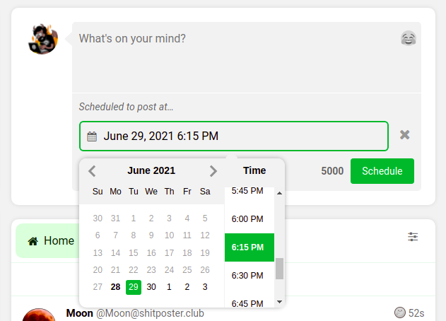
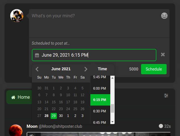
SCSS is here: https://gitlab.com/soapbox-pub/soapbox-fe/-/blob/develop/app/styles/components/datepicker.scss
is it possible to pass an inline css? I only want to change the font size
I tried using zoom and transform: scale() which helped but you get varying results on different platforms/browsers.
This issue has been automatically marked as stale because it has not had recent activity. It will be closed if no further activity occurs. Thank you for your contributions.
![stale[bot] avatar](https://avatars.githubusercontent.com/in/1724?v=4 "Published by a pub.dev verified publisher")