Doodle classification visualization
Hello,
I've created simple visualization for doodle classification example. It shows every doodle with coresponding prediction from NN.
Sample screenshot:
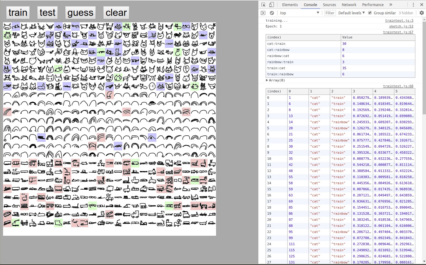
white background = NN was correct red background = guessed "cat" green background = guessed "rainbow" blue background = guessed "train"
In first table in console each row is number of mistakes for every pair label:classification.
Second table is raw list of wrong guesses in format: (index), doodle number, label, classification, guess "cat", guess "rainbow", guess "train".
In overall, looks like NN is pretty consistent with rainbow doodles, but not so much with cats and trains.
Oh this is awesome, so cool! I think this would be great to incorporate into the example code (or a second more complex version of the example.) I'll keep this open as a reference for future development and videos!