An An
这个周末加上,记得到时提醒我🙂
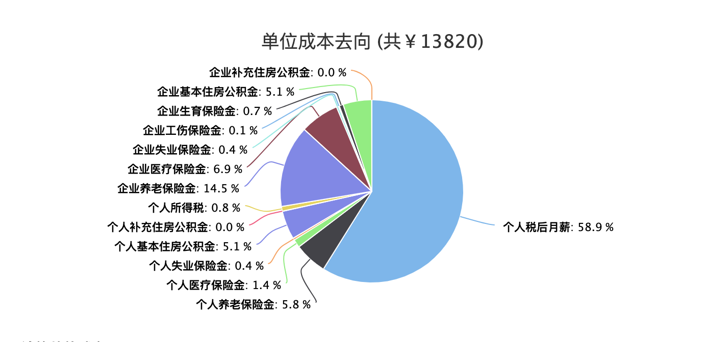
奇怪了, 你看这个网页 http://salarycalculator.sinaapp.com/
 数据很多的时候,似乎也没啥毛病
你看他的 pie 配置代码 ```js function renderOrgPieChart(data, selector) { var $target = $(selector); $target.highcharts({ credits: { enabled: false }, chart: { plotBackgroundColor: null, plotBorderWidth: null, plotShadow: true }, title: { text:...
那就说明你的饼图尺寸太大了,没有释放足够的空间用于显示 DataLabels
这就有点蛋疼了,可能是非要达到一定的宽高比才行
你给个设计稿看看,我看看能不能搞定,看你的需求描述,应该问题不大
参见iOS 版本的 AAChartKit, https://github.com/AAChartModel/AAChartKit/issues/803
安卓端的 AAChartCore 使用方法 ```java aaChartView.aa_addPointToChartSeriesElement(0 , new Random().nextInt(100) ,true); ``` 使用定时器循环执行此方法后, 图形动态效果类似 https://www.highcharts.com.cn/demo/highstock/dynamic-update 这种水平滚动效果
> 在add point时,能否设置对应的category? 这个还真的不太好办,参见 Stack Overflow 上的官方回复 https://stackoverflow.com/questions/18372682/add-category-in-highcharts 这种方法的缺陷在于你必须事先设定好 categories 数组的所有的元素的值. 如果你的图表的动态更新时间很长,频率又很高,这种方法就很操蛋了,这样的话,categories的数组元素个数也太大了