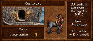
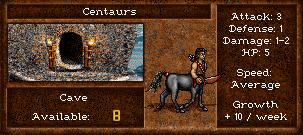
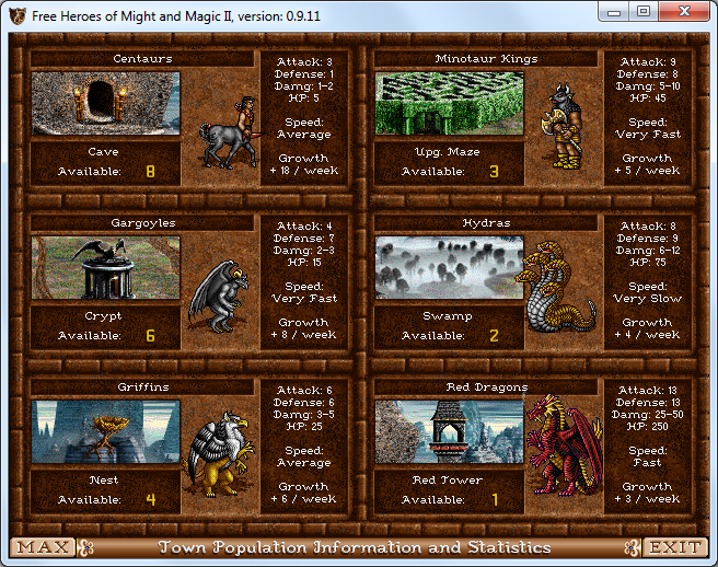
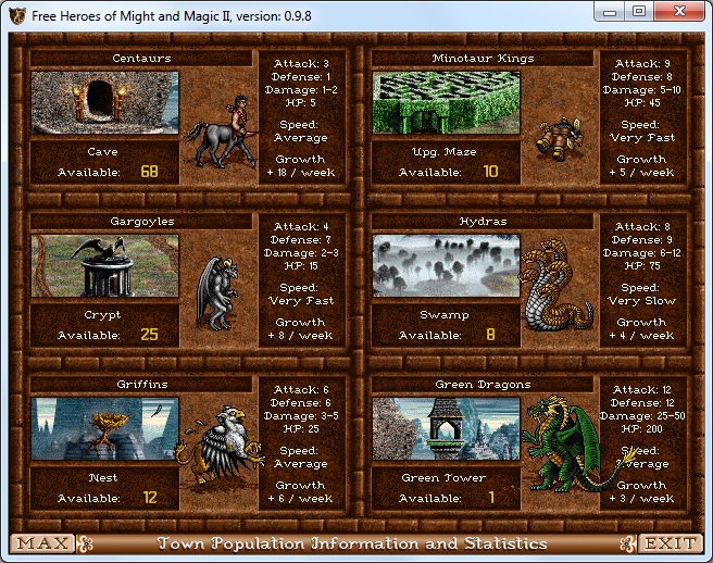
Town Population screen (with the well), wrong vertical and horizontal position of elements
In fheroes2, the vertical and horizontal position of the elements is not the same as in the original game.
This includes the creature name, creature information, the name of the creature's dwelling, the word "Available:", the number of creatures available, and the creature's sprite.
In original game:

In fheroes2:

Open the two images in different tabs in your browser, enlarge the images and switch between the two tabs alternately. Heroes 2 first, fheroes2 second.
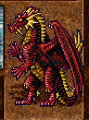
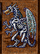
The Dragons and Bone Dragon sprites should also be moved horizontally relative to the edge of the area where they are located. 1 pixel to the left for the Dragons sprites and 1 pixel to the right for the Bone Dragon sprite. It should also be ensured that creature shadows are not displayed over the creature information frame to the right of the creature's sprite.
Regarding the vertical position of text: in my personal point of view, vertically centered information looks better. In the OG it seems to be shifted up a bit (8 pix from upper border and 10 pix from bottom)... As well as current is shifted down. (10pix from upper and 7pix from bottom)
@Branikolog.
Regarding the vertical position of text: in my personal point of view, vertically centered information looks better. In the OG it seems to be shifted up a bit (8 pix from upper border and 10 pix from bottom)... As well as current is shifted down. (10pix from upper and 7pix from bottom)
Indeed, it would be better. :) To be vertically centered, the vertical position of the text block should be moved 2 pixels down in the original game and moved 1 pixel up from the current position in fheroes2.
It should also be remembered that the distance between the lines of text is not the same between that of the original game (11 pixels) and that of fheroes2 (12 pixels) and that this must be taken into account. This makes things more complicated to adjust in relation to the original game.
Hi @LeHerosInconnu , I've checked the latest build and it seems that most of the stuff is fixed.
For reference this PR https://github.com/ihhub/fheroes2/pull/4600 fixed/adjusted creature information, dwelling name, and the "available" text. I didn't find this issue when working on it so I cannot guarantee that these were properly aligned in my PR according to the comments in this issue.
The number of creatures still available might still be 1 pixel too far up.
I did not look at the creature sprites' placement.
Hello @ihhub and @zenseii,
Hi @LeHerosInconnu , I've checked the latest build and it seems that most of the stuff is fixed.
For reference this PR #4600 fixed/adjusted creature information, dwelling name, and the "available" text. I didn't find this issue when working on it so I cannot guarantee that these were properly aligned in my PR according to the comments in this issue.
The number of creatures still available might still be 1 pixel too far up.
I did not look at the creature sprites' placement.
I checked this and here are my observations:
- The creature's name and the dwelling's name are not centered horizontally.
- The text block of the creature's characteristics is not centered vertically.
- The position of the number of available creatures is correct.
- The position of the creatures' sprites is not correct.
In original game:
In fheroes2:
For the "Damage:" line, I think the word "Damage" can be written in full (instead of "Damg" as in the original game) because, now that the block of text is centered horizontally, the line would not touch the edges of the frame (and even if it did it wouldn't be too visually disturbing even in the case of the Dragons).
In fheroes2 (previous version):
Thanks for checking! I admit that I did not look much at vertically centering the characteristics but none of it should be hard to fix.
I'm not too convinced we should revert back to writing damage in full, for the same reason as described in the PR and as seen for the bone dragons here above. I personally feel that there should at least be 1 pixel of empty margin between the text and the border of the characteristics box. Still, I do not feel very strongly about whether it is written the one way or the other.
Hello @zenseii and @Branikolog,
I'm not too convinced we should revert back to writing damage in full, for the same reason as described in the PR and as seen for the bone dragons. I personally feel that there should at least be 1 pixel of empty margin between the text and the border of the characteristics box. Still, I do not feel very strongly about this.
If you look closely, you will see that there would be 1 pixel of spacing on each side of the "Damage:" line using the entire word "Damage" if the line were centered horizontally in the frame. :)
In fheroes2 (previous version):
"Damage:" ligne centered horizontally:
Hi All. I'd better prefer traditional "DMG", rather than "Damg". )
The "Damage:" line is close to the edge only for Dragons, for all other creatures the space is larger, I think it's a shame to reduce the word in this situation. :)