Font, spacing between letters and between lines
In fheroes2, the letters are tighter and the line spacing is larger compared to the original game. This can be easily noticed with the scenario description which is not displayed in the same way.
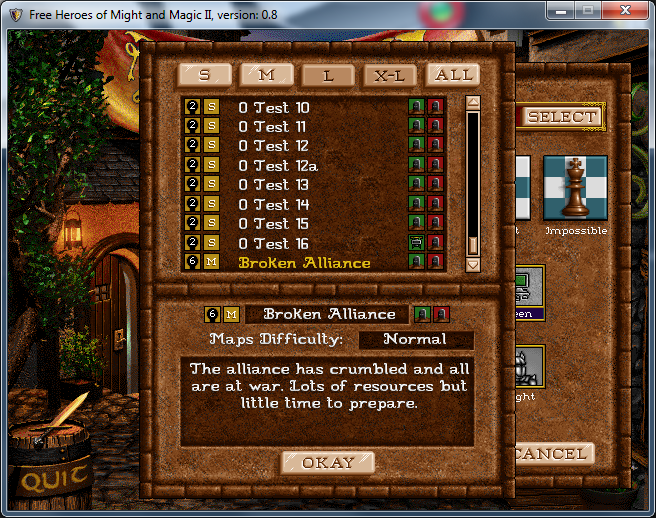
In the original game:

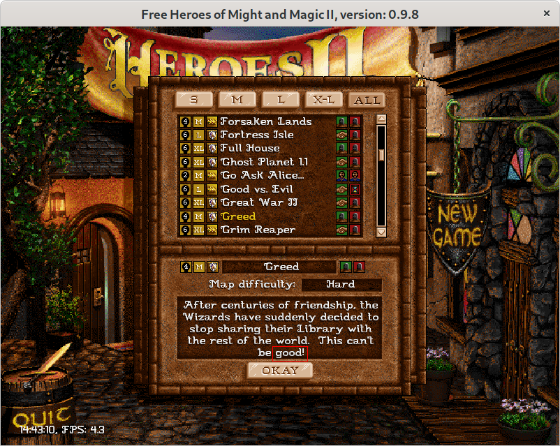
In fheroes2:
Hi, @LeHerosInconnu! I can see the difference. But doesn't it looks better in fheroes2, in your opinion?
Hello @Branikolog, I'm so used to playing with the airier font from the original Heroes 2 that the texts in fheroes2 seem strange to me. I have the impression that the text is all curled up on itself, it gives a feeling of oppression. And it is even more obvious, for example in small info windows, I have the impression that the text has been compressed to be able to fit into the window space.
Additionally, the right margin in the description box seems to be non-existent, should be at least one pixel:

I am moving this issue out of the original project scope. While it is good to replicate the original game by 100% the current implementation allows us to have more text to be displayed and players are used to it.
Moving this issue to the Discussion section as I don't think we are going to use the original text alignment.