flutter_time_picker_spinner
 flutter_time_picker_spinner copied to clipboard
 icemanbsi
A Flutter widget to set time with spinner instead of material time picker
flutter_time_picker_spinner
Time Picker widget with spinner instead of a material time picker.
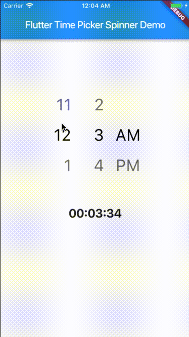
12H format
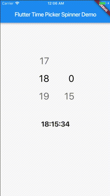
24H format
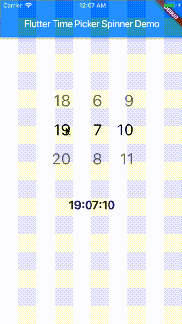
24H format with second
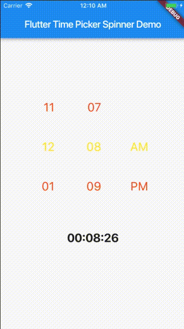
Custom style
Getting Started
This project is a starting point for a Dart package, a library module containing code that can be shared easily across multiple Flutter or Dart projects.
For help getting started with Flutter, view our online documentation, which offers tutorials, samples, guidance on mobile development, and a full API reference.
Props
| props | types | defaultValues |
|---|---|---|
| time | DateTime | Current Time [ DateTime.now() ] |
| minutesInterval | int | 1 |
| secondsInterval | int | 1 |
| is24HourMode | bool | true |
| isShowSeconds | bool | false |
| isShowSeconds | bool | false |
| highlightedTextStyle | TextStyle | false |
| normalTextStyle | TextStyle | false |
| itemHeight | double | 60.0 |
| itemWidth | double | 45.0 |
| spacing | double | 20.0 |
| alignment | AlignmentGeometry | Alignment.centerRight |
| isForce2Digits | bool | false |
| onTimeChange | TimePickerCallback |
Usage
import 'package:flutter_time_picker_spinner/flutter_time_picker_spinner.dart';

Widget widget() {
  return new TimePickerSpinner(
    is24HourMode: false,
    normalTextStyle: TextStyle(
      fontSize: 24,
      color: Colors.deepOrange
    ),
    highlightedTextStyle: TextStyle(
      fontSize: 24,
      color: Colors.yellow
    ),
    spacing: 50,
    itemHeight: 80,
    isForce2Digits: true,
    onTimeChange: (time) {
      setState(() {
        _dateTime = time;
      });
    },
  );
}
 icemanbsi