 hypeserver
How to show ONLY date inputs (and NOT the rest of the calendar)?
Subject of the issue
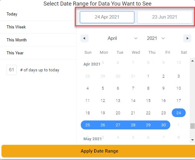
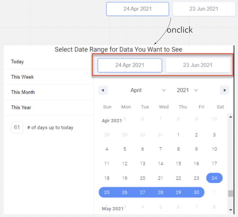
It looks like there has been many requests for this in the past but library owners does not want to support feature as a configuration to only show the date inputs (see red box in attached image), and optionally show/hide the rest of the widgets onclick.
As a workaround, I want to ONLY show the date inputs as a component by itself. (And then write my own code to show the full widget onclick)
How can I show ONLY the date inputs? (What is the component name of the date inputs? Can I import it and render it by itself?)
hi @phutngo can you share a protoype what you'd like to achieve at the end?
hi @keremciu, thanks for asking.
ideally, same feature as demo here: http://airbnb.io/react-dates/?path=/story/daterangepicker-drp--default. Just 2 date-input fields (that can by default display whatever dates was selected), when user click on either one, the whole DateRangePicker then popup.
+1. Not usable for me without this feature. Note that Material-UI labs date picker does this by default.
I have a one-line form with this date range picker. The line is like 10 rows tall, which makes it not really usable. Would love that feature too. Only show the two dates and expand (pop-over or the like) on click, and collapse on focus loss or something.
My workaround:
import React, { useState } from "react";
import { makeStyles } from "@material-ui/core";
import clsx from "clsx";
import { DateRange } from "react-date-range";

const useStyles = makeStyles((theme) => ({
  root: {
    width: "100%",

    "& .rdrDateDisplayWrapper": {
      cursor: "pointer",
    },

    "& .rdrMonths, & .rdrDateInput": {
      pointerEvents: "none",
    },

    "&.collapsed": {
      "& .rdrMonthAndYearWrapper, & .rdrMonths": {
        display: "none",
      },
    },
  },
}));

const CollapseDateRange = (props) => {
  const classes = useStyles(props);

  const [collapsed, setCollapsed] = useState(true);

  const toggleCollapse = (event) => {
    (event.target.classList.contains("rdrDateDisplay") ||
      event.target.classList.contains("rdrDateDisplayWrapper")) &&
      setCollapsed((prev) => !prev);
  };

  return (
    <div onClick={toggleCollapse}>
      <DateRange
        {...props}
        className={clsx(classes.root, collapsed && "collapsed")}
      />
    </div>
  );
};

export default CollapseDateRange;
Don't know why but the onClick did not work on DateRange so I added a div.
My workaround:
import React, { useState } from "react";

import { makeStyles } from "@material-ui/core";

import clsx from "clsx";

import { DateRange } from "react-date-range";


const useStyles = makeStyles((theme) => ({

  root: {

    width: "100%",


    "& .rdrDateDisplayWrapper": {

      cursor: "pointer",

    },


    "& .rdrMonths, & .rdrDateInput": {

      pointerEvents: "none",

    },


    "&.collapsed": {

      "& .rdrMonthAndYearWrapper, & .rdrMonths": {

        display: "none",

      },

    },

  },

}));


const CollapseDateRange = (props) => {

  const classes = useStyles(props);


  const [collapsed, setCollapsed] = useState(true);


  const toggleCollapse = (event) => {

    (event.target.classList.contains("rdrDateDisplay") ||

      event.target.classList.contains("rdrDateDisplayWrapper")) &&

      setCollapsed((prev) => !prev);

  };


  return (

    <div onClick={toggleCollapse}>

      <DateRange

        {...props}

        className={clsx(classes.root, collapsed && "collapsed")}

      />

    </div>

  );

};


export default CollapseDateRange;
Don't know why but the
onClickdid not work onDateRangeso I added adiv.
This solution breaks keyboard accessibility. Would be great to have an official solution
+1 any updates on this or does someone have a suggestion for an alternative hack to do this?
If somebody is still searching for a date ranger picker alternative, that supports features like last month natively and is collapsed by default, I highly recommend tremor: https://www.tremor.so/docs/components/daterangepicker