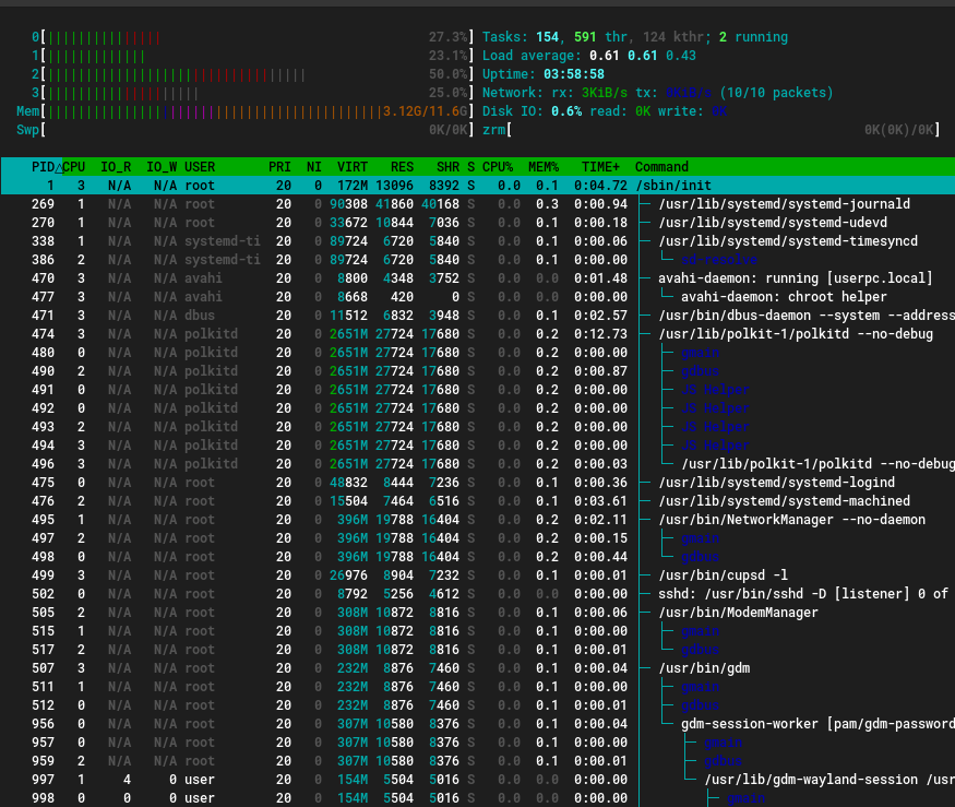
Default color scheme: Avoid using dark color fonts on black bg
htop 3.2.0 Dark color fonts on black bg shouldn't be used. e.g. Previously in <3.2 threads where green, but now they are unreadable dark blue.

In the default color profile, we have:
      [PROCESS_THREAD] = ColorPair(Green, Black),
      [PROCESS_THREAD_BASENAME] = A_BOLD | ColorPair(Green, Black),
Showing custom thread names, which you have enabled in Setup (F2) -> Display Options, we chose another color to differentiate these. And that is Blue by default. Try a different color preset if that works better for you?
I would second that. The default color preset is great, except for its usage of (non-bold) blue. Any chance to switch that to bold blue? Should be perfectly visible with light and dark background then.
@BenBE Custom thread names is your turf...
diff --git a/CRT.c b/CRT.c
index 868f2377..4391f7c0 100644
--- a/CRT.c
+++ b/CRT.c
@@ -156,7 +156,7 @@ static int CRT_colorSchemes[LAST_COLORSCHEME][LAST_COLORELEMENT] = {
       [PROCESS_THREAD] = ColorPair(Green, Black),
       [PROCESS_THREAD_BASENAME] = A_BOLD | ColorPair(Green, Black),
       [PROCESS_COMM] = ColorPair(Magenta, Black),
-      [PROCESS_THREAD_COMM] = ColorPair(Blue, Black),
+      [PROCESS_THREAD_COMM] = A_BOLD | ColorPair(Blue, Black),
       [BAR_BORDER] = A_BOLD,
       [BAR_SHADOW] = A_BOLD | ColorPairGrayBlack,
       [SWAP] = ColorPair(Red, Black),
This looks much better, I second @eworm-de's proposal.
@BenBE Custom thread names is your turf...
Bold (light) has not been used there, as bold is a marker for the executable basename.
@BenBE Custom thread names is your turf...
Bold (light) has not been used there, as bold is a marker for the executable basename.
Aah, that makes sense. Shall we move the basename to bold cyan or so to make it still differentiate? The bold blue is much more readable than the plain blue so it would be nice to be able to change that. Without breaking porcelain elsewhere...
Is there a reason not to have bold blue in network and I/O meters? That's where it bother even more.
Now you get greedy, @eworm-de :-)
Aah, that makes sense. Shall we move the basename to bold cyan or so to make it still differentiate? The bold blue is much more readable than the plain blue so it would be nice to be able to change that. Without breaking porcelain elsewhere...
It actually is bold cyan already. So no risk of confusion?
I'm not sure I like to make everything bold … Will have to see it in action.
But given threads are green usually, marking COMM there as orange may be an alternative …
Please test #1023, give feedback and let me know if this causes any color conflicts or other issues.
Okay, quick test feedback:
- The
[]brackets around inactive tabs look strange. Also the dark-grey on blue is kinda hard to read. Would be better to have black there for the tab text). - The digits overlapping the text at the right of meters are still dark blue, making that area hard to read (could be updated when touching this anyway)
- Can't check the ZRAM changes due to lack of having ZRAM configured.
The digits overlapping the text at the right of meters are still dark blue, making that area hard to read (could be updated when touching this anyway)
Is this particular point similar to what I tried to fix in #930 ? I have screenshots posted there, so check whether if it's the same issue.
The digits overlapping the text at the right of meters are still dark blue, making that area hard to read (could be updated when touching this anyway)
Is this particular point similar to what I tried to fix in #930 ? I have screenshots posted there, so check whether if it's the same issue.
Yes. Was with that PR in mind …
I second that the new lighter blue in 3.2.2 works much better on black background (i.e. the default colors). I had to install my first ever snap to get the latest htop version on Ubuntu LTS.
Big thanks for a simply awesome process monitor 🥇
With the darkgrey instead of light (7=dark fg) it can fortunately be mitigated by using the "broken grey" theme, despite the grey being correct, only the default theme uses the wrong grey (8=light bg)
Is there a PR with the change(s) left on this issue to be fully resolved? /DLange
Looking at the history of this issue I think @eworm-de may have some …
My changes were about bold blue and have been merged in 2ca75625ee5c2ac0ef1571e6918d7c94f3aa011c (& 37d30a3a7d6c96da018c960d6b6bfe11cc718aa8).
If there's nothing left, I think we can close this one.
Has the grey been fixed too? From what has been said here it seems only the blue was taken care of.
No grey, no green. Just blue.
Personally I am fine with current state.
I mean, I really don't understand how anyone finds fine the looks that are seen at the top of this issue. You can clearly see that the grey is just not visible at all.
For that you can use the "Broken Gray" color scheme, @JosefLitos
Yes, but that removes the grey entirely, instead of using the correct colour. Also the grey isn't broken, broken are the defaults of the colorscheme.
Can you do two screenshots please:
- Your preferred "gray"
- The "broken gray" colorscheme for comparison. I am confused on what you want but have a different default color scheme (which is likely not going to happen, see above) /DLange
My issue comes mainly from the day variant of my colour scheme, which has very subtle secondary background (the grey that is being used for text here)