Wysiwyg editor for comments boxes
Is your feature request related to a problem? Please describe. Currently to format text in the tasks comments section of TM you have to use Markdown. That has a few disadvantages: If you do not have some sort of developer background Markdown could be too hard to use.
There is not even a hint accompanying the text box that Markdown can be used. So those that know Markdown will not use it because they simply do not know they can.
The result of this is that all comments look like boring unformatted blocks of text, unattractive to read.
Describe the solution you'd like
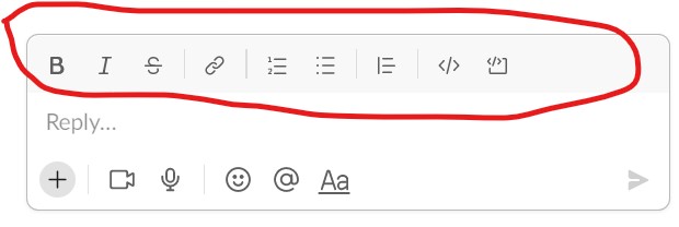
The ideal solution would be a text editor with a toolbar with buttons to render bold, italic and lists (numbered, not numbered) etc.
Additional context The idea was martien's
We recently added some textual hints to indicate the comment textarea has support for images and markdown. In addition to that, you can now also preview your comment before posting it. This is currently on the staging instance and will be available on the live instance soon.
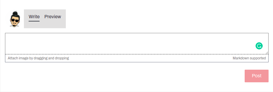
Tested. The preview works when commenting a project, great job with that 👍
I would appreciate if it would be available also when commenting a task after mapping/validation.
Awesome! I agree with @Patrik-Br , having this in the validation/mapping task comments would be great too
This is a great improvement compared to the current situation.
But my original idea is that the ideal solution would be a formatting toolbar. With a few basic formatting tools, like bold text, insert hyperlink, bulleted or numbered lists. No Markdown needed then.
Like the bar we have on Slack.
Tested on: https://tasks-stage.hotosm.org/projects/5871
My findings:
This is a great improvement compared to the current situation. The Preview tab is a giant help in writing good looking comments.
What i also appreciate is that when you increase the size of the textbox the "Post" button stays visible (instead of being covered by the textbox, as it is now).
Issues:
- As to image insertion: no matter where you place the cursor, the image always lands at the end of the text. It would be nice if the image would be placed where your cursor is.
- After inserting a hyperlink, the Preview shows it as flat text. Only after posting the comment the hyperlink is shown as a hyperlink. That way it is harder to check if your hyperlink is really working.
The toolbar would be nice, but will take time.
Could a tooltip be added to the text "Markdown supported" showing some basics? Maybe something like:
_Text_ Displays text in italics
**Text** Displays the text in bold
~~Text~~ Adds strikethrough effect to the text
`code`  unformatted code
# Heading   H1 heading
## Heading   H2 heading
* item   unordered list
1 item   ordered list
As to the tooltip: even better would be a text on the page near the textbox. With a link to a Markdown cheat sheet.
I realise this will take up (valuable) space. But maybe it could be cut down to bold and (un)ordered list. I think there is no great need for italics, code or headings in these often short comments.
**Text** bold
* item   unordered list
1 item   ordered list
<hyperlink to Markdown cheat sheet>
test
code
block with ```
preview showed monospace font and respected CRLF, but pressing enter did not respect CRLF. Also, should the block be indented by 4 spaces?
With a link to a Markdown cheat sheet.
Markdown link: https://www.markdownguide.org/basic-syntax/ ( from https://www.hotosm.org/tech-blog/tm-notifications-performance/ ); may since have changed.
Optional placeholder (code)
url: 'https://www.markdownguide.org/basic-syntax/',
Hi all, the Quality Control Working Group would like to prioritize this one