KoExtensions
 KoExtensions copied to clipboard
Published
20 hours ago •
 hoonzis
Simple charting library originaly built for KnockoutJS and few useful knockout bindings
KoExtensions

KoExtensions can be used as standalone JavaScript charting library based on D3JS or plug-in for KnockoutJS. Besides charting, when used with Knockout it provides other useful bindings. Available charts:
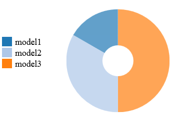
| Pie Chart | Bar Chart | Line Chart |
|---|---|---|
 |
 |
 |
| Example | Example1 Example2 | Example1With Slidder |
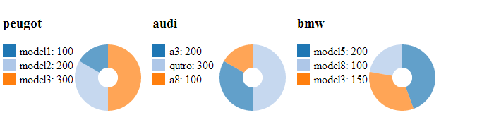
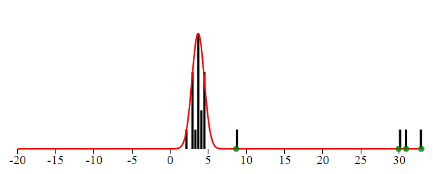
| Chord Chart | Bubble Chart | Histogram |
|---|---|---|
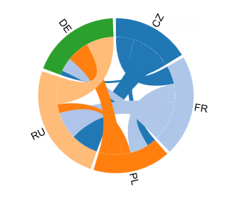 |
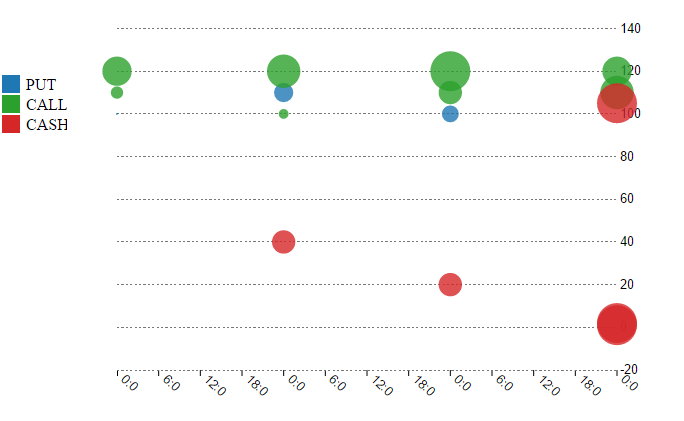 |
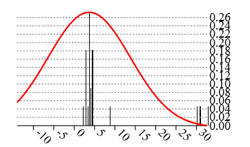 |
| Example | Example | Example |
Fiddle to play around: https://jsfiddle.net/u4sL2x67/4/
Other bindings useful for Knockout:
- Bootstrap DateTime picker binding [Example] datepickerEx
- FormattedValue binding - showing data values in the UI with applied formatting (currencies, rounding). Example
All charts are created with D3JS and based on multiple examples provided in the documentation.
Using KoExtensions
KoExtensions can be used either together with Knockout or as a separate charting library.
// As separate charting library
<script src="d3.js"></script>
<script src="koextensions.js"></script>
koext.charting.lineChart(testData, el, {width:"100px"});
// Together with knockout
<script src="d3.js"></script>
<script src="knockout.js"></script>
<script src="koextensions.js"></script>
<div data-bind="linechart:testData, chartOptions:{width:100px}"
Contributing and building
Browserify is used to combine the files in src folder and create the bundle, few tests are written with QUnit. Gulp tasks are avaiable for both:
gulp build
gulp test
Some useful tips
- Showing multiple charts in knockout foreach loop can be achieved as follows:
<!-- ko foreach: cars -->
 	<div style="float:left;margin-right:10px">
	 	<h3 data-bind="text:name"></h3>
		<div data-bind="piechart: data"></div>
 	</div>
 <!-- /ko -->
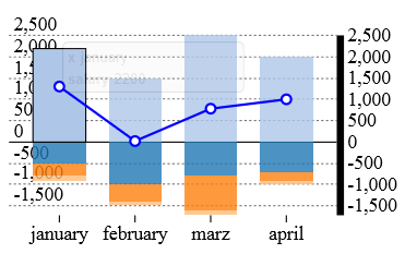
- Interesting usage of barchart can be "cashflow chart" which shows a single line, going through the bars being the addition of the bars values. This can be achieved as follows:
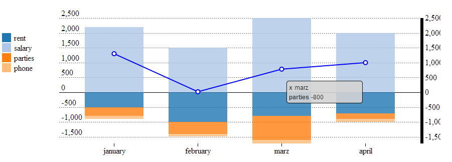
<div id="cashFlow" data-bind="barchart: lifeExpenses, xcoord:'month',line:expensesPerMonth,chartOptions:{legend:true, width:800,height:300,style:'stack',sameScaleLinesAndBars:true}">
function TestViewModels (expenses){
	self = this;
	self.lifeExpenses = ko.observableArray([]);
	self.expensesPerMonth = ko.observableArray([]);
	var totalPerMonth = expenses.map(function(item){
		var keys = Object.keys(item).filter(function(key){return key != 'month';});
		var monthTotal =  {	x : item['month'], y : d3.sum(keys, function(key) { return item[key];}) };
		return monthTotal;
	});
	self.lifeExpenses(expenses);
	self.expensesPerMonth(totalPerMonth);
}
- Histogram chart has some additional properties which can be used to visualize the statistical distribution, using either Mean or Median and standard variance or MAD (Median absolute deviation)
<div id="histogram" data-bind="histogram: data, chartOptions : {
        tolerance : 10,
        showProbabilityDistribution: true,min : -20,
        expected: 'median',
        useMAD: true,
        showOutliers: true}"></div>