Charts are cut off in History modal
Checklist
- [X] I have updated to the latest available Home Assistant version.
- [X] I have cleared the cache of my browser.
- [X] I have tried a different browser to see if it is related to my browser.
Describe the issue you are experiencing
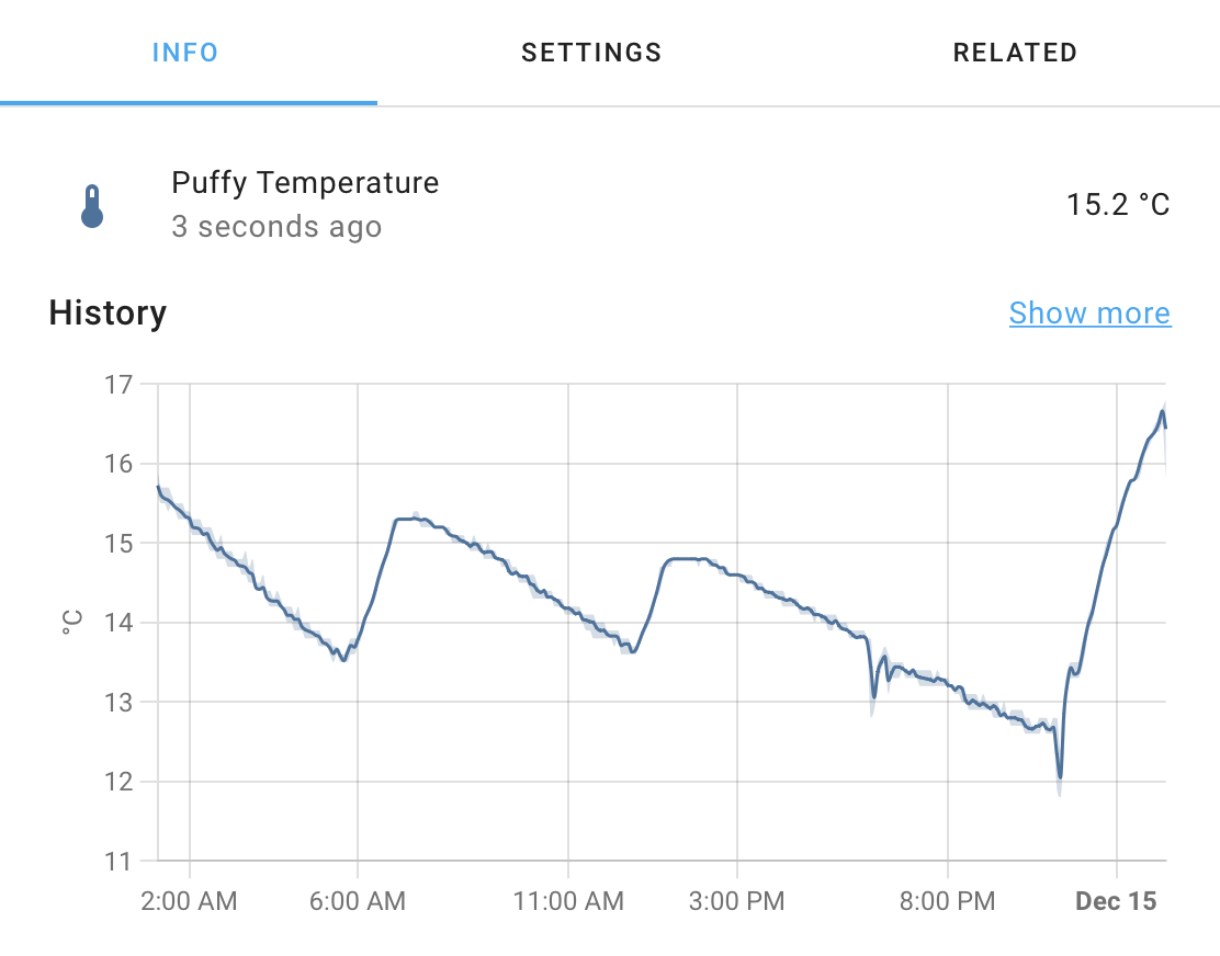
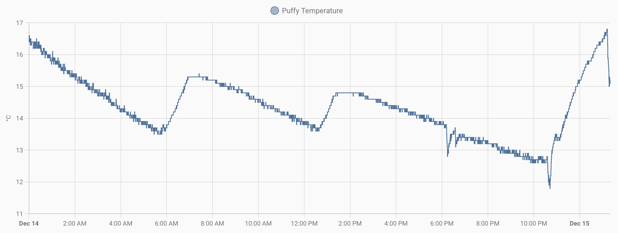
The chart in the details modal is cut off on the right.
Describe the behavior you expected
I expect the full chart to be visible. In the History view, the full chart is visible.
Steps to reproduce the issue
- Click on details of an entity that has stats
What version of Home Assistant Core has the issue?
2022.12.6
What was the last working version of Home Assistant Core?
2022.12.6
In which browser are you experiencing the issue with?
Safari Version 16.1
Which operating system are you using to run this browser?
macOS
State of relevant entities
No response
Problem-relevant frontend configuration
No response
Javascript errors shown in your browser console/inspector
No response
Additional information
No response
These are absolutely different graphs - precise actual data in History & approximate statistical data in more-info. They are not obliged to look same.
I have the same problem. This used to work fine in the pop up dialog. It really should be showing the last value, as you go to that dialog to see a short term trend.
There hasn't been any activity on this issue recently. Due to the high number of incoming GitHub notifications, we have to clean some of the old issues, as many of them have already been resolved with the latest updates. Please make sure to update to the latest Home Assistant version and check if that solves the issue. Let us know if that works for you by adding a comment 👍 This issue has now been marked as stale and will be closed if no further activity occurs. Thank you for your contributions.