Add vertical option for tile card
Breaking change
Proposed change
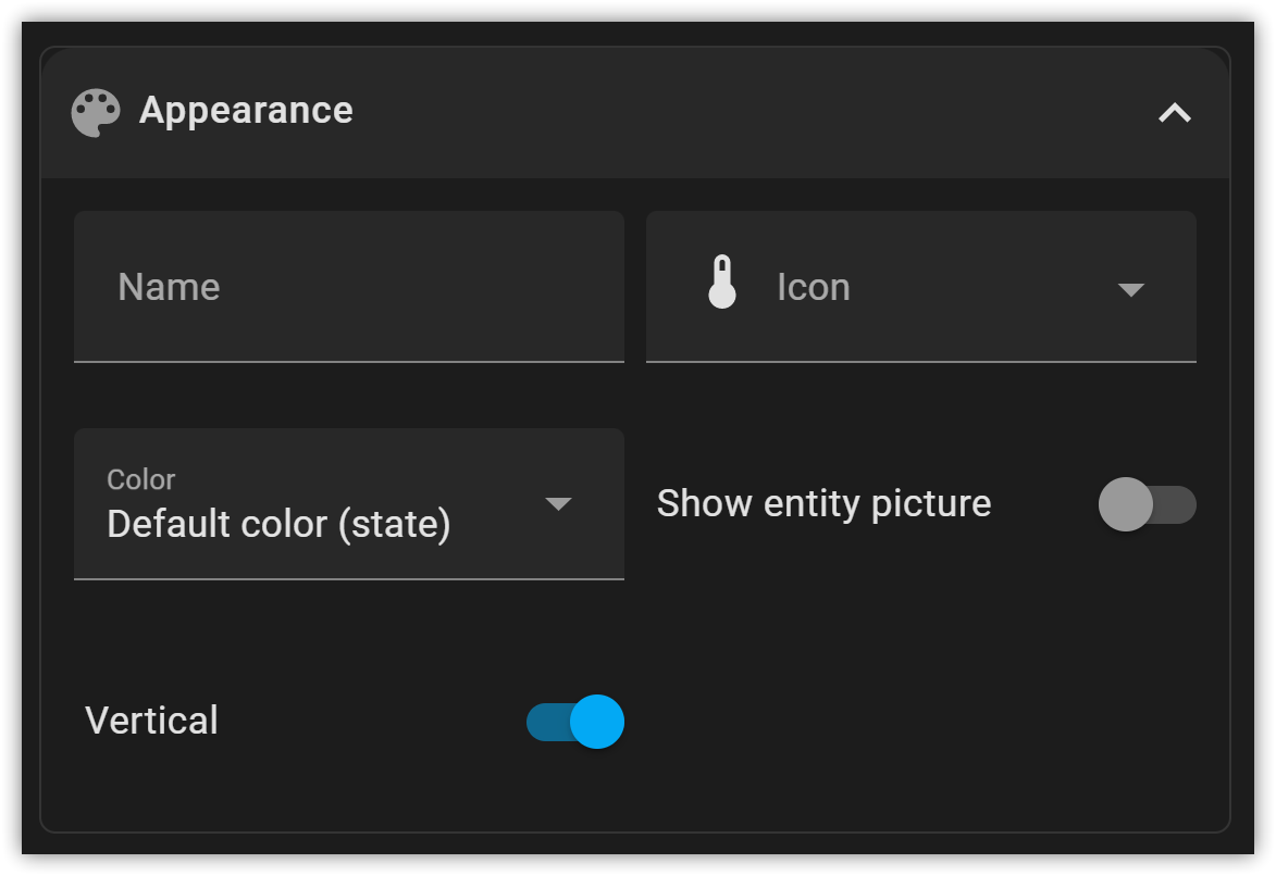
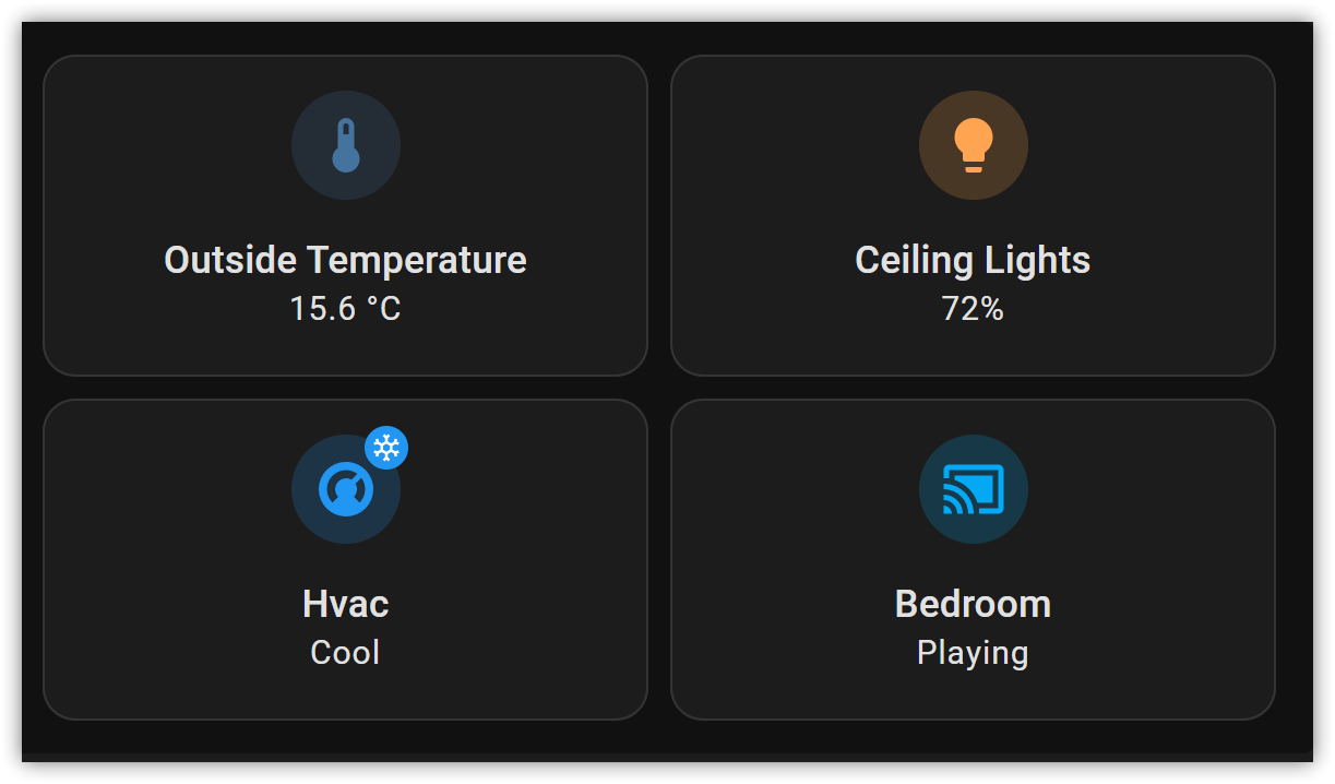
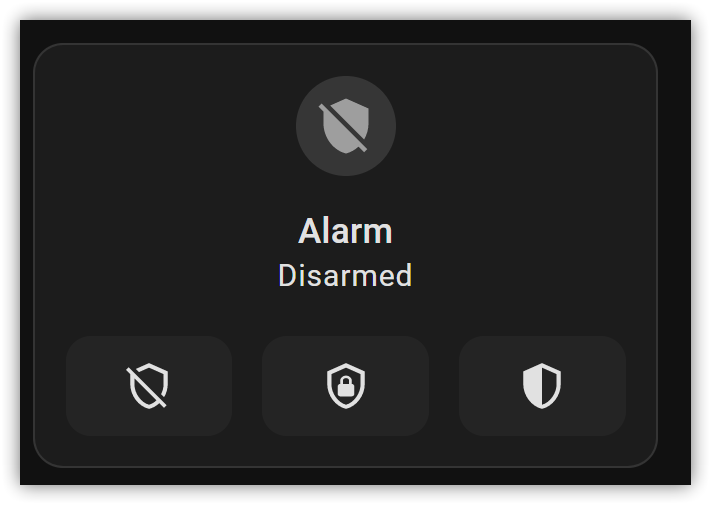
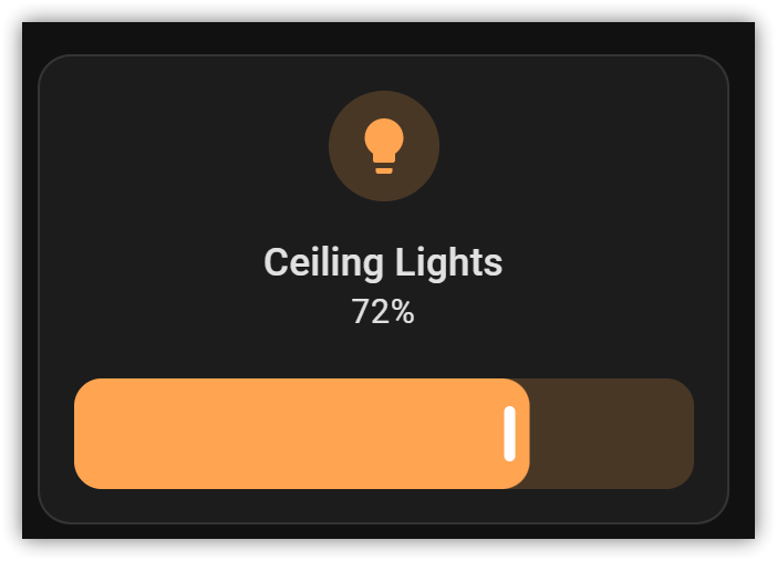
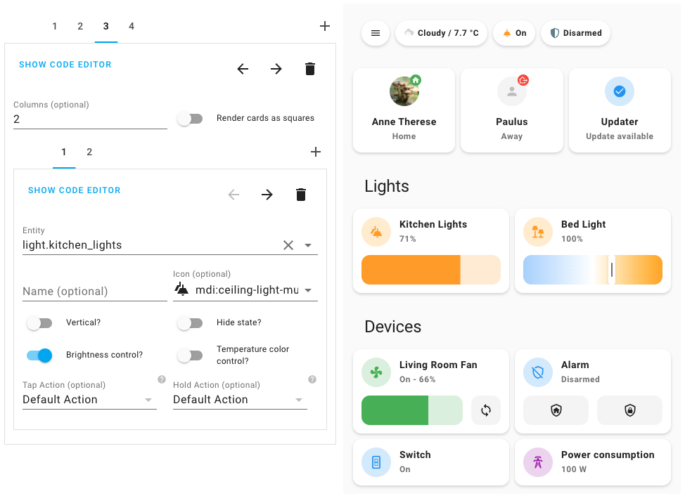
For some scenarios a vertical tile card is much more appealing. This PR adds a simple css class, that sets the flex-direction to column instead of row and centers the text. I also added a boolean switch to the tile card editor.
Some screenshots:
Type of change
- [ ] Dependency upgrade
- [ ] Bugfix (non-breaking change which fixes an issue)
- [x] New feature (thank you!)
- [ ] Breaking change (fix/feature causing existing functionality to break)
- [ ] Code quality improvements to existing code or addition of tests
Example configuration
Additional information
- This PR fixes or closes issue: fixes #
- This PR is related to issue or discussion:
- Link to documentation pull request:
Checklist
- [x] The code change is tested and works locally.
- [x] There is no commented out code in this PR.
- [ ] Tests have been added to verify that the new code works.
If user exposed functionality or configuration variables are added/changed:
- [ ] Documentation added/updated for www.home-assistant.io
I am trying to understand the benefit of that layout. Isn't that always using more space than before?
Yes true, but in some layouts it fits great.
For example here is the demo picture of the mushroom project:
In the top row it uses vertical cards and in my opinion it fits nicely here.
As a mushroom user who's slowly moving to tile as it becomes more feature complete, being able to set cards vertically for grid layouts is essential