frontend
 frontend copied to clipboard
 home-assistant
Fix button card font size on mobile
Proposed change
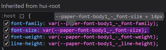
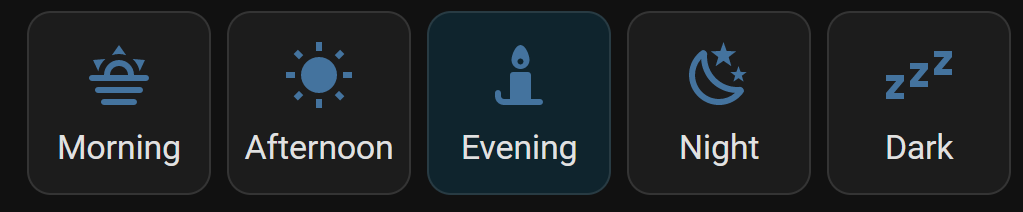
The button card defines its own font size in rem, which results in style inconsistencies. While it might look correct on desktop:
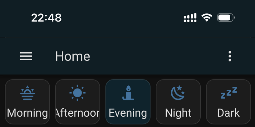
The font size is too large on mobile. For example on iOS:
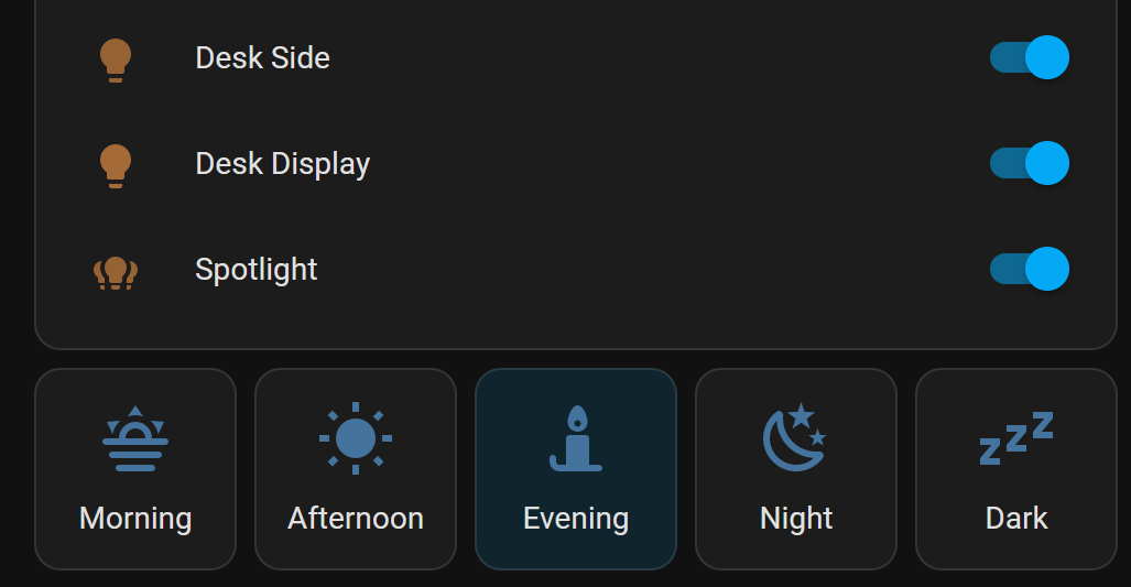
By dropping the font size override, the element will use the font size that fits on all platforms and is already used by other elements:
Type of change
- [ ] Dependency upgrade
- [x] Bugfix (non-breaking change which fixes an issue)
- [ ] New feature (thank you!)
- [ ] Breaking change (fix/feature causing existing functionality to break)
- [ ] Code quality improvements to existing code or addition of tests
Example configuration
square: true
columns: 5
type: grid
cards:
  - show_name: true
    show_icon: true
    type: button
    tap_action:
      action: toggle
    entity: <entity with a reasonably long name>
Additional information
Checklist
- [x] The code change is tested and works locally.
- [x] There is no commented out code in this PR.
- [ ] Tests have been added to verify that the new code works.
If user exposed functionality or configuration variables are added/changed:
- [ ] Documentation added/updated for www.home-assistant.io
Hi Nezz
It seems you haven't yet signed a CLA. Please do so here.
Once you do that we will be able to review and accept this pull request.
Thanks!
![home-assistant[bot] avatar](https://avatars.githubusercontent.com/in/97978?v=4 "Published by a pub.dev verified publisher")
Are you using a theme or other custom things?
I'm not able to reproduce this issue, furthermore, because we have set a fixed font size on the html element (which makes rem a bit useless, but we should still use it someday) it should not matter what your settings are...
Anyway, we should not change the styling everywhere because it is not correct on 1 device.
Try this:
type: grid
columns: 5
square: true
cards:
  - show_name: true
    show_icon: true
    type: button
    entity: scene.living_room_afternoon
    name: Afternoon
I'm using the stock dashboard without themes. The issue happens for me both in the app and Safari. I'd assume that it also affects Android phones. I'm also able to reproduce by increasing the zoom in my desktop browser to 150%.
Is the button designed to just have a very large text and therefore using 5 columns with more than 6 characters on each is just too much?
Can we give it a none rem size, so that it stays the same on all devices and is fixed for Safari?
Sure, I updated it to 16.8 pixels, which matches the 14px rem size on desktop: