xticks/yticks argument does not work for hvplot heatmap
Short description of issue
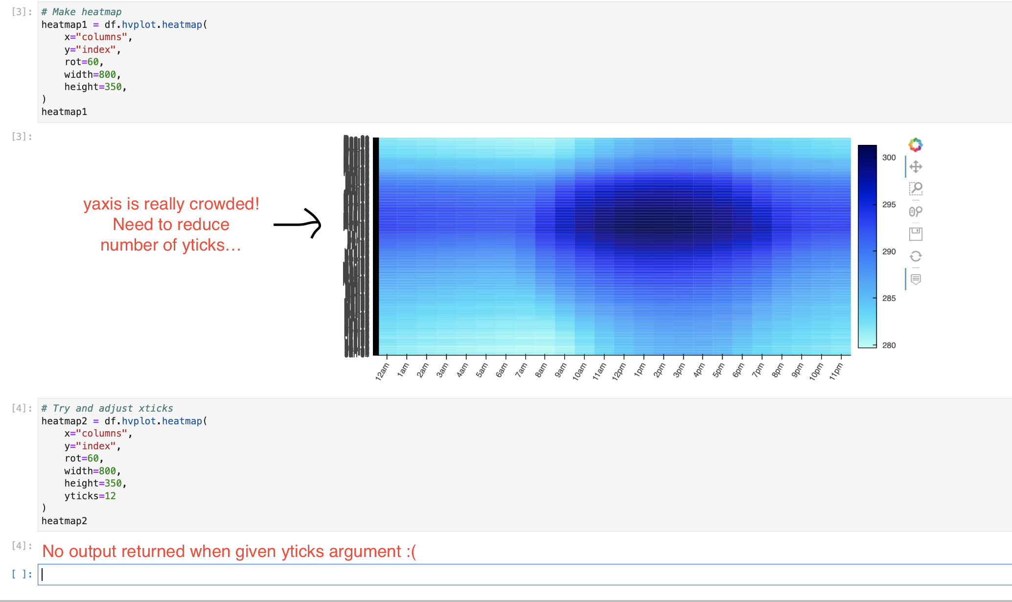
I really need to reduce the density of yticks on my heatmap. Supposedly, the xticks and yticks argument should be able to do this, but it doesn't work, and actually makes my plot disappear.
Software version info
hvplot version: 0.8.0 pandas version: 1.3.4
Complete, minimal, self-contained example code that reproduces the issue
Code is pasted below. A Jupyter Notebook with this code and data used by the notebook is also included.
Zip file with data and notebook: data_and_notebook.zip
Code snippet from notebook:
df = pd.read_csv("tmy_data.csv", index_col="date") # Read data

heatmap2 = df.hvplot.heatmap( # Make plot
    x="columns",
    y="index",
    rot=60,
    width=800,
    height=350,
    yticks=12
)
heatmap2
Screenshots or screencasts of the bug in action
Description of expected behavior and the observed behavior
Expected Behavior: yticks argument reduces the number of yticks present if I feed it an integer value (i.e. if i set yticks=10, I should get back a heatmap with 10 yticks).
Observed behavior: No heatmap is returned
Hi @nicolejkeeney !
Thanks for reporting this issue. I believe hvPlot doesn't handle two things properly there:
- in general it struggles with categorical axes, which is the case in your data
- when it struggles, it should say so by emitting a warning or raising an error with an informative message
Two workarounds that might be worth trying in the mean time:
- in the reference gallery you'll see that your data can be a long timeseries and use Pandas datetime features (e.g.
df.hvplot.heatmap(x='time.month', y='time.day')). This is also demonstrated in the timeseries data guide. Using that approach, theyticksoption works as expected. - the
yticksoption work well on numerical data so you could replace your index by the default Pandas index (0, 1, 2, etc.) and setyticksas a list of(index, label), every X label being the original labels while the others are set to empty strings.
Same (or very similar) thing happens for me with grouped box and violin plots.
mport hvplot
import hvplot.xarray
import xarray as xr
import numpy as np
from bokeh.models import BasicTickFormatter

if __name__ == "__main__":
    # make a dummy xarray dataset with two dimensions
    dim1_size = 10000
    dim2_size = 50
    xds = xr.Dataset(
        {"values": (("dim1", "dim2"), np.random.random((dim1_size, dim2_size)))},
        coords={"dim1": np.arange(dim1_size), "dim2": np.arange(dim2_size)},
    )

    # this works, but the horizontal axis labels overrun and are illegible
    p = xds.hvplot.violin("values", by="dim2")
    hvplot.show(p)

    # --------------------------------------------------
    # for each of the following, a server starts and no plot appears at all

    # p = xds.hvplot.violin("values", by="dim2", xticks=[0, 25, 50])
    # hvplot.show(p)

    # p = xds.hvplot.violin("values", by="dim2").opts(xticks=[1, 25, 50])
    # hvplot.show(p)

    # formatter = BasicTickFormatter()
    # p = xds.hvplot.violin("values", by="dim2").opts(xformatter=formatter)
    # hvplot.show(p)
just noting this is still happening in v11.1. The suggested workaround of using time series features doesn't really help.
import hvplot
import hvplot.xarray
import matplotlib.ticker
import numpy as np
import pandas as pd
import xarray as xr
from bokeh.models import BasicTickFormatter

DAYS_IN_YEAR = 365

if __name__ == "__main__":
    # make a dummy xarray dataset with two dimensions
    dim1_size = 10000
    dim2_size = DAYS_IN_YEAR
    xds = xr.Dataset(
        {"values": (("dim1", "dim2"), np.random.random((dim1_size, dim2_size)))},
        coords={"dim1": np.arange(dim1_size), "dim2": np.arange(dim2_size)},
    )
    xds = xds.assign_coords(date=('dim2', pd.to_timedelta(range(DAYS_IN_YEAR), unit="d") + pd.to_datetime("2016/1/1")))

    # this works, but the horizontal axis labels overrun and are illegible
    p1 = xds.hvplot.violin("values", by="dim2")

    # the suggested workaround of using timeseries features does not help:
    p2 = xds.hvplot.violin("values", by="date.dayofyear")
    hvplot.show(p1 + p2)