graph numbers vs spreadsheet
@holiman, I'm wondering about the numbers in this spreadsheet:

There SLOAD is at 1000 gas per ms.
But in these graphs from the readme, for stats around the same block numbers, SLOAD is not as extreme (in the 4mil to 5mil, SLOAD doesn't even appear):


Trying to get a sense for these variations... is the spreadsheet data not a good sample?
That spreadsheet (if it's the one I made a while back?) is a predecessor to the vmstats-thingy. I think the data from the spreadsheet are some random block segments that I ran off my laptop, whereas the data in vmstats was collected a bit more carefully (from zero to head, on aws machines). It's really odd though, that SLOAD is not part of 4M to 5M. Because it's in this chart:
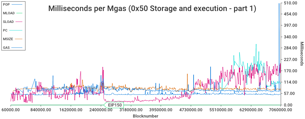
(Makes me wonder if there's an off by one error, and the 4M to 5M is actually showing 3M to 4M ? Or, it's because it didn't start to rise until the late 4M -- EDIT : yes, that would make sense, since the spreadsheet starts at 4.76M, which is just when it starts to become heavy again )