[FEATURE] Youth tab - don't use slider, and put graph on the left
Is your feature request related to a problem? Please describe. The sliders on the bottom of the page are taking too much space. I think the same functionality can be done without a slider.
Next to that it confuses me, because I have no idea what the slider is for, what does setting the slider for starting and current skill do??
The graph on the right which shows developments is on the right of the screen, while this is more informative.
Describe the solution you'd like Move graph to the left, so that it is the first graph that you see. It gives a good visual information on the progress of a player.
Use something different than a slider for starting and current skill. For example make it a field where you can add a number. Or two clickable fields. First field select value [0..8] and second field [0..99] so that you can set a value like 7.99 etc.
Additional context
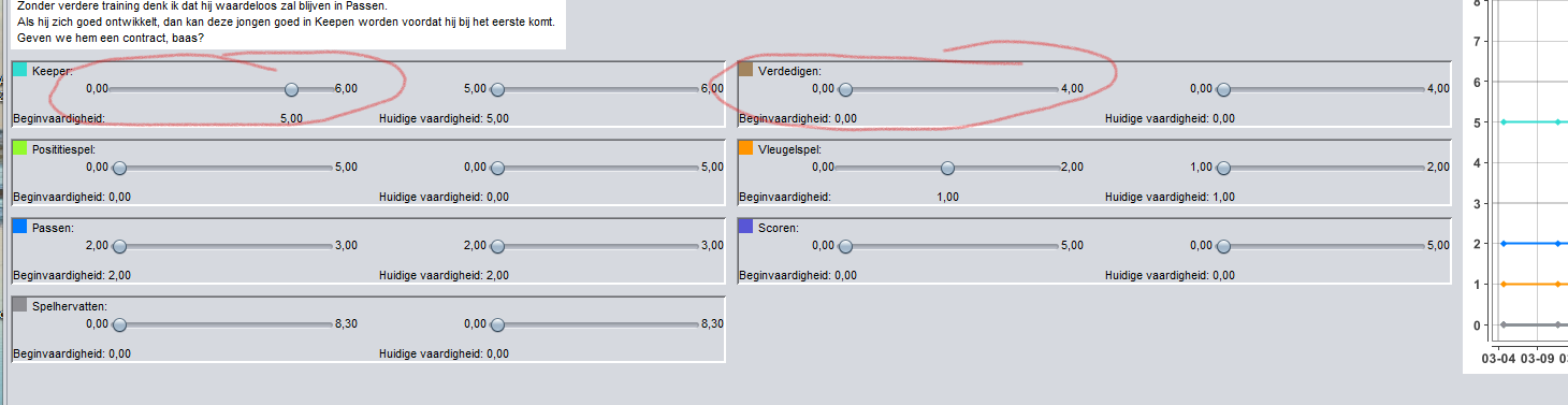
sliders are not only used to display the skills of youth players but also to adjust those.
I will also come back to this one beginning next month because I can't check it right now.
But if I remember correctly my point is that the same functionality can be done without a slider.
Two things to consider; is slider more user friendly to set them precisely than number fields? And is it worth the amount of space they take in? (Aka what other information to they push away because of the space they take in?)
Wanted to give you this feedback already since you are looking into issues that are still open.