 hicetnunc2000
Add a popup component
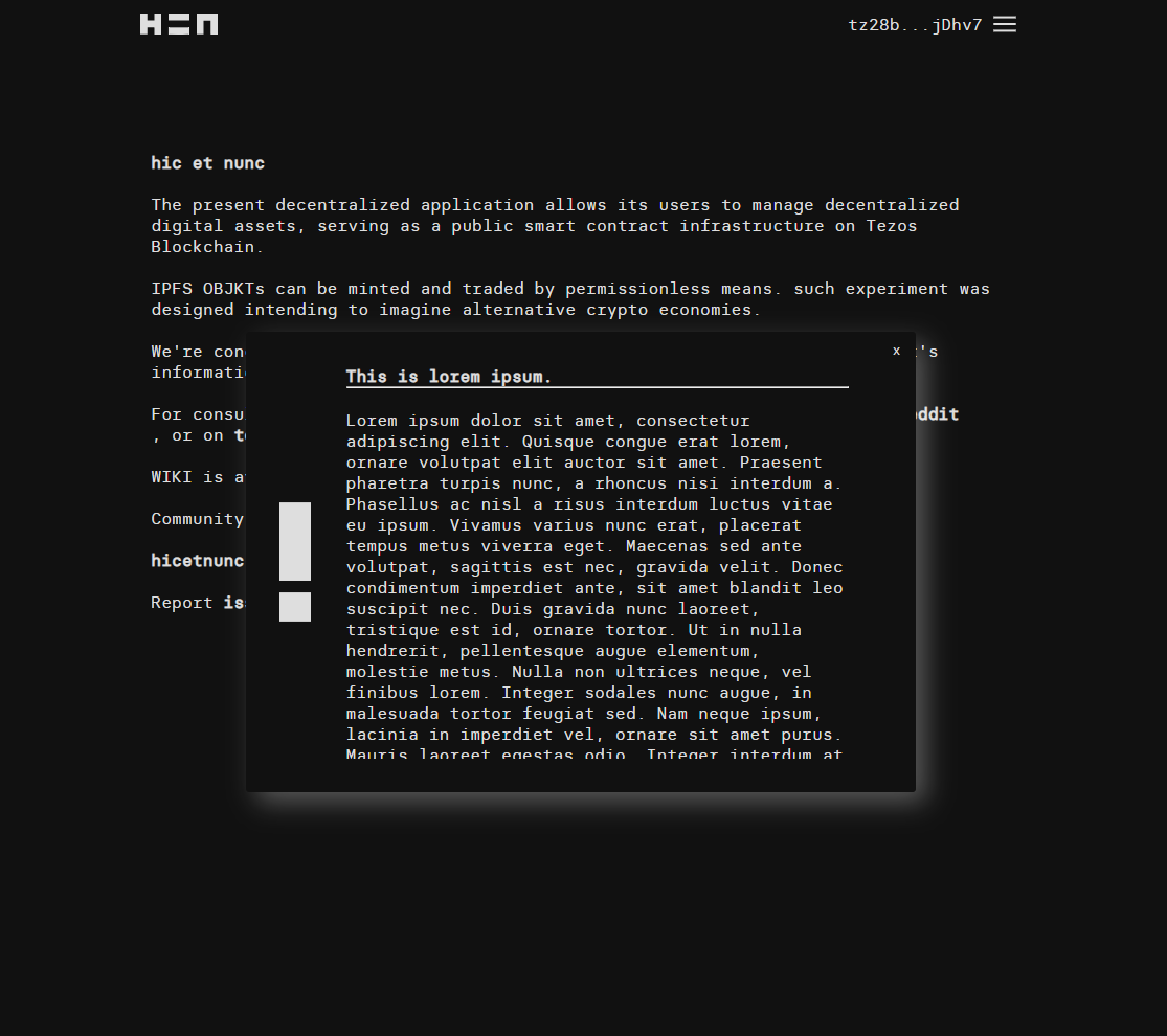
Simple Popups
An example of the component (commented out of course) can be found in the about.js file. The only parameters are sad, happy, exclamation, and null. Each corresponds to the respective svg, when null or not sad, happy nor exclamation, the HEN svg is returned.
Feedback please :). (First PR)
**Forgot to mention there's a title parameter, simply returns the title of the popup as a bolded text
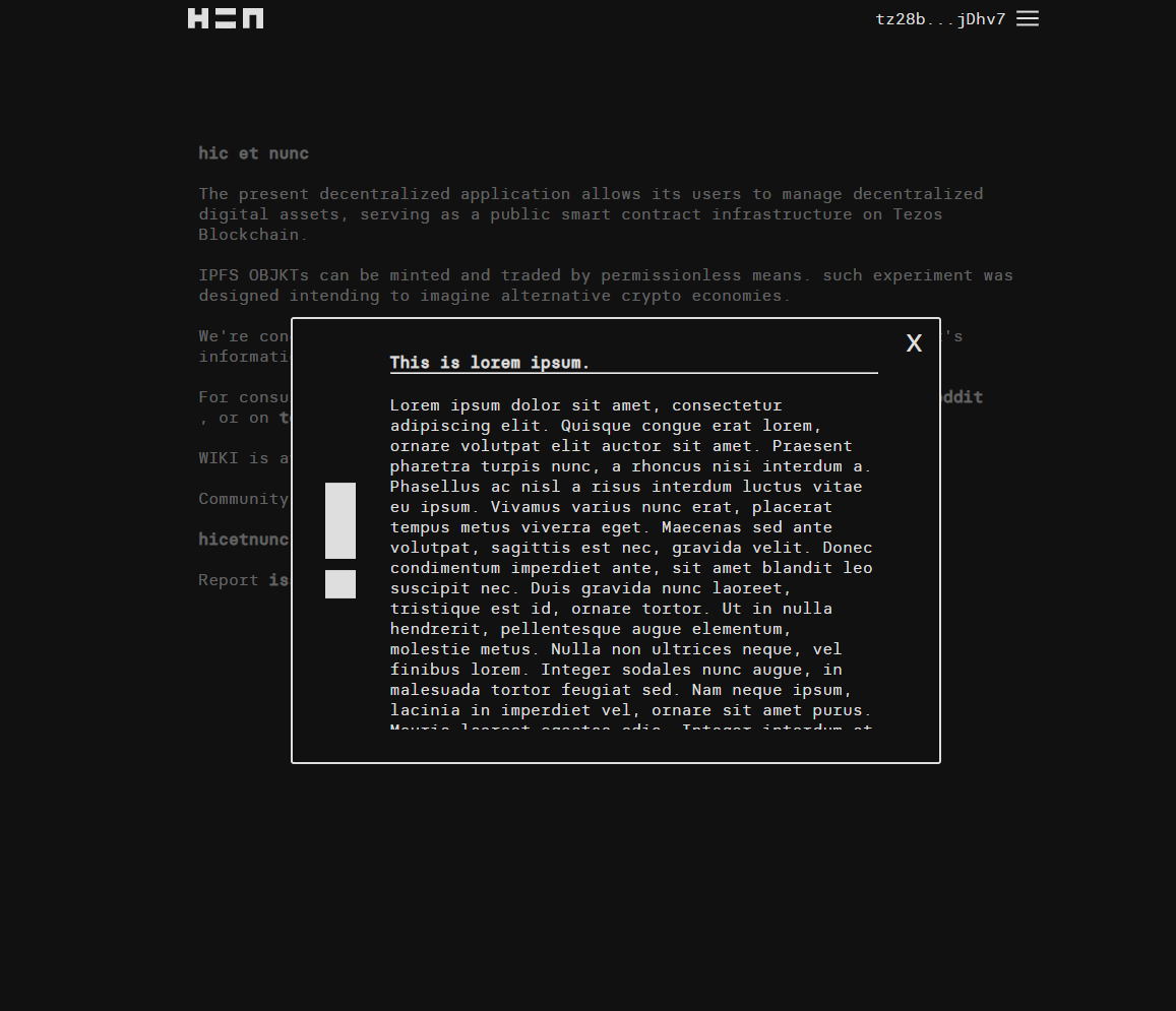
some screenshots for reference. I started reviewing this and think it looks pretty good code-wise with maybe some aesthetic feedback, will give it some more thought later or if anyone else has feedback that's great.
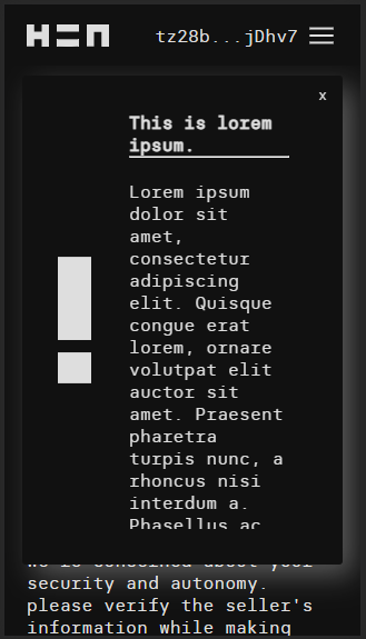
couple of ideas: white border instead of box shadow, hacky backdrop with box-shadow: 0 0 0 99999px #1119;, and a bigger close button (tiny close buttons are no fun on mobile)
@Pixel10312 can you update to remove the demo? needs to be out before merge into live site. also let me know what you think on the CSS ideas.
@Pixel10312 can you update to remove the demo? needs to be out before merge into live site. also let me know what you think on the CSS ideas.
Going to commit the CSS changes, really liked the 'focused' view. Increased the close__btn font size to x-large, should make a difference when on mobile. Will also remove the demo.