openmoji
 openmoji copied to clipboard
OpenMoji mentions on twitter
- cat - Very Positive, the best
- pumpkin - Very Positive
- wrestlers - Very Positive
- train - Very Positive
- money face - Positive
- wave - Positive
- alien - Neutral
- haunted house - not a review
- otter - all vendors seem to be poor lol
- horse - Poor - needs hind leg - #106
- small aeroplane - Poor - no cabin, looks like a drone - #105
- teddy bear - Poor - not cute enough :( - #106
- raccoon - Very Poor - is this a cat?? a lemur?? a ferret?? all i know is it's not a raccoon - #106
- bee 1 bee 2 - Very Poor - looks like an angel, not anatomically similar to a bee - #106
- waffle - Very Poor - add butter and syrup - #105
- light bulbs - Very Poor - should have a screw thread on the base - #106
- flamingo - Very Poor - one leg should be straight and with pink stroke - #106
- zany face - Very Poor - have mouth be inline with eyes - #106
- falafel - Very Poor - other platforms have a plate of falafel - #105
Added to respective issues
@carlinmack Many thanks for this! Super helpful! Yes we should take social media feedback serious ... but still this should not prevent us keeping / thinking / designing original and non-uniform solutions. It is all about finding a "good" balance ... which we have to find though making and discourse. Basically how we are doing it currently :)
- dog - Very Positive!
- merman merwoman - Good - guy could have hair
- shark - Good
- guitar - Good
- woman vampire - Good
- man vampire - Okay, fangs should be white
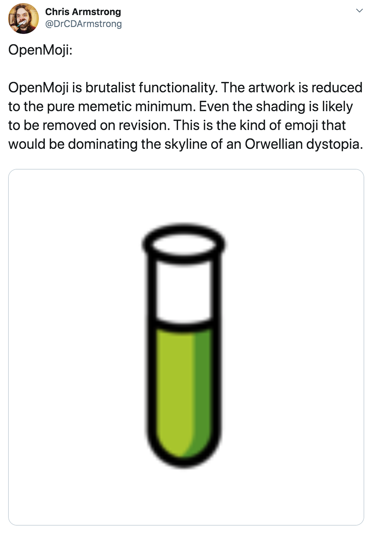
- test tube - Okay
- lion - Okay
- church - not a review
- dagger - Poor - looks like a turkey baster (true) - #106
- cactus - Poor, arms should be the same colour, have some spines - #106
- frog - Poor - too minimalistic
- briefs - Poor - subjective improvements, it's fine
- clef - Poor - G clef abstract, badly proportioned
- sheep - Poor
- dove - Poor
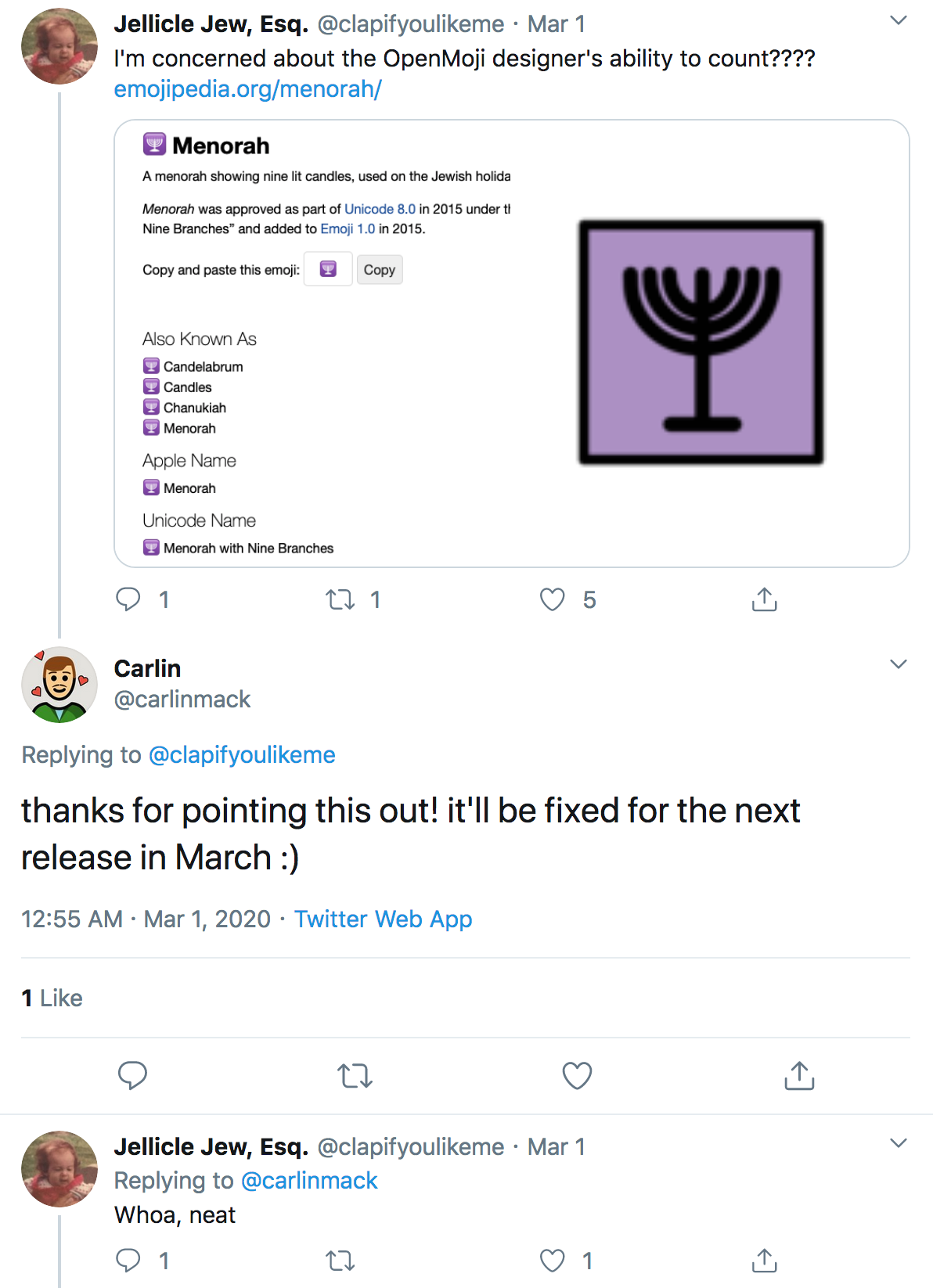
- menorah - Poor, should be 9 candles - #105
- ringed planet - Poor, we should make it look more planetary with bands of colour, change rotation to 26.7° ? emojipedia think it's cute though - #105
- telescope - Poor, I have no idea how to fix though
- train car - Poor - hide the wheels - #106
- amphora - Very Poor, thicker handles, design should be geometric, not block shapes - #106
- classical building - Very Poor, should have 4 columns, should be more structural (?) - #106
- kimono - Very Poor, not a kimono - #106
- bowl with spoon - Very Poor - Bowl should at least have a flat base, curved spoon would be a plus - #106
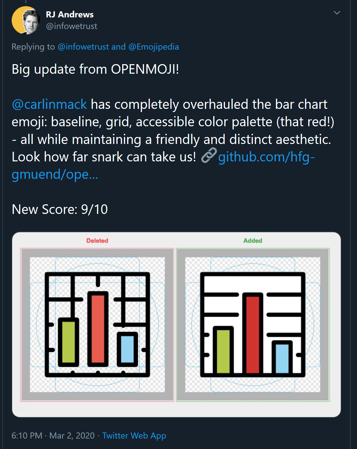
- bar chart one and two- Very Poor - Probably fine for our emoji, but would be good to incorporate axis if possible. Also white background shoudl be added, also fix the intersection with the green bar - #106
- DNA - Very Poor - Not similar to DNA? idk looks like DNA to me
- guardsman - Very Poor - hat should be domed among a lot of other adjustments - #106
- book pile - Very Poor - too simple - #106
- moyai - easter island head - Very Poor - #106
- sunrise - Good, clouds should go over sun
Added to respective issues
@carlinmack Great + Many thanks for the intriguing list! Yes there is some actionable feedback in it ... however we have to be aware that these twitter review are also very much "bashing social media review" which often operate on a totally different level :)
Also I wanted to share this one 😂! I take it as a compliment!
https://twitter.com/DrCDArmstrong/status/1232988417933422592

@carlinmack Also ... I'm really impressed how you handle the interactions on twitter!! 🎩!! Many thanks this is just mega nice and so positive!
e.g. https://twitter.com/carlinmack/status/1233903734834507776

cc @dnlutz
more good press :)

Super cool to counter a review that way! :) 👍
yes indeed, thank you @carlinmack !